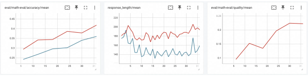
## Line Charts: Evaluation Metrics Over Time
### Overview
The image presents three separate line charts, each displaying a different evaluation metric related to "math eval" over a time scale from 0 to 30. The charts are arranged horizontally. Each chart has a title indicating the metric being measured: accuracy/mean, response length/mean, and quality/mean. Each chart displays two lines representing different aspects of the metric.
### Components/Axes
Each chart shares the following components:
* **X-axis:** Represents time, scaled from 0 to 30. The axis is labeled with numerical markers at intervals of 5.
* **Y-axis:** Represents the metric value. The scale varies for each chart.
* **Line 1 (Red):** Represents one aspect of the metric.
* **Line 2 (Blue):** Represents another aspect of the metric.
* **Title:** Located at the top of each chart, indicating the metric being displayed.
* **Icons:** Located at the top-right of each chart. These appear to be controls for exporting or manipulating the chart (e.g., download, edit).
Specifics for each chart:
* **Chart 1 (Accuracy/Mean):** Y-axis ranges from approximately 0.25 to 0.45.
* **Chart 2 (Response Length/Mean):** Y-axis ranges from approximately 40 to 220.
* **Chart 3 (Quality/Mean):** Y-axis ranges from approximately 0.05 to 0.25.
### Detailed Analysis or Content Details
**Chart 1: eval/math eval/accuracy/mean**
* **Red Line (Accuracy):** Starts at approximately 0.32 at x=0, increases to a peak of around 0.41 at x=10, decreases to approximately 0.37 at x=20, and then increases to approximately 0.43 at x=30. The line generally slopes upward.
* **Blue Line (Mean):** Starts at approximately 0.27 at x=0, steadily increases to approximately 0.36 at x=30. The line slopes upward.
**Chart 2: response_length/mean**
* **Red Line (Response Length):** Starts at approximately 180 at x=0, fluctuates significantly between approximately 80 and 210, ending at approximately 190 at x=30. The line exhibits high variability.
* **Blue Line (Mean):** Starts at approximately 60 at x=0, fluctuates between approximately 40 and 70, ending at approximately 50 at x=30. The line exhibits moderate variability.
**Chart 3: eval/math eval/quality/mean**
* **Red Line (Quality):** Starts at approximately 0.10 at x=0, increases to approximately 0.14 at x=10, decreases to approximately 0.12 at x=15, and then sharply increases to approximately 0.23 at x=30. The line shows a strong upward trend in the later stages.
* **Blue Line (Quality):** This line is not visible in the image.
### Key Observations
* **Accuracy and Mean (Chart 1):** Both accuracy and the mean value increase over time, suggesting improvement in the evaluation metric.
* **Response Length (Chart 2):** The response length fluctuates considerably, with no clear upward or downward trend. The mean response length remains relatively stable.
* **Quality (Chart 3):** The quality metric shows a significant improvement towards the end of the time period.
### Interpretation
The data suggests a positive trend in both accuracy and overall mean performance (Chart 1) over the observed time period. While response length is variable (Chart 2), the mean remains relatively consistent. The most notable observation is the substantial increase in quality (Chart 3) towards the end of the period, indicating a potential breakthrough or improvement in the evaluation process.
The relationship between the charts suggests that improvements in accuracy and quality may not necessarily correlate with response length. The fluctuating response length could be due to variations in the complexity of the evaluated tasks or the strategies employed. The late-stage quality improvement could be a result of optimizations or adjustments made to the evaluation process.
The absence of a visible blue line in Chart 3 is an anomaly that requires further investigation. It is possible that the data for the second aspect of the quality metric is missing or not being displayed.