## Line Charts: Comparative Analysis of Metrics Over Time
### Overview
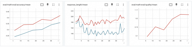
The image contains three line charts comparing two data series (red and blue) across three distinct metrics: accuracy, response length, and quality. Each chart tracks changes over a time axis (x-axis) from 5 to 35 units. The red line consistently outperforms the blue line in all metrics, with notable trends in stability and growth.
---
### Components/Axes
1. **Chart 1: `eval/math-eval/accuracy/mean`**
- **X-axis**: Time (5–35 units, increments of 5)
- **Y-axis**: Accuracy (0.25–0.45, increments of 0.05)
- **Legend**: Red = "Series A", Blue = "Series B"
2. **Chart 2: `response_length/mean`**
- **X-axis**: Time (5–35 units, increments of 5)
- **Y-axis**: Response Length (140–220, increments of 20)
- **Legend**: Red = "Series A", Blue = "Series B"
3. **Chart 3: `eval/math-eval/quality/mean`**
- **X-axis**: Time (5–35 units, increments of 5)
- **Y-axis**: Quality (0.1–0.25, increments of 0.05)
- **Legend**: Red = "Series A", Blue = "Series B"
---
### Detailed Analysis
#### Chart 1: Accuracy
- **Red Line**: Starts at ~0.30, rises steadily to ~0.42 by time 35. Minor plateau between 20–25 units.
- **Blue Line**: Begins at ~0.25, increases gradually to ~0.35 by time 35. Slight dip at time 15.
- **Trend**: Red line maintains a 0.05–0.10 advantage over blue throughout.
#### Chart 2: Response Length
- **Red Line**: Fluctuates between ~180–200, peaking at ~210 at time 10. Stabilizes after time 20.
- **Blue Line**: Oscillates between ~140–160, with a sharp spike to ~180 at time 30. More volatile than red.
- **Trend**: Red line remains 20–40 units higher than blue, despite higher variability.
#### Chart 3: Quality
- **Red Line**: Starts at ~0.10, rises sharply to ~0.22 by time 30. Sustains growth after time 25.
- **Blue Line**: Begins at ~0.12, increases to ~0.18 by time 35. Slower growth rate than red.
- **Trend**: Red line achieves 0.04–0.10 higher values consistently.
---
### Key Observations
1. **Consistent Superiority**: Red line outperforms blue in all metrics across all time points.
2. **Volatility**: Blue line in Chart 2 shows irregular fluctuations, while red lines in Charts 1 and 3 exhibit smoother growth.
3. **Asymptotic Behavior**: In Chart 1, red line’s growth slows after time 25, suggesting diminishing returns.
4. **Outlier**: Blue line in Chart 2 spikes to ~180 at time 30, briefly closing the gap with red (~200).
---
### Interpretation
The data suggests **Series A (red)** demonstrates superior performance in accuracy, response length, and quality metrics compared to **Series B (blue)**. The stability of red lines implies optimized processes or models, while blue’s volatility (especially in response length) may indicate inefficiencies or external noise. The quality metric’s steep rise for red after time 25 hints at a critical intervention or model update. Notably, blue’s late-stage spike in response length (time 30) could reflect a temporary anomaly or resource-intensive adjustment. Overall, the trends emphasize the importance of metric-specific optimizations for Series A.