\n
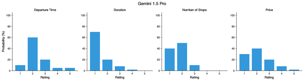
## Bar Charts: Travel Feature Distributions
### Overview
The image presents four separate bar charts, arranged horizontally. Each chart depicts the probability distribution of a different travel feature: Departure Time, Duration, Number of Stops, and Price. The x-axis of each chart represents a "Rating" scale from 1 to 5, and the y-axis represents "Probability (%)". All charts share the same scales for both axes. A "Gemini 1.5 Pro" watermark is present at the top-right.
### Components/Axes
* **X-axis Label (all charts):** "Rating" (ranging from 1 to 5)
* **Y-axis Label (all charts):** "Probability (%)" (ranging from 0 to 100)
* **Chart Titles (from left to right):** "Departure Time", "Duration", "Number of Stops", "Price"
* **Data Series:** Each chart has a single data series represented by blue bars.
### Detailed Analysis or Content Details
**1. Departure Time:**
* The bar for Rating 1 has a height of approximately 60%.
* The bar for Rating 2 has a height of approximately 20%.
* The bar for Rating 3 has a height of approximately 10%.
* The bars for Ratings 4 and 5 are very small, both around 5%.
* Trend: The probability decreases as the rating increases.
**2. Duration:**
* The bar for Rating 1 has a height of approximately 70%.
* The bar for Rating 2 has a height of approximately 20%.
* The bar for Rating 3 has a height of approximately 5%.
* The bars for Ratings 4 and 5 are very small, both around 2%.
* Trend: The probability decreases sharply as the rating increases.
**3. Number of Stops:**
* The bar for Rating 1 has a height of approximately 50%.
* The bar for Rating 2 has a height of approximately 40%.
* The bar for Rating 3 has a height of approximately 10%.
* The bars for Ratings 4 and 5 are very small, both around 2%.
* Trend: The probability decreases as the rating increases, but less dramatically than for Departure Time or Duration.
**4. Price:**
* The bar for Rating 1 has a height of approximately 40%.
* The bar for Rating 2 has a height of approximately 30%.
* The bar for Rating 3 has a height of approximately 20%.
* The bar for Rating 4 has a height of approximately 10%.
* The bar for Rating 5 has a height of approximately 5%.
* Trend: The probability decreases as the rating increases.
### Key Observations
* For all four features, the highest probability is associated with a Rating of 1.
* The distributions are heavily skewed towards lower ratings.
* Ratings 4 and 5 have consistently low probabilities across all features.
* The "Duration" chart shows the most concentrated distribution, with a very high probability for Rating 1.
### Interpretation
The data suggests that, for this dataset of travel options, lower ratings are more common for all four features (Departure Time, Duration, Number of Stops, and Price). A "Rating" of 1 appears to be the most typical or preferred value for each feature. This could indicate that most travel options have short departure times, short durations, few stops, and low prices. The steep decline in probability as the rating increases suggests that options with higher ratings (e.g., long departure times, long durations, many stops, high prices) are relatively rare.
The consistent pattern across all four charts implies a systemic preference or constraint within the data. It's possible that the data represents budget travel options, or that the rating scale is designed to favor lower values. Without further context on what the "Rating" scale represents, it's difficult to draw more specific conclusions. The "Gemini 1.5 Pro" watermark suggests this data may be generated or analyzed by that AI model.