## Bar Chart: Gemini 1.5 Pro
### Overview
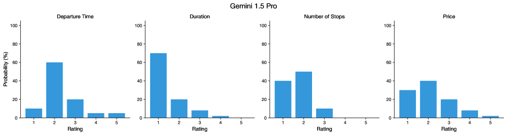
The image displays four bar charts arranged in a 2x2 grid, each representing the probability distribution of different attributes (Departure Time, Duration, Number of Stops, Price) across a 5-point rating scale. All bars are blue, with a legend positioned at the top-right corner. The y-axis is labeled "Probability (%)" (0–100%), and the x-axis is labeled "Rating" (1–5). The main title "Gemini 1.5 Pro" is centered at the top.
### Components/Axes
- **Legend**: Located at the top-right corner, indicating the color blue corresponds to all data series (no explicit labels for categories).
- **Axes**:
- **X-axis**: "Rating" (1–5), evenly spaced.
- **Y-axis**: "Probability (%)" (0–100%), with increments of 20%.
- **Charts**:
1. **Departure Time**: Highest probability at Rating 2 (~60%), followed by Rating 3 (~20%), and lower values for Ratings 1, 4, and 5.
2. **Duration**: Highest probability at Rating 1 (~70%), followed by Rating 2 (~20%), with negligible values for Ratings 3–5.
3. **Number of Stops**: Highest probability at Rating 2 (~50%), followed by Rating 1 (~40%), and Rating 3 (~10%), with no values for Ratings 4–5.
4. **Price**: Highest probability at Rating 2 (~40%), followed by Rating 1 (~30%), Rating 3 (~20%), Rating 4 (~10%), and Rating 5 (~2%).
### Detailed Analysis
- **Departure Time**:
- Rating 2 dominates (~60%), suggesting a strong preference for this rating.
- Ratings 1, 4, and 5 have low probabilities (<10%).
- **Duration**:
- Rating 1 is most probable (~70%), indicating a preference for shorter durations.
- Ratings 3–5 have minimal probabilities (<5%).
- **Number of Stops**:
- Rating 2 is the most probable (~50%), followed by Rating 1 (~40%).
- Rating 3 has a smaller share (~10%), while Ratings 4–5 are absent.
- **Price**:
- Rating 2 is the most probable (~40%), with Rating 1 (~30%) and Rating 3 (~20%) also significant.
- Ratings 4 and 5 have low probabilities (~10% and ~2%, respectively).
### Key Observations
1. **Dominance of Lower Ratings**: Departure Time, Duration, and Number of Stops show strong probabilities for lower ratings (1–3), suggesting a preference for shorter, simpler, or less frequent options.
2. **Price Anomaly**: While Rating 2 is the most probable for Price, Rating 1 also has a notable share (~30%), unlike other categories where Rating 1 is less dominant.
3. **High Ratings (4–5)**: Rarely appear in all categories, with only Rating 5 in Price having a minimal presence (~2%).
### Interpretation
The data suggests that users or systems prioritize lower ratings for attributes like Departure Time, Duration, and Number of Stops, likely due to efficiency or cost concerns. For Price, Rating 2 is the most probable, but Rating 1’s significant share (~30%) may indicate a bifurcation in pricing strategies (e.g., budget vs. mid-range options). The near-absence of high ratings (4–5) across most categories implies that extreme values (e.g., very long durations or high prices) are uncommon or undesirable. The anomaly in Price’s Rating 5 (~2%) could reflect a niche market or outliers in pricing data. Overall, the trends highlight a preference for balanced, mid-range options over extremes.