\n
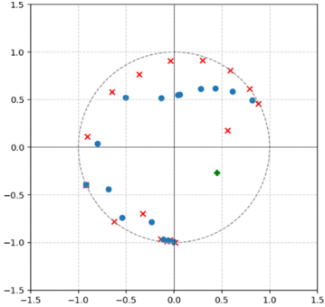
## Scatter Plot: Data Distribution
### Overview
The image presents a scatter plot with data points distributed across a two-dimensional plane. The plot features three distinct marker types: blue circles, red crosses, and a single green square. A dashed circle is overlaid on the scatter plot, potentially representing a boundary or threshold. The axes range from -1.5 to 1.5 on both the x and y axes.
### Components/Axes
* **X-axis:** Ranges from -1.5 to 1.5. No label is present.
* **Y-axis:** Ranges from -1.5 to 1.5. No label is present.
* **Markers:**
* Blue Circles
* Red Crosses
* Green Square
* **Circle:** Dashed circle centered approximately at the origin (0,0) with a radius of approximately 1.0.
### Detailed Analysis
The data points are distributed as follows:
* **Blue Circles:** These points generally follow a semi-circular pattern in the upper half of the plot, transitioning to a more scattered distribution in the lower half.
* Approximate coordinates: (-0.8, 0.6), (-0.5, 0.7), (-0.2, 0.6), (0.0, 0.5), (0.2, 0.5), (0.4, 0.4), (0.5, 0.2), (0.3, -0.2), (0.0, -0.5), (-0.3, -0.7), (-0.6, -1.0), (-0.8, -1.2)
* **Red Crosses:** These points are more evenly distributed around the circle, with a concentration in the upper quadrants.
* Approximate coordinates: (-1.0, 0.8), (-0.8, 0.1), (-0.4, 0.8), (0.0, 1.0), (0.4, 0.8), (0.8, 0.4), (0.5, -0.4), (0.0, -0.6), (-0.5, -0.5), (-1.0, -0.3)
* **Green Square:** A single green square is located at approximately (0.3, -0.1).
The dashed circle appears to encapsulate the majority of the blue circle and red cross data points, with some points falling outside of it.
### Key Observations
* The blue circles exhibit a more defined pattern than the red crosses.
* The green square is an outlier, significantly separated from the other data points.
* The distribution of points suggests a potential correlation between the x and y coordinates, particularly for the blue circles.
* The dashed circle may represent a decision boundary or a region of interest.
### Interpretation
The scatter plot likely represents a classification or clustering problem. The blue circles and red crosses could represent different classes or groups, and the dashed circle might delineate the boundary between these classes. The green square, being an outlier, could represent a misclassified data point or a member of a different, less frequent class. The plot suggests that the x and y coordinates are informative features for distinguishing between the classes. Without knowing the context of the data, it's difficult to determine the specific meaning of the axes or the variables they represent. However, the visual pattern suggests a non-linear relationship between the variables and the classes. The concentration of points along the circle suggests a circular or angular relationship. Further analysis, such as calculating the distance of each point from the origin or performing a statistical test, could provide more insights into the underlying data distribution and relationships.