## Scatter Plot with Unit Circle: Data Distribution Analysis
### Overview
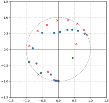
The image displays a 2D scatter plot overlaid with a unit circle (radius = 1) centered at the origin (0,0). The plot contains multiple data points represented by different markers (blue circles, red crosses, a green diamond, and a blue square) distributed across the four quadrants. There is no explicit chart title or legend provided within the image frame.
### Components/Axes
* **X-Axis:** Linear scale ranging from -1.5 to 1.5. Major tick marks and labels are present at -1.5, -1.0, -0.5, 0.0, 0.5, 1.0, and 1.5. The axis is labeled with numerical values only; no descriptive title (e.g., "X") is visible.
* **Y-Axis:** Linear scale ranging from -1.5 to 1.5. Major tick marks and labels are present at -1.5, -1.0, -0.5, 0.0, 0.5, 1.0, and 1.5. The axis is labeled with numerical values only; no descriptive title (e.g., "Y") is visible.
* **Grid:** A light gray grid is present, with lines corresponding to the major tick marks on both axes.
* **Reference Circle:** A dashed gray circle with a radius of 1 unit, centered at (0,0). This is a standard unit circle.
* **Data Series (Inferred from markers):**
1. **Blue Circles (●):** A series of approximately 10 data points.
2. **Red Crosses (×):** A series of approximately 12 data points.
3. **Green Diamond (◆):** A single data point.
4. **Blue Square (■):** A single data point.
### Detailed Analysis
**Spatial Distribution and Approximate Coordinates:**
* **Blue Circles (●):** This series is primarily clustered in the upper-right quadrant (Quadrant I), inside the unit circle. One point is in the upper-left quadrant (Quadrant II), and one is in the lower-left quadrant (Quadrant III).
* Approximate coordinates (x, y): (0.1, 0.5), (0.3, 0.55), (0.5, 0.6), (0.6, 0.6), (0.7, 0.6), (0.8, 0.5), (-0.6, 0.5), (-0.8, 0.05), (-0.7, -0.45), (-0.4, -0.75).
* **Red Crosses (×):** This series is widely scattered. Several points lie outside the unit circle, particularly in the upper half. Points are present in all four quadrants.
* Approximate coordinates (x, y): (-0.9, 0.1), (-0.7, 0.55), (-0.5, 0.75), (-0.2, 0.9), (0.2, 0.9), (0.5, 0.8), (0.7, 0.65), (0.8, 0.55), (0.9, 0.45), (0.6, 0.15), (-0.6, -0.75), (-0.3, -0.85).
* **Green Diamond (◆):** A single point located in the lower-right quadrant (Quadrant IV), inside the unit circle.
* Approximate coordinate: (0.5, -0.4).
* **Blue Square (■):** A single point located in the lower-left quadrant (Quadrant III), inside the unit circle.
* Approximate coordinate: (-0.9, -0.4).
**Trend Verification:**
* There is no continuous line connecting the points, so traditional "slope" trends are not applicable. The distribution shows that the **Blue Circle** series is relatively tightly grouped in a specific region (QI), while the **Red Cross** series exhibits high variance and dispersion.
### Key Observations
1. **Clustering vs. Dispersion:** The blue circles form a loose cluster, suggesting a potential relationship or grouping for that data series. The red crosses show no clear clustering and are dispersed widely.
2. **Relation to Unit Circle:** A significant number of red cross points lie outside the unit circle (radius > 1), while all blue circle points, the green diamond, and the blue square lie inside it (radius < 1).
3. **Outliers:** The red cross at approximately (-0.2, 0.9) is the point farthest from the origin. The blue circle at (-0.8, 0.05) is an outlier relative to the main cluster of blue circles.
4. **Missing Information:** The chart lacks a title, axis labels, and a legend. The meaning of the different marker types (blue circle, red cross, etc.) is not defined within the image.
### Interpretation
This plot likely visualizes the distribution of two or more datasets in a 2D space, using the unit circle as a critical reference boundary. The data suggests a fundamental difference between the series represented by blue circles and red crosses.
* The **blue circle** series appears to represent data that is constrained or normalized, as all points fall within the unit circle. Their clustering in Quadrant I might indicate a positive correlation between the X and Y variables for this group.
* The **red cross** series represents data with much higher magnitude or variance, as many points exceed the unit radius. Their wide scatter suggests a weak or non-existent correlation between X and Y for this group.
* The single **green diamond** and **blue square** points may represent special cases, averages, or data from entirely different categories.
**Without a legend or context, the specific scientific or mathematical meaning is ambiguous.** However, the visual pattern is clear: one dataset (blue circles) is bounded and somewhat correlated, while another (red crosses) is unbounded and uncorrelated, relative to the origin and the unit circle reference. This type of plot is common in fields like signal processing (e.g., pole-zero plots), statistics (e.g., visualizing residuals or coefficients), or machine learning (e.g., decision boundaries).