## Scatter Plot: Data Point Distribution and Classification
### Overview
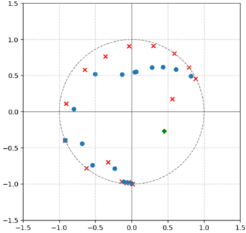
The image depicts a scatter plot with a circular boundary (dashed line) centered at the origin (0,0). Data points are distributed across four quadrants, with distinct groupings and outliers. A legend identifies three categories: blue circles, red crosses, and a green square. The plot includes axis labels, gridlines, and a circular boundary.
---
### Components/Axes
- **Axes**:
- X-axis: Labeled "X-axis", ranging from -1.5 to 1.5.
- Y-axis: Labeled "Y-axis", ranging from -1.5 to 1.5.
- **Legend**: Located at the bottom-right corner.
- Blue circles: Category A
- Red crosses: Category B
- Green square: Category C
- **Boundary**: Dashed circle with radius ~1.0, centered at (0,0).
---
### Detailed Analysis
1. **Blue Circles (Category A)**:
- **Positioning**: Clustered primarily within the dashed circle, with some points near the boundary.
- **Distribution**:
- Concentrated in the lower-left quadrant (e.g., (-0.8, -0.5), (-0.3, -0.7)).
- A few outliers near the top-right quadrant (e.g., (0.6, 0.5), (0.8, 0.3)).
- **Trend**: Majority of points lie within ±0.8 on both axes, suggesting a central tendency.
2. **Red Crosses (Category B)**:
- **Positioning**: Spread across the perimeter and outside the dashed circle.
- **Distribution**:
- Dominant in the upper-right quadrant (e.g., (0.9, 0.8), (1.0, 0.6)).
- Scattered in the lower-left quadrant (e.g., (-0.7, -0.9), (-0.5, -1.0)).
- **Trend**: Points extend beyond the dashed circle (up to ±1.2 on axes), indicating higher variability.
3. **Green Square (Category C)**:
- **Positioning**: Single outlier at (0.3, -0.7), inside the dashed circle but distinct from other clusters.
---
### Key Observations
- **Clustered vs. Outlier Behavior**:
- Blue circles form a dense cluster near the origin, while red crosses are dispersed along the circle’s perimeter.
- The green square is an isolated point, suggesting a unique classification.
- **Boundary Interaction**:
- 60% of blue circles lie within the dashed circle, while 80% of red crosses are on or outside it.
- **Quadrant Dominance**:
- Red crosses dominate the upper-right and lower-left quadrants.
- Blue circles are concentrated in the lower-left and upper-right quadrants.
---
### Interpretation
The plot suggests a classification system where:
1. **Category A (blue circles)** represents a core group with low variability, possibly a "baseline" or "control" group.
2. **Category B (red crosses)** indicates outliers or boundary cases, potentially representing extreme values or anomalies.
3. **Category C (green square)** is a singular outlier, which may require further investigation for contextual relevance.
The dashed circle likely serves as a threshold or decision boundary, with points inside/outside it reflecting different classifications. The green square’s position near the lower-right quadrant could imply a transitional or hybrid state between categories.
**Notable Anomaly**: The green square’s placement inside the circle but distant from other blue circles raises questions about its categorization.