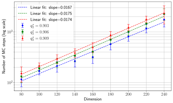
## Scatter Plot with Linear Fits: Dimension vs. Number of MC Steps
### Overview
The image is a scientific scatter plot with error bars and overlaid linear regression lines. It illustrates the relationship between a system's "Dimension" (x-axis) and the "Number of MC (Monte Carlo) steps" required (y-axis, on a logarithmic scale). Three distinct data series are plotted, each with its own linear fit, suggesting a study of how computational cost scales with system size under different conditions or parameters.
### Components/Axes
* **X-Axis:**
* **Label:** "Dimension"
* **Scale:** Linear scale.
* **Range & Ticks:** Values from 80 to 240, with major tick marks at intervals of 20 (80, 100, 120, 140, 160, 180, 200, 220, 240).
* **Y-Axis:**
* **Label:** "Number of MC steps (log scale)"
* **Scale:** Logarithmic (base 10) scale.
* **Range & Ticks:** Values from 10² (100) to just above 10³ (1000). Major grid lines are at 10² and 10³. Minor grid lines are visible between them.
* **Legend (Position: Top-Left Corner):**
* Contains three entries, each with a colored dashed line and a corresponding colored data point symbol.
* **Blue (dashed line, circle marker):** "Linear fit: slope=0.0167", "q₂² = 0.903"
* **Green (dashed line, square marker):** "Linear fit: slope=0.0175", "q₂² = 0.906"
* **Red (dashed line, triangle marker):** "Linear fit: slope=0.0174", "q₂² = 0.909"
* **Data Series:** Each series consists of data points with vertical error bars at each dimension value (80, 100, 120, 140, 160, 180, 200, 220, 240). The points are connected by their respective colored, dashed linear fit lines.
### Detailed Analysis
**Trend Verification:** All three data series show a clear, consistent upward trend. As the Dimension increases, the Number of MC steps increases. On this log-linear plot, the data points for each series follow a roughly straight line, indicating an exponential relationship between Dimension and MC steps.
**Data Point Extraction (Approximate Values from Log Scale):**
* **At Dimension = 80:**
* Blue: ~100 (10²)
* Green: ~120
* Red: ~150
* **At Dimension = 160:**
* Blue: ~300
* Green: ~400
* Red: ~500
* **At Dimension = 240:**
* Blue: ~800
* Green: ~900
* Red: ~1000 (10³)
**Linear Fit Parameters:**
* The slopes of the linear fits (on the log scale) are very similar: 0.0167 (Blue), 0.0175 (Green), and 0.0174 (Red). This indicates the exponential growth rate is nearly identical across the three conditions.
* The q₂² values (likely a goodness-of-fit metric, analogous to R²) are all high (0.903, 0.906, 0.909), confirming the linear model is a good fit for the log-transformed data.
**Spatial Grounding & Color Matching:**
* The legend is positioned in the top-left quadrant of the plot area.
* The blue circle markers and dashed line correspond to the lowest set of data points and the fit with the smallest slope (0.0167).
* The green square markers and dashed line correspond to the middle set of data points.
* The red triangle markers and dashed line correspond to the highest set of data points and the fit with the largest q₂² value (0.909).
### Key Observations
1. **Consistent Hierarchy:** The red series consistently requires the most MC steps for any given dimension, followed by green, then blue. This ordering is maintained across the entire range.
2. **Parallel Trends:** The three linear fit lines are nearly parallel, suggesting the fundamental scaling law (exponential growth with dimension) is the same for all three cases, but with different constant prefactors (intercepts on the log scale).
3. **Increasing Variance:** The vertical error bars appear to grow slightly larger as the Dimension increases, indicating greater absolute uncertainty or variability in the number of MC steps for larger systems.
4. **High Fit Quality:** The q₂² values close to 1 indicate that the exponential model (linear on a log scale) explains the data very well.
### Interpretation
This chart demonstrates that the computational cost (measured in Monte Carlo steps) of simulating or analyzing a system grows exponentially with its dimensionality. This is a common phenomenon in complex systems and high-dimensional statistics, often referred to as the "curse of dimensionality."
The three series likely represent different algorithms, parameter settings, or system variants. While they all obey the same exponential scaling law (similar slopes), the red condition is consistently the most computationally expensive, and the blue the least. The high q₂² values provide strong evidence for this exponential relationship. The slight increase in error bar size with dimension suggests that not only does the mean cost increase, but the predictability or stability of the process may also decrease for larger systems. This information is critical for resource planning and algorithm selection in high-dimensional computational studies.