\n
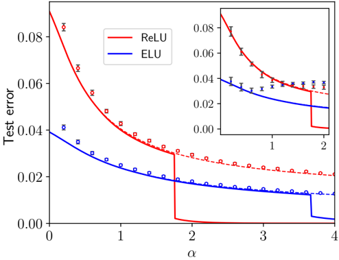
## Line Chart with Inset: Test Error vs. Alpha for ReLU and ELU Activation Functions
### Overview
The image is a technical line chart comparing the test error performance of two neural network activation functions, ReLU (Rectified Linear Unit) and ELU (Exponential Linear Unit), as a function of a hyperparameter alpha (α). The chart includes a main plot and a smaller inset plot that provides a zoomed-in view of the initial segment of the data.
### Components/Axes
* **Chart Type:** Line chart with error bars and an inset zoom.
* **Main Plot Axes:**
* **X-axis (Horizontal):** Labeled "α" (alpha). The scale runs from 0 to 4, with major tick marks at 0, 1, 2, 3, and 4.
* **Y-axis (Vertical):** Labeled "Test error". The scale runs from 0.00 to 0.08, with major tick marks at 0.00, 0.02, 0.04, 0.06, and 0.08.
* **Legend:** Located in the top-left corner of the main plot area.
* A solid red line is labeled "ReLU".
* A solid blue line is labeled "ELU".
* **Inset Plot:** Positioned in the top-right quadrant of the main plot.
* **X-axis:** Unlabeled, but corresponds to the main x-axis, showing the range from approximately 0 to 2.
* **Y-axis:** Unlabeled, but corresponds to the main y-axis, showing the range from 0.00 to 0.08.
* It displays the same two data series (ReLU in red, ELU in blue) for the specified range, providing greater detail for the initial descent.
* **Data Representation:**
* **Solid Lines:** Represent the primary trend or mean performance for each function.
* **Dashed Lines:** Appear to represent an alternative trend or bound, closely following the solid lines.
* **Markers with Error Bars:** Square markers (□) with vertical error bars are plotted along the lines, indicating discrete data points and their associated variance or confidence intervals.
### Detailed Analysis
**1. ReLU (Red Series):**
* **Trend:** The test error starts at its highest point (approximately 0.09 at α=0) and decreases sharply as α increases. The decline is very steep initially, then becomes more gradual. There is a dramatic, near-vertical drop in the solid line at approximately α=1.8, after which the error plateaus very close to 0.00.
* **Data Points (Approximate from markers):**
* α ≈ 0.2: Error ≈ 0.085
* α ≈ 0.5: Error ≈ 0.065
* α ≈ 1.0: Error ≈ 0.04
* α ≈ 1.5: Error ≈ 0.03
* α ≈ 1.8 (just before drop): Error ≈ 0.03
* α > 1.8: Error ≈ 0.00 (solid line), though dashed line and markers suggest a slow decline from ~0.025 to ~0.02.
* **Error Bars:** The error bars are largest at low α values (e.g., at α≈0.2, the bar spans roughly 0.08 to 0.09) and become smaller as α increases.
**2. ELU (Blue Series):**
* **Trend:** The test error starts lower than ReLU (approximately 0.04 at α=0) and decreases in a smooth, convex curve as α increases. The rate of decrease slows down, approaching an asymptote. There is a small, sharp step-down in the solid line at approximately α=3.7.
* **Data Points (Approximate from markers):**
* α ≈ 0.2: Error ≈ 0.038
* α ≈ 0.5: Error ≈ 0.03
* α ≈ 1.0: Error ≈ 0.022
* α ≈ 2.0: Error ≈ 0.015
* α ≈ 3.0: Error ≈ 0.012
* α ≈ 4.0: Error ≈ 0.01 (solid line), though dashed line and markers suggest a value closer to 0.013.
* **Error Bars:** The error bars for ELU are consistently smaller than those for ReLU across the entire range of α.
**3. Inset Plot Analysis:**
* The inset confirms the initial trends: ReLU starts much higher and falls rapidly, while ELU starts lower and falls more gradually.
* It clearly shows that for α < ~1.5, the ELU curve (blue) is consistently below the ReLU curve (red), indicating lower test error in this region.
* The crossover point where the ReLU solid line plunges below the ELU line occurs just before α=2 in the main plot, which is at the far right edge of the inset.
### Key Observations
1. **Performance Crossover:** There is a clear crossover in performance. For lower values of α (approximately α < 1.8), ELU yields a lower test error. For higher values of α (approximately α > 1.8), ReLU achieves a dramatically lower, near-zero test error.
2. **Discontinuity in ReLU:** The ReLU performance curve exhibits a sharp, discontinuous drop at a critical α value (~1.8). This suggests a phase transition or a threshold effect in the model's behavior related to this hyperparameter.
3. **Variance:** The error bars indicate that the variance (or uncertainty) in the test error measurement is generally higher for ReLU than for ELU, especially at lower α values.
4. **Asymptotic Behavior:** Both functions show diminishing returns as α increases. ELU's improvement slows significantly after α=2. ReLU's improvement is halted by its sharp drop, after which it remains flat.
### Interpretation
This chart demonstrates the critical impact of the hyperparameter α on the performance of neural networks using different activation functions. The data suggests:
* **ELU is more robust and performs better at lower α values.** It provides a stable, lower-error solution when α is small, with less variance in results. This could be advantageous in scenarios where tuning α is difficult or where a conservative, reliable performance is needed.
* **ReLU has a higher potential reward but involves a critical threshold.** It starts with worse performance but can achieve near-perfect test error (approaching 0) if α is tuned past a specific point (~1.8). This sharp transition implies that the network's optimization landscape or representational capacity changes fundamentally at this α value. The high variance at low α suggests training with ReLU is less stable in that regime.
* **The choice between them involves a trade-off.** One must choose between the stable, good-enough performance of ELU across a wide range of α, or the potentially superior but threshold-dependent performance of ReLU. The optimal choice depends on the ability to precisely tune α and the tolerance for risk (variance) during training.
* **The dashed lines and error bars** remind us that these are empirical results with statistical uncertainty. The dashed lines may represent a theoretical bound or the performance of a slightly different model variant, closely tracking the primary trend.
In essence, the chart is a visual argument for careful hyperparameter tuning, showing that the "best" activation function is not absolute but is contingent on the value of another parameter in the system.