## Line Chart with Confidence Intervals: ACD by Income Group
### Overview
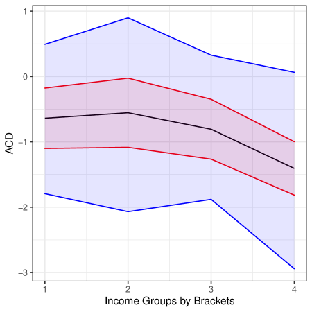
The image is a line chart displaying the relationship between "ACD" (y-axis) and four "Income Groups by Brackets" (x-axis). It features three distinct data series represented by blue, red, and black lines, each accompanied by a shaded region of the same color, indicating confidence intervals or variability around the central trend line. The chart has a white background with a light gray grid.
### Components/Axes
* **Y-Axis:**
* **Label:** "ACD"
* **Scale:** Linear, ranging from -3 to 1.
* **Major Tick Marks:** -3, -2, -1, 0, 1.
* **X-Axis:**
* **Label:** "Income Groups by Brackets"
* **Scale:** Categorical/Ordinal.
* **Categories (Tick Marks):** 1, 2, 3, 4.
* **Data Series & Legend:**
* **No explicit legend is present in the image.** The series are distinguished solely by color.
* **Blue Line & Shading:** The topmost series.
* **Red Line & Shading:** The middle series.
* **Black Line & Shading:** The bottom series.
* **Spatial Layout:** The plot area is centered. The y-axis label is rotated 90 degrees and positioned to the left of the axis. The x-axis label is centered below the axis tick labels.
### Detailed Analysis
**Trend Verification & Data Point Extraction (Approximate Values):**
1. **Blue Series (Top):**
* **Trend:** Rises from Group 1 to a peak at Group 2, then declines through Groups 3 and 4.
* **Central Line Points:**
* Group 1: ~0.5
* Group 2: ~0.9
* Group 3: ~0.3
* Group 4: ~0.1
* **Shaded Region (Confidence Interval) Bounds:**
* Group 1: ~ -1.8 to 0.5
* Group 2: ~ -2.1 to 0.9
* Group 3: ~ -1.9 to 0.3
* Group 4: ~ -2.9 to 0.1
2. **Red Series (Middle):**
* **Trend:** Slightly increases from Group 1 to Group 2, then declines steadily through Groups 3 and 4.
* **Central Line Points:**
* Group 1: ~ -0.2
* Group 2: ~ 0.0
* Group 3: ~ -0.4
* Group 4: ~ -1.0
* **Shaded Region (Confidence Interval) Bounds:**
* Group 1: ~ -1.1 to -0.2
* Group 2: ~ -1.1 to 0.0
* Group 3: ~ -1.3 to -0.4
* Group 4: ~ -1.8 to -1.0
3. **Black Series (Bottom):**
* **Trend:** Slight increase from Group 1 to Group 2, then a consistent decline through Groups 3 and 4.
* **Central Line Points:**
* Group 1: ~ -0.6
* Group 2: ~ -0.5
* Group 3: ~ -0.8
* Group 4: ~ -1.4
* **Shaded Region (Confidence Interval) Bounds:**
* Group 1: ~ -0.8 to -0.6
* Group 2: ~ -0.8 to -0.5
* Group 3: ~ -1.2 to -0.8
* Group 4: ~ -1.8 to -1.4
### Key Observations
1. **Common Peak at Group 2:** All three series show their highest (or least negative) ACD value at Income Group 2.
2. **Universal Decline After Group 2:** All series exhibit a downward trend from Income Group 2 to Group 4.
3. **Diverging Confidence Intervals:** The width of the shaded regions (uncertainty) generally increases for all series as the income group number increases, with the blue series showing the most dramatic expansion, especially at Group 4.
4. **Consistent Hierarchy:** The blue series is always above the red, which is always above the black, across all income groups. Their confidence intervals overlap significantly, particularly between the red and black series.
5. **Magnitude of Change:** The blue series shows the largest absolute change in ACD across groups (from ~0.9 to ~0.1), while the black series shows the largest negative value (~ -1.4 at Group 4).
### Interpretation
This chart suggests that the metric "ACD" has a non-linear relationship with income bracket, characterized by an initial improvement (increase in ACD) from the lowest income group (1) to the second group (2), followed by a deterioration (decrease in ACD) in higher income groups (3 and 4). This pattern holds for all three measured categories (blue, red, black), though their absolute levels differ.
The increasing width of the confidence intervals at higher income groups indicates greater uncertainty or variability in the ACD metric for those populations. This could be due to smaller sample sizes, more heterogeneous characteristics within higher income brackets, or greater volatility in the underlying phenomenon being measured.
The consistent separation between the colored lines implies that the three categories they represent (which are unlabeled but could be different demographics, regions, or experimental conditions) have systematically different baseline ACD levels, even though they respond similarly to changes in income group. The significant overlap in confidence intervals, especially between red and black, suggests that the differences between these two groups may not be statistically significant at all income levels.
**Without a legend or title, the specific meaning of "ACD" and the categories (blue/red/black) remains unknown.** The data tells a story of a peak at a lower-middle income level followed by decline, with increasing uncertainty at the top, but the real-world context is essential for full interpretation.