\n
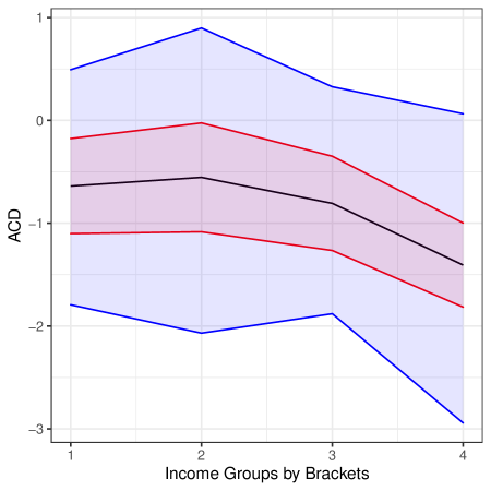
## Line Chart: ACD vs. Income Groups
### Overview
The image presents a line chart illustrating the relationship between "Income Groups by Brackets" (x-axis) and "ACD" (y-axis). Three lines are plotted, each with a shaded confidence interval. The chart appears to show how ACD values change across different income brackets.
### Components/Axes
* **X-axis:** "Income Groups by Brackets" with markers at 1, 2, 3, and 4.
* **Y-axis:** "ACD" with a scale ranging from approximately -3 to 1.
* **Line 1 (Blue):** Represents the upper bound of the data.
* **Line 2 (Black):** Represents the central tendency of the data.
* **Line 3 (Red):** Represents the lower bound of the data.
* **Shaded Regions:** Light blue for the upper bound, light red for the lower bound, and light purple for the central tendency. These represent confidence intervals around each line.
### Detailed Analysis
Let's analyze each line's trend and extract approximate data points.
* **Blue Line (Upper Bound):** This line generally slopes downward.
* At Income Group 1: Approximately 0.5
* At Income Group 2: Approximately 0.9
* At Income Group 3: Approximately 0.4
* At Income Group 4: Approximately -0.2
* **Black Line (Central Tendency):** This line exhibits a more complex pattern, initially increasing, then decreasing.
* At Income Group 1: Approximately -0.2
* At Income Group 2: Approximately 0.3
* At Income Group 3: Approximately -0.1
* At Income Group 4: Approximately -1.5
* **Red Line (Lower Bound):** This line consistently slopes downward.
* At Income Group 1: Approximately -0.8
* At Income Group 2: Approximately -0.4
* At Income Group 3: Approximately -1.2
* At Income Group 4: Approximately -2.8
The confidence intervals (shaded regions) widen as income increases, suggesting greater uncertainty in the ACD values for higher income groups.
### Key Observations
* The central tendency (black line) shows an initial increase in ACD with income, peaking around Income Group 2, then a significant decline towards Income Group 4.
* The upper and lower bounds (blue and red lines) converge towards Income Group 4, indicating a narrowing range of ACD values for the highest income bracket.
* The confidence intervals are relatively narrow for Income Group 1, suggesting more consistent ACD values for the lowest income bracket.
### Interpretation
The chart suggests a non-linear relationship between income and ACD. Initially, ACD appears to increase with income, but beyond a certain point (around Income Group 2), it decreases substantially. This could indicate a diminishing return or even a negative correlation between income and ACD for higher income groups. The widening confidence intervals for higher income groups suggest that the relationship between income and ACD becomes more variable or less predictable as income increases. The data suggests that ACD is most consistent for the lowest income bracket. The chart does not provide information on what ACD represents, but the trend suggests it is a metric that initially benefits from increased income, but then declines. Further investigation would be needed to understand the underlying reasons for this pattern.