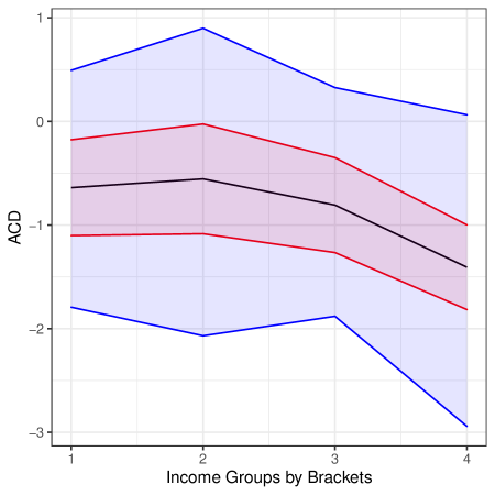
## Line Chart: ACD Values Across Income Groups by Brackets
### Overview
The chart displays three data series representing ACD (Average Call Duration) values across four income groups (labeled 1–4 on the x-axis). Each series is associated with a distinct variability level (High, Moderate, Low) as indicated by shaded regions and a legend. The y-axis ranges from -3 to 1, with negative values dominating.
### Components/Axes
- **X-axis**: "Income Groups by Brackets" (values: 1, 2, 3, 4).
- **Y-axis**: "ACD" (scale: -3 to 1, with increments of 1).
- **Legend**: Located on the right, with three entries:
- **Blue**: High Variability (shaded region spans ±0.5 around the line).
- **Red**: Moderate Variability (shaded region spans ±0.3).
- **Black**: Low Variability (shaded region spans ±0.2).
### Detailed Analysis
1. **Blue Line (High Variability)**:
- Starts at ~0.5 (x=1), peaks at 1.0 (x=2), drops to ~0.2 (x=3), and plummets to ~-2.5 (x=4).
- Shaded region widest, confirming high variability.
- Sharp decline at x=4 suggests an outlier or structural shift.
2. **Red Line (Moderate Variability)**:
- Begins at ~-0.5 (x=1), rises to 0.0 (x=2), dips to ~-0.8 (x=3), and ends at ~-1.5 (x=4).
- Shaded region narrower than blue but wider than black.
3. **Black Line (Low Variability)**:
- Relatively flat: ~-1.2 (x=1), ~-1.0 (x=2), ~-1.1 (x=3), ~-1.3 (x=4).
- Shaded region tightest, indicating minimal fluctuation.
### Key Observations
- **Blue Line Anomaly**: The abrupt drop at x=4 (-2.5) contrasts with earlier trends, potentially indicating a data outlier or external factor affecting the highest income group.
- **Inverse Relationship**: Higher income groups (x=4) correlate with lower ACD values but greater variability.
- **Stability Gradient**: Variability decreases from blue (high) to black (low), suggesting income level influences consistency in ACD.
### Interpretation
The data implies that ACD decreases as income increases, but higher-income groups exhibit less predictable behavior (higher variability). The black line’s stability across all groups may reflect a baseline metric unaffected by income. The blue line’s volatility at x=4 warrants further investigation—could this represent a systemic issue (e.g., measurement error) or a unique characteristic of the highest income bracket? The shaded regions visually reinforce the legend’s claims about variability, with blue’s wide bands aligning with its erratic trend.