\n
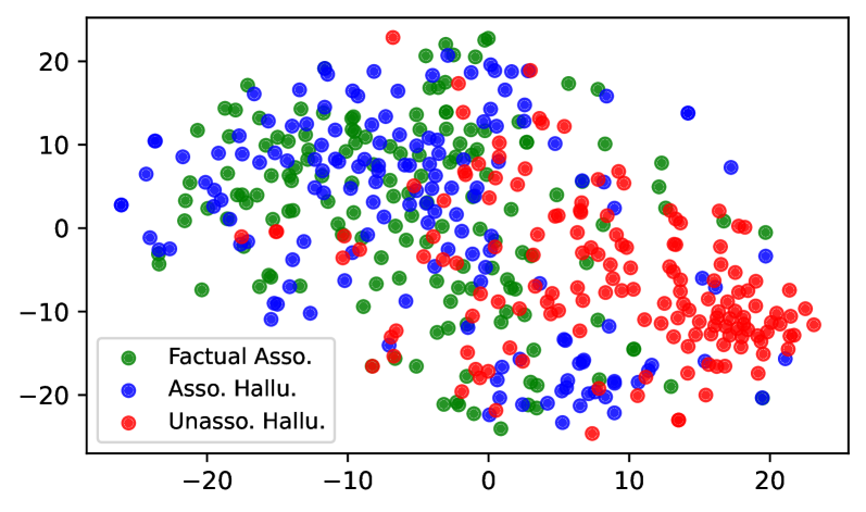
## Scatter Plot: Association Analysis
### Overview
This image presents a scatter plot visualizing the distribution of three categories of associations: "Factual Asso.", "Asso. Hallu.", and "Unasso. Hallu." The plot displays these associations based on two unspecified numerical dimensions, represented by the x and y axes. The data points are color-coded according to their category, with a legend in the bottom-left corner explaining the color scheme.
### Components/Axes
* **X-axis:** Ranges approximately from -25 to 25, with tick marks at -20, -10, 0, 10, and 20. No explicit label is provided.
* **Y-axis:** Ranges approximately from -25 to 25, with tick marks at -20, -10, 0, 10, and 20. No explicit label is provided.
* **Legend:** Located in the bottom-left corner.
* Green circles: "Factual Asso."
* Blue circles: "Asso. Hallu."
* Red circles: "Unasso. Hallu."
### Detailed Analysis
The plot contains a large number of data points for each category, distributed across the x-y plane.
* **Factual Asso. (Green):** The points are concentrated in the upper-left quadrant, with a general trend of decreasing values as the x-coordinate increases. The y-values range from approximately -5 to 22. There is a slight clustering around x = -5 and y = 15.
* **Asso. Hallu. (Blue):** These points are more widely dispersed than the "Factual Asso." points. They span the entire range of both axes, with a noticeable concentration in the lower-left quadrant and a scattering throughout the upper-right quadrant. The y-values range from approximately -22 to 12.
* **Unasso. Hallu. (Red):** The points are primarily located in the lower-right quadrant, with a strong tendency towards negative y-values. The x-values range from approximately -20 to 22, and the y-values range from approximately -20 to 5. There is a clear clustering around x = 15 and y = -10.
### Key Observations
* The "Factual Asso." points exhibit a negative correlation between the x and y values.
* The "Asso. Hallu." points show no clear correlation and are more randomly distributed.
* The "Unasso. Hallu." points are heavily concentrated in the lower-right quadrant, suggesting a strong association between high x-values and low y-values.
* There is significant overlap between the three categories, particularly in the central region of the plot.
### Interpretation
The scatter plot likely represents an analysis of associations between different variables or concepts. The three categories – "Factual Asso.", "Asso. Hallu.", and "Unasso. Hallu." – could represent different types of associations, potentially based on their strength, reliability, or origin.
* "Factual Asso." might represent associations supported by empirical evidence or established knowledge. The negative correlation suggests that as one variable increases, the other tends to decrease.
* "Asso. Hallu." could represent associations based on hallucinations or subjective experiences. The random distribution indicates a lack of consistent relationship between the variables.
* "Unasso. Hallu." might represent associations arising from hallucinations that are not related to any underlying factual basis. The concentration in the lower-right quadrant suggests a specific pattern or bias in these hallucinations.
The overlap between the categories suggests that there is ambiguity in classifying associations, and some associations may fall into multiple categories. The plot could be used to identify patterns in associations, assess the reliability of different types of associations, or explore the underlying mechanisms that generate associations. The lack of axis labels makes it difficult to determine the specific variables being analyzed, but the plot provides valuable insights into the relationships between different types of associations.