## [Area Chart Comparison]: First thoughts vs. Second thoughts
### Overview
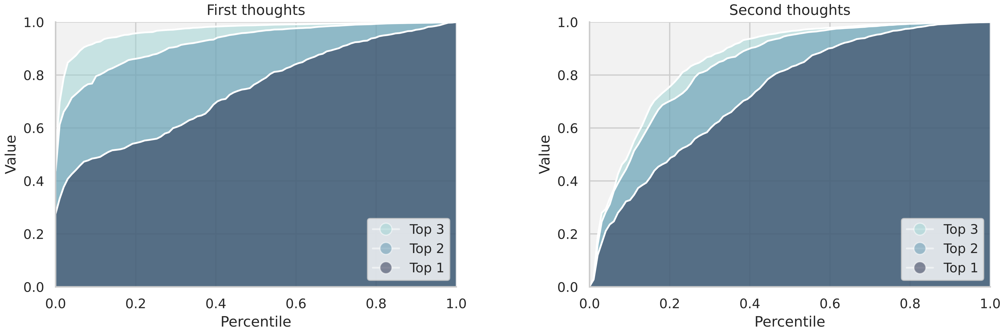
The image displays two side-by-side area charts, each plotting cumulative distributions. The left chart is titled "First thoughts" and the right chart is titled "Second thoughts." Both charts share identical axes and a three-category stacked area legend. The charts appear to compare the distribution of a "Value" metric across percentiles under two different conditions or time points.
### Components/Axes
* **Chart Titles:** "First thoughts" (left), "Second thoughts" (right).
* **X-Axis (Both Charts):** Labeled "Percentile". Scale ranges from 0.0 to 1.0, with major tick marks at 0.0, 0.2, 0.4, 0.6, 0.8, and 1.0.
* **Y-Axis (Both Charts):** Labeled "Value". Scale ranges from 0.0 to 1.0, with major tick marks at 0.0, 0.2, 0.4, 0.6, 0.8, and 1.0.
* **Legend (Both Charts):** Located in the bottom-right corner of each plot area. Contains three entries, each with a colored circle and label:
* **Top 3:** Light blue circle.
* **Top 2:** Medium blue circle.
* **Top 1:** Dark blue circle.
* **Data Series:** Each chart contains three stacked, filled areas corresponding to the legend. The areas are bounded by white lines. The stacking order from bottom to top is: Top 1 (dark blue), Top 2 (medium blue), Top 3 (light blue).
### Detailed Analysis
**Chart 1: "First thoughts" (Left)**
* **Trend Verification:** The overall shape is a concave curve that rises steeply at low percentiles and gradually flattens as it approaches the top-right corner (Percentile=1.0, Value=1.0).
* **Top 1 (Dark Blue):** This is the bottom layer. It starts at approximately (Percentile=0.0, Value=0.0). It rises steadily, showing a gentle convex curve. It reaches approximately Value=0.5 at Percentile=0.3, Value=0.8 at Percentile=0.7, and converges to Value=1.0 at Percentile=1.0.
* **Top 2 (Medium Blue):** This is the middle layer, stacked on Top 1. The combined height of Top 1 + Top 2 shows a steeper initial rise than Top 1 alone. The boundary between Top 2 and Top 3 starts at a high Value (~0.8) at very low percentiles and slowly approaches 1.0.
* **Top 3 (Light Blue):** This is the top layer. It occupies the remaining area between the Top 2 boundary and the top of the chart (Value=1.0). Its thickness is greatest at low percentiles and diminishes to near zero as the percentile increases.
**Chart 2: "Second thoughts" (Right)**
* **Trend Verification:** The overall shape is also a concave curve rising to (1.0, 1.0), but with a notably different initial trajectory compared to the first chart.
* **Top 1 (Dark Blue):** This bottom layer shows a much steeper initial ascent. It rises from (0.0, 0.0) to approximately Value=0.6 by Percentile=0.2. After this sharp initial rise, its slope decreases, and it follows a more gradual path to (1.0, 1.0).
* **Top 2 (Medium Blue):** The middle layer's boundary with Top 3 also rises steeply at first. The combined Top 1 + Top 2 area reaches near-maximum values (e.g., >0.9) at a lower percentile (around 0.4) compared to the "First thoughts" chart.
* **Top 3 (Light Blue):** This top layer is compressed into a much narrower band, especially in the mid-to-high percentile range. Its contribution is most significant only at the very lowest percentiles.
### Key Observations
1. **Shift in Distribution:** The most significant difference is the shape of the "Top 1" (dark blue) area. In "Second thoughts," it captures a much larger share of the total "Value" at lower percentiles (0.0 to 0.4) compared to "First thoughts."
2. **Convergence Speed:** The cumulative value (Top 1 + Top 2 + Top 3) approaches the maximum of 1.0 more quickly in the "Second thoughts" chart. For example, at Percentile=0.4, the total value is already above 0.9 in "Second thoughts," while it is closer to 0.7 in "First thoughts."
3. **Layer Compression:** The "Top 3" (light blue) layer is substantially thinner in "Second thoughts," indicating that the highest-ranked item(s) account for a smaller portion of the total value distribution after "second thoughts."
4. **Identical Axes and Legend:** The scales and legend are perfectly consistent between the two plots, allowing for direct visual comparison of the area shapes.
### Interpretation
These charts likely visualize the results of a ranking or selection process, comparing initial ("First thoughts") and revised ("Second thoughts") assessments. The "Value" could represent a score, probability, or resource allocation, while "Percentile" represents the ranked population.
The data suggests a consolidation of value or confidence toward the top-ranked item ("Top 1") after reconsideration. In the "First thoughts" phase, value is more distributed across the top three candidates, especially at lower percentiles. In the "Second thoughts" phase, the top candidate ("Top 1") rapidly accumulates a dominant share of the total value early in the percentile distribution, leaving less for the second and third-ranked candidates. This could model phenomena like increased decisiveness after deliberation, a "winner-takes-most" effect upon review, or the focusing of attention/resources on a primary option after initial exploration. The steep initial rise in the "Second thoughts" chart indicates that the top choice is deemed highly valuable by a large portion of the population (low percentiles) after reflection.