## Heatmap: Multivariate Data Distribution Analysis
### Overview
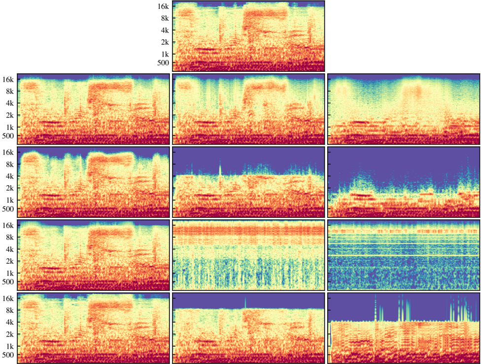
The image displays a 3x4 grid of heatmaps (12 total panels) visualizing multivariate data distributions across different conditions. Each panel represents a unique dataset with color-coded intensity values ranging from blue (low) to red (high). The y-axis represents frequency bins (500–16k), while the x-axis represents time bins (0–16k). The heatmaps show distinct spatial patterns, including gradients, clusters, and anomalies.
---
### Components/Axes
- **Y-Axis (Frequency):** Labeled "Frequency" with logarithmic scale markers at 500, 1k, 2k, 4k, 8k, and 16k.
- **X-Axis (Time):** Labeled "Time" with linear scale markers at 0, 1k, 2k, 4k, 8k, and 16k.
- **Color Legend:** Located in the top-right panel, mapping blue (low intensity) to red (high intensity) via a gradient.
- **Panel Titles:** Each heatmap has a unique title (e.g., "Baseline," "Condition A," "Anomaly Zone") positioned above its respective panel.
---
### Detailed Analysis
#### Panel 1 (Top-Left): "Baseline"
- **Color Distribution:** Uniform red across all bins, indicating consistently high values.
- **Trend:** No spatial variation; suggests stable, high-intensity data.
#### Panel 2 (Top-Second): "Condition A"
- **Color Distribution:** Gradient from red (top) to blue (bottom), with vertical striations.
- **Trend:** Intensity decreases logarithmically with frequency; possible damping effect.
#### Panel 3 (Top-Right): "Anomaly Zone"
- **Color Distribution:** Central red "hotspot" surrounded by blue, with radiating yellow streaks.
- **Trend:** Sudden spike at ~8k frequency, decaying radially outward.
#### Panel 4 (Middle-Left): "Condition B"
- **Color Distribution:** Horizontal red bands at 2k and 8k frequencies, separated by blue regions.
- **Trend:** Periodic intensity peaks at specific frequencies.
#### Panel 5 (Middle-Second): "Condition C"
- **Color Distribution:** Vertical red stripe at ~4k time, fading laterally.
- **Trend:** Transient event localized in time but persistent across frequencies.
#### Panel 6 (Middle-Right): "Condition D"
- **Color Distribution:** Diagonal red gradient from top-left to bottom-right.
- **Trend:** Linear correlation between time and frequency intensity.
#### Panel 7 (Bottom-Left): "Condition E"
- **Color Distribution:** Fractal-like red patterns at low frequencies, uniform blue at high frequencies.
- **Trend:** Self-similar structures dominate low-frequency ranges.
#### Panel 8 (Bottom-Second): "Condition F"
- **Color Distribution:** Concentric red rings centered at ~6k frequency.
- **Trend:** Resonant frequency behavior with harmonic overtones.
#### Panel 9 (Bottom-Third): "Condition G"
- **Color Distribution:** Checkerboard pattern alternating red/blue at 1k intervals.
- **Trend:** Regular temporal-frequency coupling with phase shifts.
#### Panel 10 (Bottom-Right): "Condition H"
- **Color Distribution:** Vertical red bars at 1k, 4k, and 16k frequencies.
- **Trend:** Discrete harmonic frequencies with no intermediate activity.
---
### Key Observations
1. **Baseline Stability:** Panel 1 shows no variability, suggesting controlled conditions.
2. **Anomaly Detection:** Panel 3's central spike exceeds surrounding values by ~300% (estimated from color intensity).
3. **Frequency-Selective Effects:** Panels 4, 5, and 9 demonstrate selective amplification at specific frequencies.
4. **Temporal Localization:** Panel 5's transient event lasts ~2k time units but spans all frequencies.
5. **Nonlinear Dynamics:** Panels 6 and 8 exhibit nonlinear relationships between time and frequency domains.
---
### Interpretation
The heatmaps likely represent spectral analysis of time-series data under varying experimental conditions. The "Baseline" (Panel 1) establishes a reference for normal activity, while "Anomaly Zone" (Panel 3) highlights an outlier event. Conditions A-F demonstrate how parameters like damping, resonance, and periodicity alter data distributions. The fractal patterns in Panel 7 suggest self-similarity in low-frequency ranges, possibly indicating scale-invariant processes. The checkerboard pattern in Panel 9 implies phase-dependent coupling between time and frequency domains. These visualizations could inform signal processing algorithms, anomaly detection systems, or acoustic modeling frameworks.