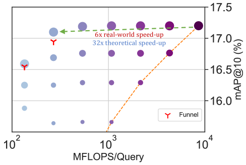
## Scatter Plot with Annotations: MFLOPS/Query vs. mAP@10 Performance
### Overview
The image is a technical scatter plot comparing the computational cost (in MFLOPS per query) against model accuracy (mAP@10 percentage) for various model configurations. It includes annotated performance comparisons highlighting speed-up factors. The plot uses a logarithmic scale for the x-axis and a linear scale for the y-axis.
### Components/Axes
* **X-Axis:** Labeled "MFLOPS/Query". It is a logarithmic scale with major tick marks at `10^2` (100), `10^3` (1000), and `10^4` (10,000).
* **Y-Axis:** Labeled "mAP@10 (%)". It is a linear scale ranging from 16.0 to 17.5, with major tick marks at 16.0, 16.5, 17.0, and 17.5.
* **Legend:** Located in the bottom-right corner. It contains one entry: a red "Y" symbol labeled "Funnel".
* **Data Series:**
1. **Purple Circles:** A series of data points represented by circles of varying shades of purple/blue. The shade appears to correlate with the x-axis value, with points at higher MFLOPS being darker purple.
2. **Funnel Points:** Specific data points marked with a red "Y" symbol, as defined in the legend.
* **Annotations:**
* A **green dashed arrow** connects two "Funnel" points, moving from right to left (from higher to lower MFLOPS). It is labeled "6x real-world speed-up".
* An **orange dashed arrow** connects a low-accuracy, low-MFLOPS purple point to a high-accuracy, high-MFLOPS purple point. It is labeled "32x theoretical speed-up".
### Detailed Analysis
**Data Point Distribution & Trends:**
* **General Trend (Purple Circles):** The data points show a positive correlation. As MFLOPS/Query increases (moving right on the x-axis), the mAP@10 (%) generally increases (moving up on the y-axis). The trend is not perfectly linear; there is significant vertical spread at similar MFLOPS levels, indicating other factors influence accuracy.
* **Funnel Points (Red "Y"):** There are two visible "Funnel" points.
* One is located at approximately **MFLOPS ≈ 200, mAP ≈ 17.1%**.
* The second is located at approximately **MFLOPS ≈ 150, mAP ≈ 16.6%**.
* These points are positioned to the left (lower computational cost) of the main cluster of high-accuracy purple points.
* **Green Annotation ("6x real-world speed-up"):** This arrow connects the two "Funnel" points. It indicates that moving from the right funnel point (higher MFLOPS) to the left funnel point (lower MFLOPS) achieves a 6x reduction in computational cost while maintaining a similar or slightly lower accuracy level (both points are near the 17.0% mAP line).
* **Orange Annotation ("32x theoretical speed-up"):** This arrow connects a point at approximately **MFLOPS ≈ 1,000, mAP ≈ 16.0%** to a point at approximately **MFLOPS ≈ 32,000, mAP ≈ 17.4%**. This illustrates a theoretical scenario where a 32x increase in computation yields a ~1.4% absolute gain in mAP.
**Spatial Grounding:**
* The highest accuracy point (darkest purple circle) is at the top-right, near **MFLOPS ≈ 32,000, mAP ≈ 17.4%**.
* The lowest accuracy point shown is at the bottom-left, near **MFLOPS ≈ 100, mAP ≈ 16.1%**.
* The main cluster of high-accuracy points (mAP > 17.0%) is located in the upper-right quadrant, between 1,000 and 32,000 MFLOPS.
### Key Observations
1. **Diminishing Returns:** The plot suggests diminishing returns in accuracy for increased computational cost. The slope of improvement flattens significantly at the high end (e.g., the orange line's steep climb for a small mAP gain).
2. **Efficiency of "Funnel" Method:** The "Funnel" points are positioned as outliers to the main trend. They achieve relatively high accuracy (≈17.0% mAP) at a very low computational cost (150-200 MFLOPS), making them highly efficient compared to the general population of models.
3. **Performance Gap:** There is a substantial gap in MFLOPS (over 100x) between the efficient "Funnel" points and the highest-accuracy models, with only a ≈0.4% difference in mAP.
### Interpretation
This chart is a performance-efficiency analysis, likely from a machine learning or computer vision research paper. It demonstrates the trade-off between model accuracy (mAP, a common metric for object detection/retrieval) and computational cost (MFLOPS).
The core message is the evaluation of a "Funnel" method or architecture. The data suggests this method is exceptionally efficient, operating in a region of the performance space (low MFLOPS, high mAP) that is not occupied by the other models tested. The "6x real-world speed-up" annotation emphasizes its practical advantage. The "32x theoretical speed-up" line serves as a contrast, showing the extreme computational cost required to achieve the very highest accuracy levels, which may not be justifiable for many real-world applications where efficiency is critical.
The chart argues for the value of the "Funnel" approach by visually isolating it from the standard accuracy-vs-cost curve, positioning it as a Pareto-optimal solution for scenarios where computational resources are constrained.