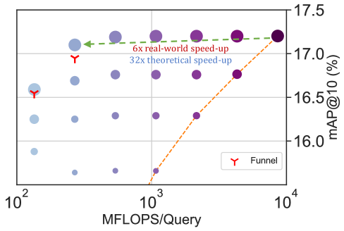
## Scatter Plot: MFLOPS/Query vs. mAP@10
### Overview
The image is a scatter plot showing the relationship between MFLOPS/Query (millions of floating-point operations per query) on the x-axis and mAP@10 (mean Average Precision at 10) on the y-axis. The plot includes data points represented by circles of varying sizes and colors, along with a dashed orange line and a dashed green line. A legend identifies a red "Y" symbol as "Funnel". The x-axis is logarithmic.
### Components/Axes
* **X-axis:** MFLOPS/Query (Millions of Floating-Point Operations per Query). Logarithmic scale with markers at 10<sup>2</sup>, 10<sup>3</sup>, and 10<sup>4</sup>.
* **Y-axis:** mAP@10 (%) (mean Average Precision at 10, in percent). Linear scale with markers at 16.0, 16.5, 17.0, and 17.5.
* **Data Points:** Circles of varying sizes and colors, ranging from light blue to dark purple. The size and color of the circles appear to represent additional dimensions of data.
* **Legend:** Located at the bottom-right of the plot. It identifies the red "Y" symbol as "Funnel".
* **Lines:** A dashed orange line slopes upwards. A dashed green line is approximately horizontal.
* **Annotations:** "6x real-world speed-up" (associated with the green dashed line) and "32x theoretical speed-up" (located below the green line).
### Detailed Analysis
* **X-Axis Values:** The x-axis is a logarithmic scale. The data points are clustered around the values 100, 1000, and 10000 MFLOPS/Query.
* **Y-Axis Values:** The y-axis represents mAP@10 (%). The data points range from approximately 15.8% to 17.4%.
* **Data Point Distribution:**
* At 10<sup>2</sup> MFLOPS/Query, the mAP@10 values range from approximately 15.8% to 16.8%. The circles are generally smaller and lighter in color.
* At 10<sup>3</sup> MFLOPS/Query, the mAP@10 values range from approximately 16.0% to 17.2%. The circles are larger and darker than those at 10<sup>2</sup>.
* At 10<sup>4</sup> MFLOPS/Query, the mAP@10 values are around 17.3% to 17.4%. The circles are the largest and darkest.
* **Dashed Orange Line:**
* The orange dashed line starts at approximately (10<sup>3</sup>, 15.8) and slopes upwards to approximately (10<sup>4</sup>, 17.3).
* Trend: The orange line shows a positive correlation between MFLOPS/Query and mAP@10.
* **Dashed Green Line:**
* The green dashed line is approximately horizontal, starting near (10<sup>2</sup>, 17.2) and extending to (10<sup>4</sup>, 17.2).
* Trend: The green line indicates a relatively constant mAP@10 value across a range of MFLOPS/Query.
* **Funnel Markers:**
* Two red "Y" symbols are present. One is located near (10<sup>2</sup>, 16.8) and the other near (10<sup>2</sup>, 16.4).
### Key Observations
* There is a general trend of increasing mAP@10 with increasing MFLOPS/Query, as indicated by the distribution of data points and the orange dashed line.
* The green dashed line suggests that a certain level of mAP@10 can be achieved and maintained even with lower MFLOPS/Query values.
* The size and color variations of the data points suggest that other factors, besides MFLOPS/Query, influence the mAP@10.
* The "Funnel" markers are located at the lower end of the MFLOPS/Query range.
### Interpretation
The plot illustrates the relationship between computational performance (MFLOPS/Query) and accuracy (mAP@10) for a particular task or system. The upward-sloping orange line suggests that increasing computational power generally leads to improved accuracy. However, the horizontal green line indicates that there may be a performance ceiling, where further increases in MFLOPS/Query do not significantly improve mAP@10.
The varying sizes and colors of the data points likely represent different configurations, algorithms, or datasets. This suggests that the relationship between MFLOPS/Query and mAP@10 is not straightforward and depends on other factors.
The "6x real-world speed-up" and "32x theoretical speed-up" annotations likely refer to the performance gains achieved by some optimization or improvement. The difference between the real-world and theoretical speed-up suggests that there are practical limitations to achieving the full potential of the optimization.
The "Funnel" markers might indicate specific data points or configurations related to a "funnel" optimization strategy, possibly highlighting a trade-off between computational cost and accuracy.