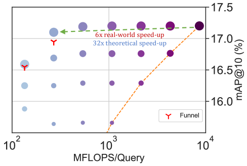
## Scatter Plot: Performance Comparison
### Overview
This image presents a scatter plot comparing the performance of a system, likely a model or algorithm, across two metrics: MFLOPS/Query (on the x-axis, logarithmic scale) and mAP@10 (%) (on the y-axis). The plot shows a general trend of increasing mAP@10 with increasing MFLOPS/Query. Two specific points are highlighted with "Funnel" labels and connected by arrows indicating performance improvements. A dashed line represents a theoretical speed-up, and a dotted line represents a real-world speed-up.
### Components/Axes
* **X-axis:** MFLOPS/Query, ranging from 10<sup>2</sup> to 10<sup>4</sup> (logarithmic scale).
* **Y-axis:** mAP@10 (%), ranging from 16.0% to 17.5%.
* **Data Points:** Numerous circular data points, varying in size and color (primarily shades of blue and purple).
* **Legend:** Located in the bottom-right corner, containing a single entry:
* "Funnel" - Represented by a red inverted triangle symbol.
* **Annotations:**
* A green arrow pointing from a lighter blue point to a darker purple point, labeled "6x real-world speed-up".
* A dashed orange line connecting several purple points, labeled "32x theoretical speed-up".
* **Gridlines:** A gray grid is present to aid in reading values.
### Detailed Analysis
The plot contains a large number of data points, making precise extraction of all values difficult. However, key points and trends can be identified:
* **Funnel Point 1 (Left):** Located at approximately MFLOPS/Query = 200, mAP@10 = 16.2%. Marked with a red inverted triangle.
* **Funnel Point 2 (Right):** Located at approximately MFLOPS/Query = 8000, mAP@10 = 17.2%. Marked with a red inverted triangle.
* **Real-World Speed-Up Line:** This line starts around MFLOPS/Query = 200, mAP@10 = 16.2% and ends around MFLOPS/Query = 8000, mAP@10 = 17.2%. The line is relatively flat initially, then slopes upward.
* **Theoretical Speed-Up Line:** This line starts around MFLOPS/Query = 800, mAP@10 = 16.0% and ends around MFLOPS/Query = 4000, mAP@10 = 17.0%. This line shows a steeper upward slope than the real-world speed-up line.
* **Data Point Distribution:** The majority of data points are clustered in the lower-left region of the plot (low MFLOPS/Query, low mAP@10). There is a sparse scattering of points towards the upper-right (high MFLOPS/Query, high mAP@10).
* **Purple Points:** A cluster of purple points generally follow the trend of the "32x theoretical speed-up" line.
* **Blue Points:** The blue points are more dispersed and generally have lower mAP@10 values compared to the purple points.
### Key Observations
* There is a positive correlation between MFLOPS/Query and mAP@10. As computational throughput increases, the model's accuracy (as measured by mAP@10) also tends to increase.
* The "Funnel" points represent a significant performance improvement, with a 6x real-world speed-up observed.
* The theoretical speed-up (32x) is considerably higher than the real-world speed-up, suggesting limitations or bottlenecks in the actual implementation.
* The purple points, which follow the theoretical speed-up line, may represent optimized configurations or algorithms.
### Interpretation
The data suggests that increasing computational resources (MFLOPS/Query) can lead to improved model performance (mAP@10). However, the discrepancy between the theoretical and real-world speed-ups indicates that there are factors limiting the efficiency of the system. These factors could include memory bandwidth, communication overhead, or algorithmic inefficiencies. The "Funnel" points highlight a specific optimization or configuration that achieves a substantial performance gain. The scatter plot demonstrates the trade-off between computational cost and accuracy, and the potential for optimization to approach the theoretical limits of performance. The clustering of points suggests that certain regions of the parameter space are more favorable than others. The difference in distribution between the blue and purple points could indicate different model architectures or training strategies.