## Line Chart: Performance Speed-Up Analysis
### Overview
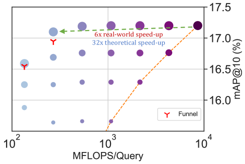
The chart compares real-world and theoretical speed-ups in computational performance, measured by MFLOPS/Query (x-axis) and mAP@10% (y-axis). Two data series are represented: a green dashed line for "6x real-world speed-up" and an orange dashed line for "32x theoretical speed-up." Purple dots labeled "Funnel" are plotted along the green line, while blue dots appear below it. Red "Y" markers highlight specific points.
### Components/Axes
- **X-axis**: "MFLOPS/Query" (log scale: 10² to 10⁴).
- **Y-axis**: "mAP@10 (%)" (linear scale: 16.0 to 17.5).
- **Legend**: Located in the bottom-right corner.
- Red "Y": "Funnel" (data points).
- Green dashed line: "6x real-world speed-up."
- Orange dashed line: "32x theoretical speed-up."
- **Annotations**:
- "6x real-world speed-up" (green dashed line).
- "32x theoretical speed-up" (orange dashed line).
### Detailed Analysis
- **X-axis markers**: 10², 10³, 10⁴.
- **Y-axis markers**: 16.0, 16.5, 17.0, 17.5.
- **Data series**:
- **Green dashed line**: Flat, indicating constant "6x real-world speed-up" across MFLOPS/Query values.
- **Orange dashed line**: Starts at ~10³ MFLOPS/Query, rising steeply to ~10⁴, showing increasing "32x theoretical speed-up."
- **Purple dots ("Funnel")**: Positioned along the green line at MFLOPS/Query values of ~10³ and ~10⁴, with mAP@10% values of ~17.0 and ~17.5.
- **Blue dots**: Located below the green line, with MFLOPS/Query values ranging from ~10² to ~10³ and mAP@10% values between ~16.0 and ~16.5.
- **Red "Y" markers**: Highlight specific points on the green line (e.g., ~10³ MFLOPS/Query, ~17.0 mAP@10%) and below it (e.g., ~10² MFLOPS/Query, ~16.0 mAP@10%).
### Key Observations
1. The green line ("6x real-world speed-up") remains flat, suggesting consistent performance across MFLOPS/Query.
2. The orange line ("32x theoretical speed-up") shows a sharp upward trend, indicating higher theoretical gains at higher MFLOPS/Query.
3. "Funnel" points (purple dots) align with the green line, implying these represent optimal real-world performance.
4. Blue dots (lower mAP@10%) may represent suboptimal or alternative configurations.
5. Red "Y" markers emphasize critical data points, possibly thresholds or benchmarks.
### Interpretation
The chart highlights a disparity between real-world and theoretical performance. The "6x real-world speed-up" (green line) is stable, while the "32x theoretical speed-up" (orange line) suggests significant potential for improvement at higher computational loads. The "Funnel" points on the green line may indicate scenarios where real-world performance matches theoretical expectations, possibly due to optimized configurations. The blue dots below the green line could represent less efficient setups or edge cases. The red "Y" markers likely denote key evaluation points, such as baseline performance or target thresholds. This analysis underscores the gap between theoretical models and practical implementation, emphasizing the need for further optimization to bridge this gap.