\n
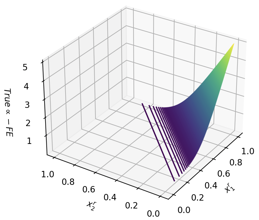
## 3D Surface Plot: True α - FE
### Overview
The image depicts a 3D surface plot, representing a function of two variables, x₁ and x₂. The z-axis represents the value of "True α - FE". The surface exhibits a curved shape, transitioning from darker purple/blue tones at lower values to lighter green/yellow tones at higher values. There are vertical lines visible within the plot, appearing as dark streaks.
### Components/Axes
* **X-axis:** Labeled "x₁", ranging from approximately 0.0 to 1.0, with markers at 0.2, 0.4, 0.6, 0.8, and 1.0.
* **Y-axis:** Labeled "x₂", ranging from approximately 0.0 to 1.0, with markers at 0.2, 0.4, 0.6, 0.8, and 1.0.
* **Z-axis:** Labeled "True α - FE", ranging from approximately 0.0 to 5.0, with markers at 1.0, 2.0, 3.0, 4.0, and 5.0.
* **Surface:** The main visual element, displaying the function's output as a colored surface. The color gradient transitions from dark purple (low values) to light green/yellow (high values).
* **Vertical Lines:** Dark vertical lines are present throughout the plot, seemingly representing specific values or slices of the function.
### Detailed Analysis
The surface generally slopes upwards as both x₁ and x₂ increase. The lowest values of "True α - FE" (around 0-1) are concentrated near the origin (x₁ ≈ 0, x₂ ≈ 0). As x₁ and x₂ approach 1.0, the value of "True α - FE" increases significantly, reaching values up to approximately 5.0.
The vertical lines appear to be concentrated in the region where x₁ is relatively small (approximately 0.0 to 0.4) and x₂ varies between 0.0 and 1.0. These lines suggest a potential discontinuity or specific feature of the function within that region.
It is difficult to extract precise numerical values from the plot without knowing the exact function being represented. However, we can approximate some points:
* At x₁ = 0.0, x₂ = 0.0, "True α - FE" ≈ 0.5
* At x₁ = 1.0, x₂ = 0.0, "True α - FE" ≈ 3.5
* At x₁ = 0.0, x₂ = 1.0, "True α - FE" ≈ 3.0
* At x₁ = 1.0, x₂ = 1.0, "True α - FE" ≈ 5.0
### Key Observations
* The function is non-linear, exhibiting a curved surface.
* The value of "True α - FE" increases with increasing values of x₁ and x₂.
* The vertical lines suggest a potential feature or discontinuity in the function, particularly when x₁ is small.
* The color gradient provides a visual representation of the function's output, with darker colors indicating lower values and lighter colors indicating higher values.
### Interpretation
This plot likely represents the relationship between two input variables (x₁ and x₂) and a calculated value ("True α - FE"). The vertical lines could represent a set of constant values for x₁, showing how "True α - FE" changes with x₂ for those specific x₁ values. The increasing trend suggests a positive correlation between the input variables and the output value.
The "True α - FE" label suggests this might be related to a statistical model or a correction factor. "FE" could stand for "Fixed Effects" in a statistical context, and "True α" might represent the true parameter value being estimated. The plot could be visualizing the bias or error introduced by a fixed effects model, showing how it deviates from the true parameter value as a function of the input variables.
Without further context, it's difficult to determine the exact meaning of the plot. However, the visualization suggests a complex relationship between the variables, with potential non-linearities and specific features that warrant further investigation.