## Horizontal Bar Chart: R1-Qwen | GK23EN
### Overview
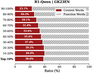
The chart compares the distribution of **Content Words** (red) and **Function Words** (gray) across different frequency ranges (90-100% to Top-10%). Each bar represents the percentage ratio of these word types within specific frequency brackets. The x-axis shows the ratio (%), while the y-axis lists frequency ranges in descending order.
### Components/Axes
- **X-Axis**: Ratio (%) from 0 to 100, labeled "Ratio (%)".
- **Y-Axis**: Frequency ranges (90-100%, 80-90%, ..., Top-10%), ordered from highest to lowest frequency.
- **Legend**: Located in the top-right corner, with red representing **Content Words** and gray representing **Function Words**.
- **Bars**: Horizontal bars for each category, with red bars (Content Words) consistently shorter than gray bars (Function Words) in all frequency ranges.
### Detailed Analysis
- **Content Words (Red)**:
- **90-100%**: 23.1%
- **80-90%**: 26.2%
- **70-80%**: 29.1%
- **60-70%**: 31.6%
- **50-60%**: 33.6%
- **40-50%**: 35.6%
- **30-40%**: 37.4%
- **20-30%**: 39.2%
- **10-20%**: 40.0%
- **Top-10%**: 38.6%
- **Function Words (Gray)**:
- Calculated as 100% minus Content Words for each category (e.g., 90-100%: 76.9%, 80-90%: 73.8%, etc.).
### Key Observations
1. **Content Words** peak at **40.0%** in the **10-20%** frequency range, then slightly decrease to **38.6%** in the **Top-10%** range.
2. **Function Words** dominate in the **Top-10%** range (**61.4%**) and decrease progressively as frequency increases.
3. The **20-30%** and **10-20%** ranges show the highest proportions of Content Words, while the **90-100%** range has the lowest (**23.1%**).
### Interpretation
The data suggests that **Function Words** (e.g., prepositions, conjunctions) are more prevalent in high-frequency terms (Top-10%), while **Content Words** (e.g., nouns, verbs) dominate in mid-frequency ranges (20-30% and 10-20%). This aligns with linguistic patterns where function words are often the most frequent in corpora, but content words become more prominent in less frequent terms. The slight dip in Content Words in the **Top-10%** range may indicate a focus on function words in the most common terms, possibly due to grammatical or structural roles. The chart highlights a trade-off between word frequency and semantic content, with function words dominating high-frequency tiers.