## Pie Chart: Distribution of Majors in a Graduate Survey
### Overview
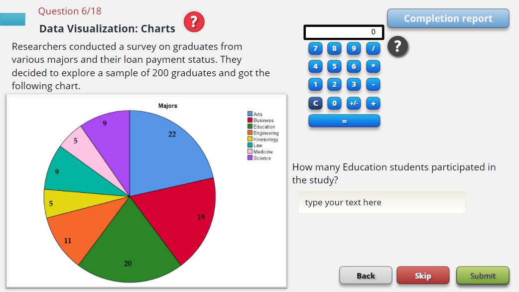
This image is a screenshot of an online quiz or test interface. The central element is a pie chart titled "Majors," which displays the distribution of academic majors among a sample of 200 graduates surveyed about their loan payment status. The interface includes a question, a calculator widget, and navigation buttons.
### Components/Axes
* **Chart Type:** Pie Chart.
* **Chart Title:** "Majors" (positioned above the chart).
* **Legend:** Located to the right of the pie chart. It lists 8 categories with corresponding color swatches.
* **Data Labels:** Numerical values are placed directly on each pie slice.
* **Surrounding Interface Elements:**
* **Header:** "Question 6/18" and "Data Visualization: Charts" with a red question mark icon.
* **Descriptive Text:** "Researchers conducted a survey on graduates from various majors and their loan payment status. They decided to explore a sample of 200 graduates and got the following chart."
* **Question Panel (Right Side):** Contains a calculator widget and the question: "How many Education students participated in the study?" with a text input field.
* **Navigation Buttons (Bottom):** "Back", "Skip", "Submit".
* **Top Right Button:** "Completion report".
### Detailed Analysis
**Pie Chart Data Extraction:**
The chart is divided into 8 slices. The legend and slice colors are matched below. The numerical value on each slice is transcribed. The sum of all values is 100.
| Legend Label | Color (from legend swatch) | Slice Color (Visual Match) | Value on Slice |
| :--- | :--- | :--- | :--- |
| Arts | Blue | Blue (largest slice, top-right) | 22 |
| Business | Red | Red (bottom-right) | 19 |
| Education | Green | Green (bottom-center) | 20 |
| Engineering | Orange | Orange (bottom-left) | 11 |
| Kinesiology | Yellow | Yellow (left) | 5 |
| Law | Teal | Teal (left) | 9 |
| Medicine | Pink | Pink (top-left) | 5 |
| Science | Purple | Purple (top-left) | 9 |
**Spatial & Trend Verification:**
* The slices are arranged clockwise from the top-right: Arts (22, blue), Business (19, red), Education (20, green), Engineering (11, orange), Kinesiology (5, yellow), Law (9, teal), Medicine (5, pink), Science (9, purple).
* The visual size of each slice corresponds to its numerical value (e.g., the blue "Arts" slice at 22 is the largest, the yellow "Kinesiology" and pink "Medicine" slices at 5 are the smallest).
**Calculator Widget:**
* A standard calculator interface with a display showing "0".
* Buttons for digits 0-9, operators (+, -, *, /), a decimal point (.), clear (C), and equals (=).
### Key Observations
1. **Data Sum:** The values on the pie chart sum to 100 (22+19+20+11+5+9+5+9 = 100). Given the stated sample size of 200 graduates, these numbers most likely represent **percentages**, not raw counts.
2. **Largest and Smallest Groups:** "Arts" (22%) and "Education" (20%) are the two largest groups. "Kinesiology" and "Medicine" are tied as the smallest groups at 5% each.
3. **Interface Context:** The image is part of an interactive assessment. The user is prompted to calculate and input the number of "Education" students.
### Interpretation
The pie chart provides a categorical breakdown of the survey sample's academic background. The primary information is the proportional representation of each major.
* **Answering the Embedded Question:** The question asks for the number of Education students. Since the chart value for Education is 20 and the total sample is 200, the calculation is: 20% of 200 = (20/100) * 200 = **40 students**. This is the likely expected answer for the text input field.
* **Data Implication:** The distribution shows a concentration in Arts, Business, and Education majors, which together account for 61% of the sample. This composition is crucial context for the study's findings on loan payment status, as debt levels and repayment patterns can vary significantly by field of study.
* **Anomaly/Note:** The chart uses whole numbers that sum to 100, strongly implying percentages. However, the chart itself lacks a "%" symbol on the labels or a note clarifying this, which could be a point of confusion for a test-taker. The calculator widget suggests that numerical computation based on the chart data is a required part of the assessment.