## Pie Chart: Distribution of Graduate Majors
### Overview
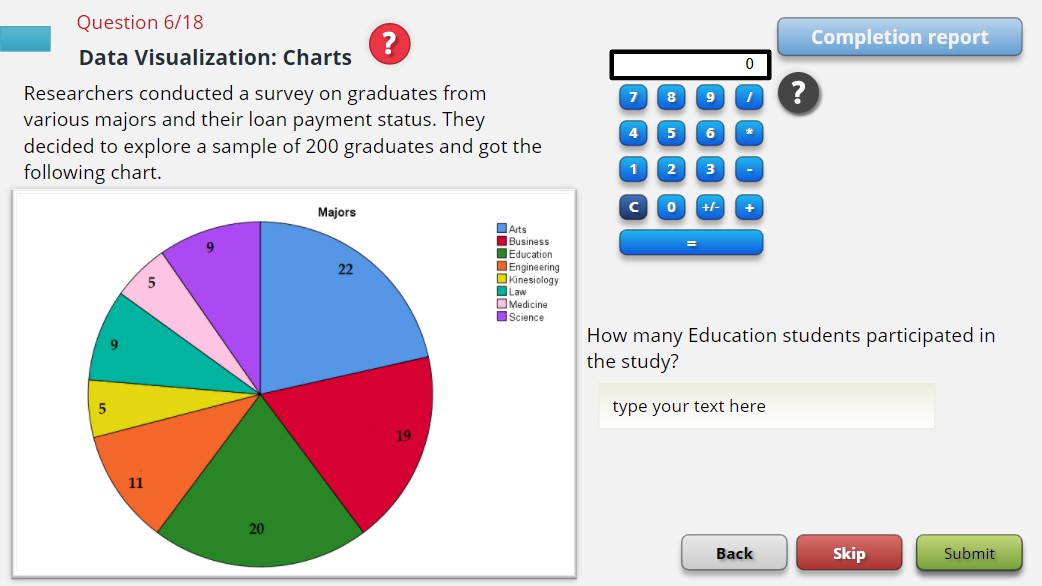
The image displays a pie chart titled "Majors" representing the distribution of 200 surveyed graduates across various academic disciplines. The chart includes a legend on the right, numerical labels for each segment, and a question asking for the number of Education students in the study. A calculator and navigation buttons (Back, Skip, Submit) are visible in the interface.
### Components/Axes
- **Legend**:
- Arts (blue)
- Business (red)
- Education (green)
- Engineering (orange)
- Kinesiology (yellow)
- Law (teal)
- Medicine (pink)
- Science (purple)
- **Pie Chart Segments**:
- Arts: 22
- Business: 19
- Education: 20
- Engineering: 11
- Kinesiology: 5
- Law: 9
- Medicine: 5
- Science: 9
- **Question Text**: "How many Education students participated in the study?"
- **Answer Input**: Empty text box labeled "type your text here"
### Detailed Analysis
- **Segment Values**:
- Arts (blue): 22
- Business (red): 19
- Education (green): 20
- Engineering (orange): 11
- Kinesiology (yellow): 5
- Law (teal): 9
- Medicine (pink): 5
- Science (purple): 9
- **Total Chart Sum**: 100 (sum of all segment values)
- **Sample Size Mentioned**: 200 graduates (text states "sample of 200 graduates")
### Key Observations
1. **Discrepancy in Totals**: The pie chart sums to 100, while the text explicitly states a sample size of 200 graduates. This suggests either:
- The chart represents percentages (e.g., 22% of 200 = 44, but labeled as 22).
- A miscalculation or mislabeling in the chart's numerical values.
2. **Largest Segment**: Arts (22) is the most represented major.
3. **Second-Largest Segment**: Education (20) follows closely.
4. **Smallest Segments**: Kinesiology (5) and Medicine (5) are the least represented.
### Interpretation
The data suggests Arts is the most common major among the surveyed graduates, followed by Education and Business. The low representation of Kinesiology and Medicine indicates these fields are less prevalent. The mismatch between the chart's total (100) and the stated sample size (200) raises questions about data accuracy or representation (e.g., percentages vs. absolute counts). The answer to the question "How many Education students participated?" is explicitly labeled as **20** in the chart, despite the total inconsistency.