## Scatter Plot: Accuracy vs. Time-to-Answer for Different Methods and k-values
### Overview
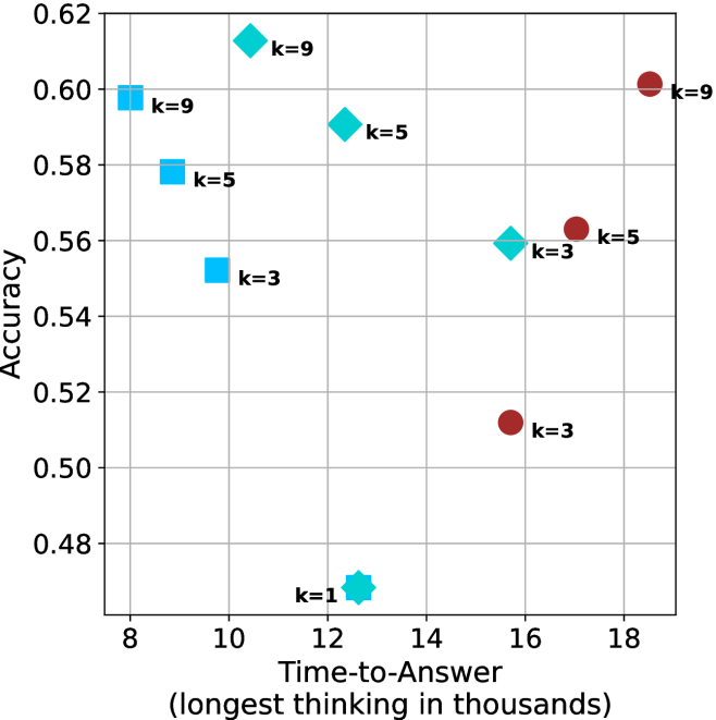
This image is a scatter plot comparing the performance of three distinct methods (differentiated by shape and color) across varying values of a parameter `k`. The plot visualizes the trade-off between prediction accuracy and computational time (measured as "Time-to-Answer" in thousands of units). Each data point is annotated with its corresponding `k` value.
### Components/Axes
* **Y-Axis:** Labeled **"Accuracy"**. The scale ranges from 0.48 to 0.62, with major gridlines at intervals of 0.02.
* **X-Axis:** Labeled **"Time-to-Answer (longest thinking in thousands)"**. The scale ranges from 8 to 18, with major gridlines at intervals of 2.
* **Data Series (Implicit Legend):** Three distinct series are represented by different shapes and colors:
1. **Cyan Squares:** One method.
2. **Cyan Diamonds:** A second method.
3. **Brown Circles:** A third method.
* **Annotations:** Each data point is labeled with text indicating the `k` value used for that run (e.g., "k=9").
### Detailed Analysis
**Data Points (Approximate Coordinates: Time-to-Answer, Accuracy):**
* **Cyan Squares Series:**
* `k=9`: (8.0, 0.60)
* `k=5`: (9.0, 0.58)
* `k=3`: (10.0, 0.55)
* **Trend:** As `k` increases, Accuracy increases while Time-to-Answer decreases.
* **Cyan Diamonds Series:**
* `k=9`: (10.5, 0.61)
* `k=5`: (12.0, 0.59)
* `k=3`: (15.5, 0.56)
* **Trend:** As `k` increases, Accuracy increases while Time-to-Answer decreases.
* **Brown Circles Series:**
* `k=9`: (18.5, 0.60)
* `k=5`: (17.0, 0.56)
* `k=3`: (15.5, 0.51)
* `k=1`: (12.5, 0.47)
* **Trend:** As `k` increases, both Accuracy and Time-to-Answer increase.
### Key Observations
1. **Inverse vs. Direct Relationship:** The two cyan series (Squares and Diamonds) show an **inverse relationship** between `k` and Time-to-Answer. In contrast, the brown Circles series shows a **direct relationship** where higher `k` leads to both higher accuracy and longer computation time.
2. **Performance Frontier:** The Cyan Diamond at `k=9` (10.5, 0.61) and the Cyan Square at `k=9` (8.0, 0.60) represent the highest accuracy points for their respective series and are achieved with relatively low Time-to-Answer. The Brown Circle at `k=9` achieves similar accuracy (0.60) but requires the highest Time-to-Answer (18.5).
3. **Lowest Performance Point:** The Brown Circle at `k=1` (12.5, 0.47) has the lowest accuracy on the chart.
4. **Convergence at High k:** For `k=9`, all three methods achieve high accuracy (0.60-0.61), but with vastly different time costs (8.0 to 18.5).
5. **Overlap Point:** At approximately (15.5, 0.56), a Cyan Diamond (`k=3`) and a Brown Circle (`k=5`) have nearly identical performance coordinates despite different `k` values and methods.
### Interpretation
This chart likely compares different algorithms or model configurations (the three shapes) where `k` is a key hyperparameter (e.g., number of neighbors, ensemble size, or search depth).
* **The cyan methods (Squares and Diamonds) appear to be more efficient.** They achieve their peak accuracy at lower `k` values, which, counter-intuitively for these series, also corresponds to *faster* computation times. This suggests these methods might have an optimization where increasing `k` prunes the search space or improves efficiency, leading to both better and faster results. The Diamond method generally offers a slightly better accuracy-time trade-off than the Square method for the same `k`.
* **The brown method (Circles) follows a more traditional, brute-force-like scaling pattern.** Increasing `k` improves accuracy but at a direct and significant cost in computation time. It is the least efficient method for achieving high accuracy.
* **The key takeaway is the stark difference in scaling behavior.** The choice of method fundamentally changes how the `k` parameter affects performance. For applications where speed is critical, the cyan methods (particularly Diamonds) are superior. If maximum accuracy is the only goal and time is secondary, the brown method at high `k` is competitive but inefficient. The overlap point demonstrates that different method/`k` combinations can yield equivalent performance, highlighting the importance of this type of analysis for model selection.