## Heatmap: Number of Feedback Repairs vs Number of Initial Programs
### Overview
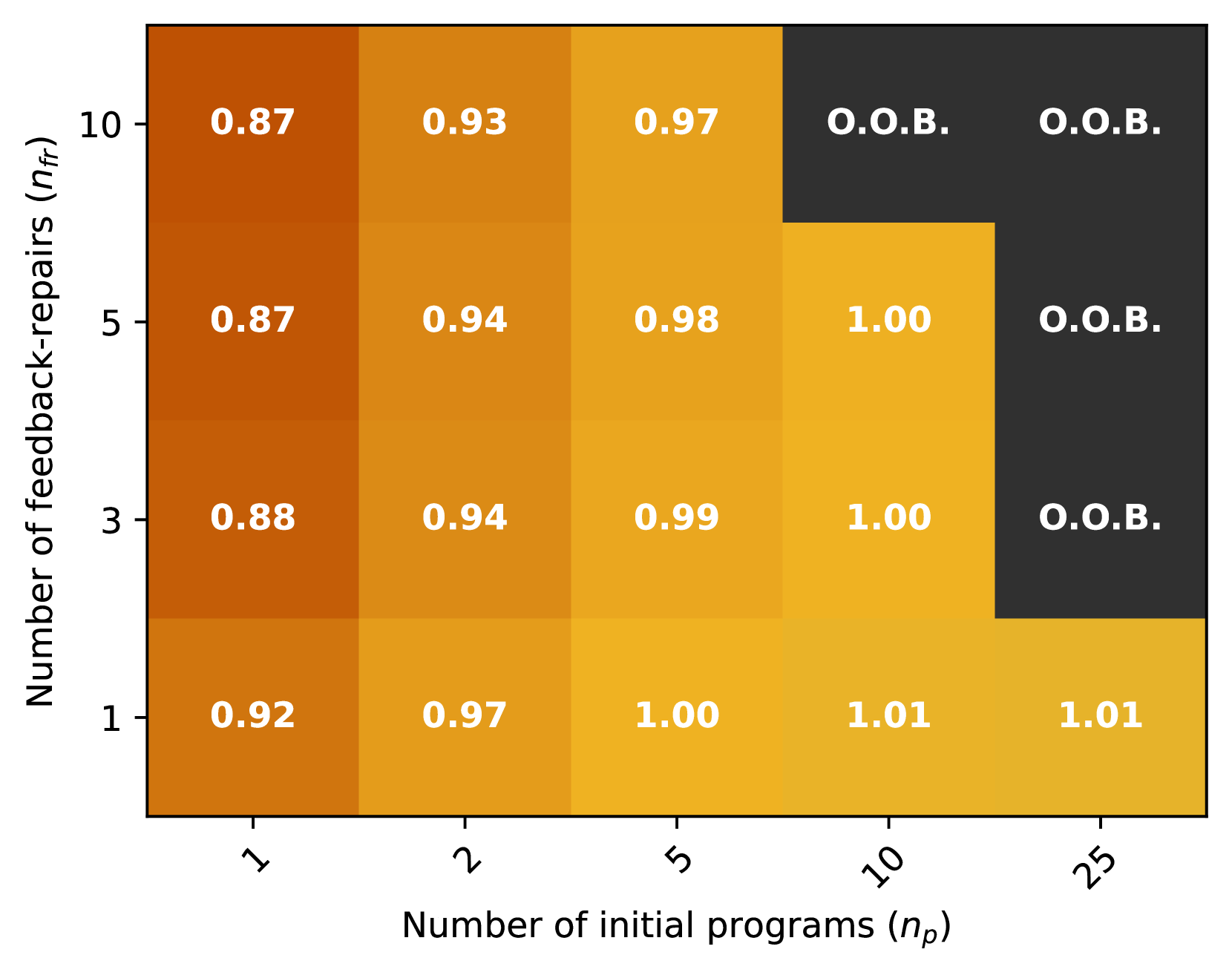
The heatmap illustrates the relationship between the number of initial programs (n_p) and the number of feedback repairs (n_f). The color gradient represents the frequency of feedback repairs, with darker shades indicating higher frequencies.
### Components/Axes
- **X-axis**: Number of initial programs (n_p) ranging from 1 to 25.
- **Y-axis**: Number of feedback repairs (n_f) ranging from 1 to 10.
- **Legend**: The legend indicates the color coding for feedback repair frequencies, with darker shades representing higher frequencies.
### Detailed Analysis or ### Content Details
The heatmap shows a clear trend where the number of feedback repairs increases with the number of initial programs. The highest frequency of feedback repairs is observed when there are 10 initial programs, with a frequency of 1.00. As the number of initial programs increases, the frequency of feedback repairs also increases, peaking at 25 initial programs with a frequency of 1.01.
### Key Observations
- The highest frequency of feedback repairs is observed when there are 10 initial programs.
- The frequency of feedback repairs increases with the number of initial programs.
- There is a slight increase in the frequency of feedback repairs as the number of initial programs increases beyond 10.
### Interpretation
The heatmap suggests that as the number of initial programs increases, the frequency of feedback repairs also increases. This could indicate that more initial programs may require more feedback repairs. The slight increase in frequency beyond 10 initial programs could suggest that there is a threshold beyond which the number of feedback repairs does not significantly increase. The interpretation of this data would depend on the specific context and goals of the study.