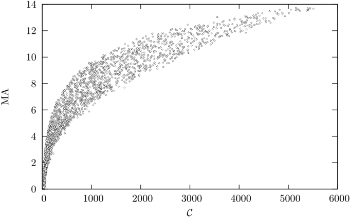
## Scatter Plot: Relationship between C and MA
### Overview
The image is a scatter plot displaying a large dataset of individual data points, each represented by a small, hollow circle. The plot illustrates the relationship between two variables, labeled "C" on the horizontal axis and "MA" on the vertical axis. The data shows a clear, non-linear, positive correlation where MA increases with C, but the rate of increase slows as C becomes larger.
### Components/Axes
* **Chart Type:** Scatter Plot.
* **X-Axis (Horizontal):**
* **Label:** "C" (centered below the axis).
* **Scale:** Linear scale.
* **Range:** 0 to 6000.
* **Major Tick Marks:** At intervals of 1000 (0, 1000, 2000, 3000, 4000, 5000, 6000).
* **Y-Axis (Vertical):**
* **Label:** "MA" (centered to the left of the axis, rotated 90 degrees).
* **Scale:** Linear scale.
* **Range:** 0 to 14.
* **Major Tick Marks:** At intervals of 2 (0, 2, 4, 6, 8, 10, 12, 14).
* **Data Series:** A single series of data points. All points are visually identical (small, gray, hollow circles). There is no legend, as only one data category is present.
* **Spatial Layout:** The plot area is bounded by a rectangular frame. The axes are positioned at the bottom and left edges. The data cloud originates near the coordinate (0,0) and extends towards the top-right corner of the plot area.
### Detailed Analysis
* **Data Distribution & Trend:**
* **Trend Verification:** The overall data cloud forms a concave-down curve. It begins with a very steep, near-vertical ascent from the origin (0,0) and gradually transitions to a much shallower, almost horizontal slope as it approaches the right side of the graph.
* **Point Density:** The data points are extremely dense in the region where C is between 0 and approximately 1000, forming a thick, dark band. As C increases beyond 1000, the points become progressively more scattered and sparse, though they still follow the clear curved trend.
* **Approximate Value Ranges:**
* At C ≈ 0, MA ≈ 0.
* At C ≈ 1000, MA values range approximately from 6 to 9, with the central tendency around 7.5.
* At C ≈ 3000, MA values range approximately from 10 to 12.
* At C ≈ 5000, MA values are clustered between approximately 12.5 and 14.
* **Spread/Variance:** The vertical spread (variance in MA for a given C) appears relatively consistent in absolute terms across the range of C, but becomes more noticeable visually at higher C values due to the lower point density.
### Key Observations
1. **Strong Non-Linear Correlation:** There is an unambiguous, strong positive relationship between C and MA. The relationship is not linear; it exhibits clear diminishing returns.
2. **Saturation Behavior:** The curve suggests a saturation effect. As the independent variable C increases, the dependent variable MA continues to increase but approaches what appears to be an asymptotic limit near MA = 14.
3. **High Initial Sensitivity:** The steepest part of the curve is at very low C values (C < 500), indicating that MA is highly sensitive to changes in C when C is small.
4. **Absence of Outliers:** The data points form a cohesive cloud with no obvious outliers far from the main trend. All points adhere closely to the implied curve.
5. **Language:** All text in the image (axis labels "C" and "MA") is in English.
### Interpretation
This scatter plot demonstrates a classic **diminishing returns** or **saturation kinetics** relationship. The variable "MA" is dependent on "C", but its growth is constrained as "C" increases.
* **What the data suggests:** The pattern is characteristic of many natural and engineered systems. For example:
* In **chemistry/enzymology**, this could resemble a Michaelis-Menten plot where reaction rate (MA) increases with substrate concentration (C) until enzyme active sites are saturated.
* In **economics**, it could model production output (MA) versus capital investment (C), where initial investments yield high returns, but later investments add less incremental value.
* In **machine learning**, it might show model accuracy (MA) versus training dataset size (C), where more data helps a lot initially, but gains plateau.
* **How elements relate:** The independent variable "C" drives the increase in "MA". The system's capacity to translate increases in C into increases in MA is finite, leading to the observed plateau. The high density of points at low C suggests that the process or phenomenon being measured is most frequently observed or operates in that lower range.
* **Notable Anomalies:** There are no anomalies. The data is remarkably consistent with the theoretical curve it implies. The lack of scatter at very low C and the uniform spread at higher C suggest a stable, well-characterized process with inherent, consistent variability.
**In summary, the image provides a clear visual fact: the relationship between C and MA is positive, non-linear, and saturating. The precise mathematical function (e.g., logarithmic, square root, hyperbolic) cannot be determined without the raw data, but the qualitative behavior is unequivocally demonstrated.**