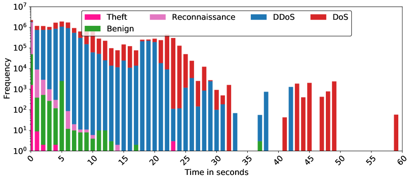
# Technical Document Analysis of Bar Chart
## Axis Labels and Scale
- **X-Axis**: "Time in seconds" (linear scale, 0 to 60 seconds)
- **Y-Axis**: "Frequency" (logarithmic scale, 10⁰ to 10⁷)
## Legend
- **Location**: Top-right corner of the chart
- **Categories and Colors**:
- **Theft**: Pink
- **Reconnaissance**: Purple
- **DDoS**: Blue
- **DoS**: Red
- **Benign**: Green
## Key Trends and Data Points
1. **DDoS (Blue)**:
- **Trend**: Dominates early time intervals (0–20 seconds), with frequencies consistently above 10⁵. Gradual decline observed after 20 seconds.
- **Peak**: Highest frequency (~10⁶) at 0–5 seconds.
- **Notable**: Remains the largest contributor across most time intervals.
2. **DoS (Red)**:
- **Trend**: Minimal presence before 20 seconds. Sharp increase post-20 seconds, peaking at ~10⁵ between 40–50 seconds.
- **Peak**: Highest frequency (~10⁵) at 45–50 seconds.
- **Notable**: Overtakes DDoS in frequency after 30 seconds.
3. **Theft (Pink)**:
- **Trend**: Sporadic small spikes (10⁰–10³) primarily between 0–15 seconds.
- **Peak**: Max frequency (~10²) at 10 seconds.
- **Notable**: Rarely exceeds 10³.
4. **Reconnaissance (Purple)**:
- **Trend**: Similar to Theft, with minor spikes (10⁰–10³) between 0–15 seconds.
- **Peak**: Max frequency (~10²) at 5 seconds.
- **Notable**: Disappears entirely after 20 seconds.
5. **Benign (Green)**:
- **Trend**: Moderate presence (10¹–10⁴) across all intervals, with occasional spikes.
- **Peak**: Max frequency (~10⁴) at 5 seconds.
- **Notable**: Persistent but never dominant.
## Spatial Grounding and Validation
- **Legend Colors Match Data**:
- Blue (DDoS) aligns with tallest bars in early intervals.
- Red (DoS) corresponds to later tall bars (40–50 seconds).
- Pink/Purple (Theft/Reconnaissance) match small segments in early bars.
- Green (Benign) appears as mid-sized segments throughout.
## Component Isolation
- **Main Chart**: Bar segments stacked vertically, with colors representing categories.
- **Legend**: Independent of chart, positioned for clarity.
- **No Footer/Additional Text**: Chart focuses solely on frequency vs. time.
## Conclusion
The chart illustrates a time-series frequency distribution of network events. DDoS and DoS dominate, with DDoS peaking early and DoS later. Theft and Reconnaissance are rare, while Benign activity is persistent but secondary.