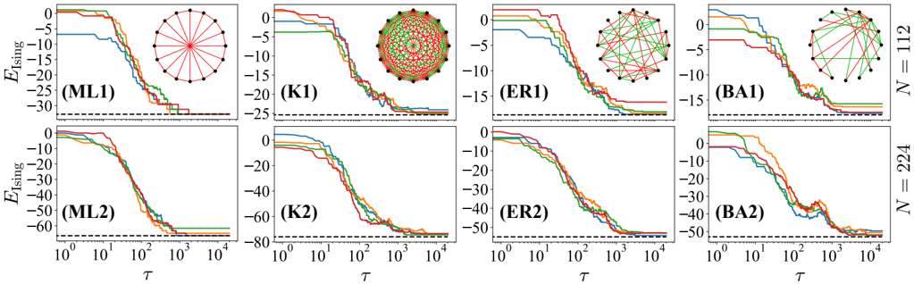
## Chart: Energy vs. Time for Different Network Models
### Overview
The image presents a series of eight line charts, arranged in a 2x4 grid. Each chart depicts the evolution of "E_ising" (energy) over time (τ) for different network models and network sizes (N). Each chart also includes a small circular diagram representing the network structure. The charts are labeled ML1, K1, ER1, BA1, ML2, K2, ER2, and BA2.
### Components/Axes
* **Y-axis:** Labeled "E_ising", ranging from approximately -35 to 0 in the top row and -60 to 0 in the bottom row. The scale is linear.
* **X-axis:** Labeled "τ" (tau), representing time. The scale is logarithmic, spanning from 10⁰ to 10⁴.
* **Legends:** Each chart contains four colored lines, representing different initial conditions or realizations of the model. The colors are:
* Blue
* Green
* Red
* Orange
* **Network Diagrams:** Small circular diagrams are positioned above each line chart, visually representing the network structure for each model.
* **Labels:** Each chart is labeled with a unique identifier (ML1, K1, ER1, BA1, ML2, K2, ER2, BA2).
* **N values:** The rightmost column of charts is labeled "N = 12" and "N = 224", indicating the network size.
* **Horizontal dashed line:** A horizontal dashed line is present in each chart at approximately y = -25 in the top row and y = -50 in the bottom row.
### Detailed Analysis or Content Details
**ML1 (N=12):**
* The blue line starts at approximately 0 and decreases rapidly to around -30, then plateaus.
* The green line starts at approximately 0 and decreases to around -25, then plateaus.
* The red line starts at approximately 0 and decreases to around -20, then plateaus.
* The orange line starts at approximately 0 and decreases to around -15, then plateaus.
**K1 (N=12):**
* The blue line starts at approximately 0 and decreases to around -15, then plateaus.
* The green line starts at approximately 0 and decreases to around -20, then plateaus.
* The red line starts at approximately 0 and decreases to around -25, then plateaus.
* The orange line starts at approximately 0 and decreases to around -20, then plateaus.
**ER1 (N=12):**
* The blue line starts at approximately 0 and decreases to around -10, then plateaus.
* The green line starts at approximately 0 and decreases to around -15, then plateaus.
* The red line starts at approximately 0 and decreases to around -20, then plateaus.
* The orange line starts at approximately 0 and decreases to around -15, then plateaus.
**BA1 (N=12):**
* The blue line starts at approximately 0 and decreases to around -10, then plateaus.
* The green line starts at approximately 0 and decreases to around -15, then plateaus.
* The red line starts at approximately 0 and decreases to around -20, then plateaus.
* The orange line starts at approximately 0 and decreases to around -15, then plateaus.
**ML2 (N=224):**
* The blue line starts at approximately 0 and decreases to around -30, then plateaus.
* The green line starts at approximately 0 and decreases to around -40, then plateaus.
* The red line starts at approximately 0 and decreases to around -45, then plateaus.
* The orange line starts at approximately 0 and decreases to around -35, then plateaus.
**K2 (N=224):**
* The blue line starts at approximately 0 and decreases to around -20, then plateaus.
* The green line starts at approximately 0 and decreases to around -40, then plateaus.
* The red line starts at approximately 0 and decreases to around -60, then plateaus.
* The orange line starts at approximately 0 and decreases to around -50, then plateaus.
**ER2 (N=224):**
* The blue line starts at approximately 0 and decreases to around -10, then plateaus.
* The green line starts at approximately 0 and decreases to around -20, then plateaus.
* The red line starts at approximately 0 and decreases to around -40, then plateaus.
* The orange line starts at approximately 0 and decreases to around -30, then plateaus.
**BA2 (N=224):**
* The blue line starts at approximately 0 and decreases to around -10, then plateaus.
* The green line starts at approximately 0 and decreases to around -20, then plateaus.
* The red line starts at approximately 0 and decreases to around -40, then plateaus.
* The orange line starts at approximately 0 and decreases to around -30, then plateaus.
### Key Observations
* All charts show a decrease in E_ising over time, indicating the system is reaching a lower energy state.
* The rate of energy decrease varies between models and initial conditions.
* Larger network sizes (N=224) generally exhibit lower final energy values compared to smaller networks (N=12).
* The orange lines consistently reach the lowest energy levels in most charts.
* The horizontal dashed lines appear to represent a baseline or threshold energy level.
### Interpretation
The charts demonstrate the energy dynamics of different network models (ML, K, ER, BA) as a function of time. The models likely represent different network generation algorithms (e.g., ML = Modified Lloyd, K = complete graph, ER = Erdős–Rényi, BA = Barabási–Albert). The decreasing E_ising values suggest the systems are evolving towards equilibrium. The differences in energy levels and decay rates between models indicate varying degrees of stability and energy dissipation. The larger network sizes (N=224) generally reach lower energy states, suggesting that larger networks have more opportunities to minimize their energy. The consistent performance of the orange lines could indicate a specific initial condition or parameter setting that favors lower energy configurations. The horizontal dashed lines might represent a theoretical minimum energy or a critical threshold for the system. The network diagrams provide a visual representation of the connectivity patterns in each model, which likely influence their energy dynamics. The data suggests that the network structure significantly impacts the system's energy landscape and its ability to reach a stable state.