## Line Chart: Score vs. Generation for Different Initial Population Sizes
### Overview
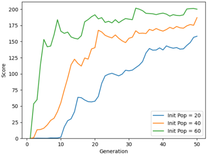
The image is a line chart plotting "Score" against "Generation" for three different experimental conditions, labeled by their initial population size ("Init Pop"). The chart demonstrates how the performance (score) of a process, likely an evolutionary or genetic algorithm, evolves over 50 generations for populations starting at sizes of 20, 40, and 60.
### Components/Axes
* **Chart Type:** Multi-line chart.
* **X-Axis (Horizontal):**
* **Label:** "Generation"
* **Scale:** Linear, from 0 to 50.
* **Major Tick Marks:** At intervals of 10 (0, 10, 20, 30, 40, 50).
* **Y-Axis (Vertical):**
* **Label:** "Score"
* **Scale:** Linear, from 0 to 200.
* **Major Tick Marks:** At intervals of 25 (0, 25, 50, 75, 100, 125, 150, 175, 200).
* **Legend:**
* **Position:** Bottom-right corner of the chart area.
* **Entries:**
1. **Blue Line:** "Init Pop = 20"
2. **Orange Line:** "Init Pop = 40"
3. **Green Line:** "Init Pop = 60"
### Detailed Analysis
The chart displays three distinct data series, each showing a generally increasing trend with fluctuations.
1. **Green Line (Init Pop = 60):**
* **Trend:** Starts at the highest score, experiences a very rapid initial increase, then continues to rise with moderate fluctuations, eventually plateauing near the top of the chart.
* **Key Data Points (Approximate):**
* Generation 0: Score ~0.
* Generation 5: Score ~150.
* Generation 10: Score ~180 (local peak).
* Generation 20: Score ~190.
* Generation 30: Score ~180 (local trough).
* Generation 40: Score ~195.
* Generation 50: Score ~200 (highest point on the chart).
2. **Orange Line (Init Pop = 40):**
* **Trend:** Starts at a moderate score, increases steadily with some volatility, and maintains a position between the green and blue lines throughout.
* **Key Data Points (Approximate):**
* Generation 0: Score ~0.
* Generation 5: Score ~25.
* Generation 10: Score ~50.
* Generation 20: Score ~140.
* Generation 30: Score ~160.
* Generation 40: Score ~170.
* Generation 50: Score ~180.
3. **Blue Line (Init Pop = 20):**
* **Trend:** Starts at the lowest score, shows a slower initial rise, then accelerates its growth, but remains the lowest-performing series throughout the 50 generations.
* **Key Data Points (Approximate):**
* Generation 0: Score ~0.
* Generation 10: Score ~0 (begins rising after Gen 10).
* Generation 20: Score ~60.
* Generation 30: Score ~100.
* Generation 40: Score ~140.
* Generation 50: Score ~160.
### Key Observations
* **Clear Hierarchy:** There is a consistent performance hierarchy: `Init Pop = 60` > `Init Pop = 40` > `Init Pop = 20` at virtually every generation after the initial phase.
* **Convergence Rate:** The series with the largest initial population (green) not only starts higher but also reaches near-maximum scores much faster (by ~Generation 20) compared to the others.
* **Diminishing Returns:** While all lines show improvement, the rate of score increase slows over time for each, suggesting a convergence toward an optimal solution or a performance ceiling.
* **Volatility:** All lines exhibit fluctuations (ups and downs), which is characteristic of stochastic optimization processes like genetic algorithms. The green line shows particularly sharp early fluctuations.
### Interpretation
This chart illustrates a fundamental principle in population-based optimization algorithms: **larger initial populations generally lead to faster discovery of high-quality solutions and better overall performance within a fixed number of generations.**
* **Exploration vs. Exploitation:** A larger initial population (Init Pop = 60) provides greater genetic diversity from the start, enabling more effective exploration of the solution space. This leads to the rapid initial gains seen in the green line. Smaller populations (Init Pop = 20) start with less diversity, resulting in a slower start as they must first generate variety through mutation and crossover.
* **Performance Ceiling:** The fact that all three lines appear to be approaching a similar upper bound (around a score of 200) suggests there may be a theoretical maximum or a very difficult-to-exceed optimum for the problem being solved. The larger population simply gets there faster.
* **Practical Implication:** The data suggests a trade-off. Using a larger initial population requires more computational resources per generation but achieves high scores in fewer generations. A smaller population is cheaper per generation but may require many more generations to reach the same level of performance. The optimal choice depends on the specific cost of evaluating one generation versus the cost of running additional generations.
**Language Declaration:** All text within the image is in English.