\n
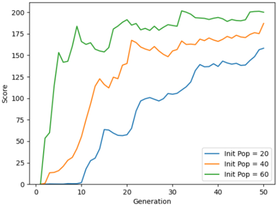
## Line Chart: Score vs. Generation for Different Initial Populations
### Overview
The image presents a line chart illustrating the relationship between 'Score' and 'Generation' for three different 'Init Pop' (Initial Population) values: 20, 40, and 60. The chart displays how the score evolves over generations for each initial population size.
### Components/Axes
* **X-axis:** 'Generation', ranging from approximately 0 to 50.
* **Y-axis:** 'Score', ranging from approximately 0 to 200.
* **Legend:** Located in the top-right corner, identifying the three lines:
* Blue line: 'Init Pop = 20'
* Orange line: 'Init Pop = 40'
* Green line: 'Init Pop = 60'
### Detailed Analysis
The chart shows three distinct lines representing the score progression for each initial population size.
* **Init Pop = 20 (Blue Line):** This line starts at approximately 0 at Generation 0, rapidly increases to around 75 by Generation 10, then plateaus and continues to increase more slowly, reaching approximately 150 at Generation 50. The line exhibits several small fluctuations throughout the generations.
* **Init Pop = 40 (Orange Line):** This line also starts at approximately 0 at Generation 0, but increases more rapidly than the blue line, reaching around 120 by Generation 10. It then experiences fluctuations, reaching a peak of approximately 180 around Generation 25, and then decreases slightly before stabilizing around 175 at Generation 50.
* **Init Pop = 60 (Green Line):** This line shows the fastest initial increase, reaching approximately 150 by Generation 5. It then fluctuates significantly, reaching a maximum score of approximately 200 around Generation 15, and then stabilizes around 190-200 for the remainder of the generations.
### Key Observations
* Higher initial population sizes (40 and 60) generally lead to higher scores compared to a smaller initial population size (20).
* The green line (Init Pop = 60) consistently achieves the highest scores throughout the generations.
* All three lines exhibit fluctuations, suggesting that the score is not a strictly increasing function of generation.
* The rate of score increase diminishes over time for all initial population sizes.
### Interpretation
The data suggests that increasing the initial population size positively impacts the score achieved over generations. This could be due to a larger initial population providing more diversity, which allows for more effective exploration of the solution space. However, the fluctuations observed in all lines indicate that the process is not deterministic and that random factors play a role. The diminishing rate of score increase over time suggests that the system is approaching a point of diminishing returns, where further generations yield smaller improvements in score. The green line's consistent high performance suggests that an initial population of 60 provides a good balance between diversity and efficiency. The chart demonstrates a typical evolutionary process where initial diversity leads to rapid improvement, followed by stabilization as the population converges towards optimal solutions.