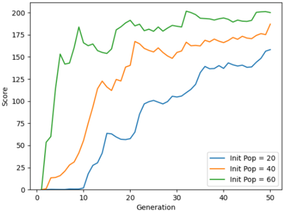
## Line Graph: Score Trends Across Generations for Different Initial Populations
### Overview
The image depicts a line graph comparing the performance (score) of three distinct initial population sizes (20, 40, 60) over 50 generations. Scores are plotted on the y-axis (0–200), while generations are on the x-axis (0–50). Three colored lines represent the populations: blue (20), orange (40), and green (60).
### Components/Axes
- **X-axis (Horizontal)**: Labeled "Generation," scaled from 0 to 50 in increments of 10.
- **Y-axis (Vertical)**: Labeled "Score," scaled from 0 to 200 in increments of 25.
- **Legend**: Located in the bottom-right corner, mapping colors to initial population sizes:
- Blue: Init Pop = 20
- Orange: Init Pop = 40
- Green: Init Pop = 60
### Detailed Analysis
1. **Green Line (Init Pop = 60)**:
- Starts at ~50 (Generation 0) and rises sharply to ~150 by Generation 10.
- Exhibits fluctuations but maintains a general upward trend, peaking near 200 by Generation 50.
- Shows the highest variability (e.g., dips to ~125 at Generation 15, spikes to ~190 at Generation 30).
2. **Orange Line (Init Pop = 40)**:
- Begins at ~0 (Generation 0) and rises steeply to ~125 by Generation 10.
- Stabilizes between ~150–175 from Generation 20 onward, with minor oscillations.
- Ends near ~175 at Generation 50.
3. **Blue Line (Init Pop = 20)**:
- Remains near 0 until Generation 10, then climbs gradually to ~100 by Generation 30.
- Accelerates sharply after Generation 30, reaching ~150 by Generation 50.
- Shows the least variability but the slowest initial growth.
### Key Observations
- **Performance Correlation**: Larger initial populations (green) achieve higher scores earlier and maintain a lead throughout.
- **Threshold Effects**: The orange line (40) demonstrates a "breakthrough" around Generation 10, suggesting a critical mass effect.
- **Delayed Growth**: The blue line (20) exhibits a "late surge" after Generation 30, indicating slower adaptation but eventual competitiveness.
- **Volatility**: The green line’s fluctuations suggest higher sensitivity to generational changes compared to smaller populations.
### Interpretation
The data implies that **initial population size significantly impacts long-term performance**, with larger populations achieving higher scores more consistently. The green line’s volatility may reflect exploration of a broader solution space, while the blue line’s delayed growth could indicate resource constraints or slower optimization. The orange line’s mid-range performance suggests a balance between stability and adaptability. Notably, all populations improve over time, but the rate and trajectory differ markedly, highlighting the importance of initial conditions in evolutionary or iterative systems.