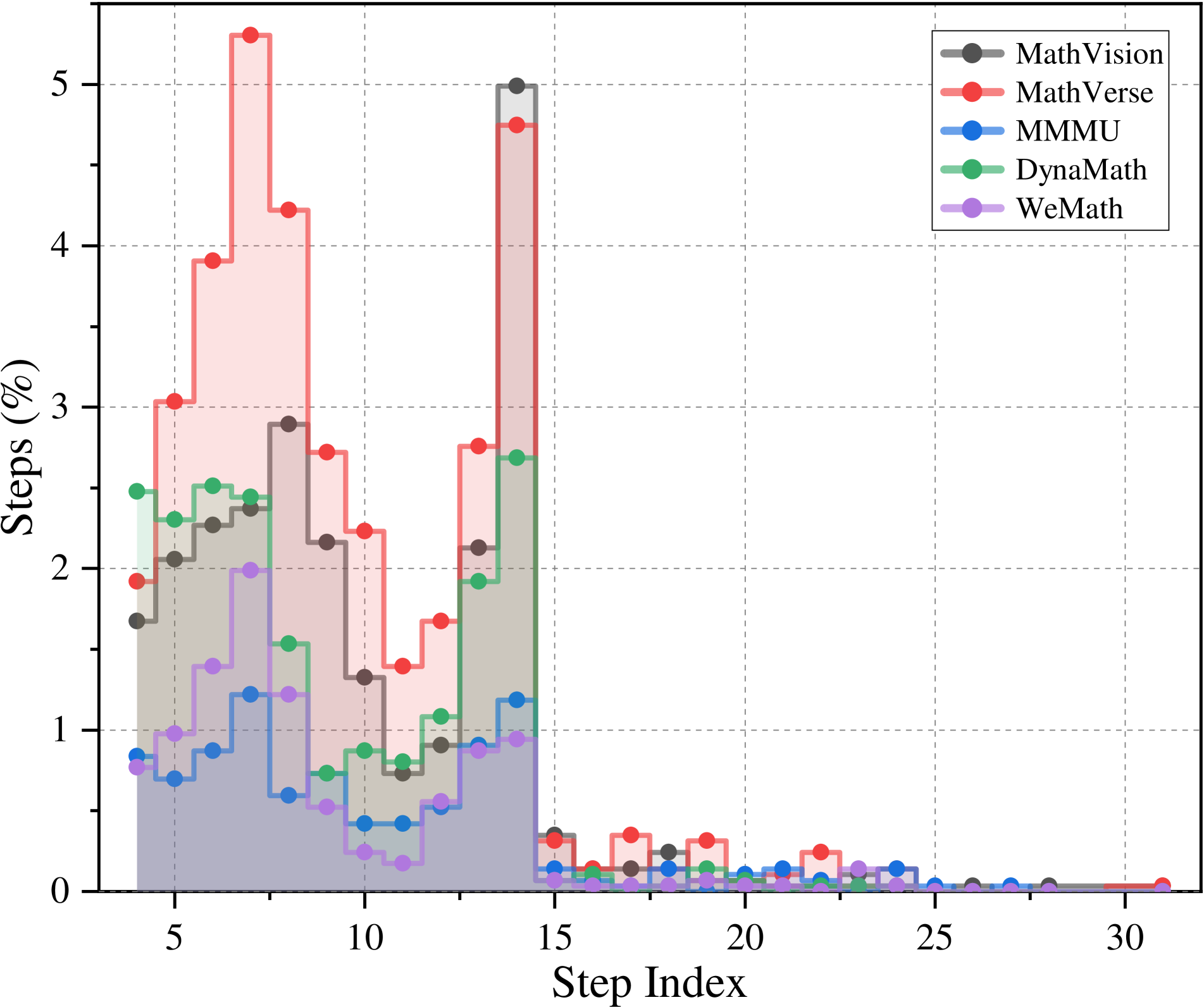
## Line Chart: Step Index vs. Steps (%)
### Overview
The chart displays five data series representing the percentage of steps taken across a step index range (0–30). Each series is color-coded and labeled in the legend (top-right). The y-axis shows "Steps (%)" with a range of 0–5, while the x-axis shows "Step Index" with a range of 0–30. Dotted grid lines aid in reading values.
### Components/Axes
- **X-axis (Step Index)**: Labeled "Step Index" with ticks at 0, 5, 10, 15, 20, 25, 30.
- **Y-axis (Steps %)**: Labeled "Steps (%)" with ticks at 0, 1, 2, 3, 4, 5.
- **Legend**: Located in the top-right corner, with five entries:
- **MathVision** (gray line)
- **MathVerse** (red line)
- **MMMU** (blue line)
- **DynaMath** (green line)
- **WeMath** (purple line)
### Detailed Analysis
1. **MathVision (gray)**:
- Starts at ~1.5% at Step Index 5.
- Peaks at ~3% around Step Index 10.
- Drops to ~0.5% by Step Index 15, then remains near 0.
2. **MathVerse (red)**:
- Starts at ~2% at Step Index 5.
- Peaks sharply at ~5% around Step Index 10.
- Drops sharply to ~0.5% by Step Index 15, then remains near 0.
3. **MMMU (blue)**:
- Starts at ~0.8% at Step Index 5.
- Peaks at ~1.2% around Step Index 10.
- Drops to ~0.2% by Step Index 15, then remains near 0.
4. **DynaMath (green)**:
- Starts at ~2.5% at Step Index 5.
- Peaks at ~3% around Step Index 10.
- Drops to ~1% by Step Index 15, then remains near 0.
5. **WeMath (purple)**:
- Starts at ~1% at Step Index 5.
- Peaks at ~2% around Step Index 10.
- Drops to ~0.5% by Step Index 15, then remains near 0.
### Key Observations
- **Peak Activity**: All lines peak around Step Index 10, suggesting a critical threshold or event at this point.
- **MathVerse (red)** exhibits the highest peak (~5%) and sharpest decline, indicating a brief but intense activity.
- **DynaMath (green)** and **MathVision (gray)** show moderate peaks (~3% and ~3%, respectively) with gradual declines.
- **MMMU (blue)** and **WeMath (purple)** have lower peaks (~1.2% and ~2%, respectively) but similar decline patterns.
- All lines drop to near 0% after Step Index 15, suggesting a cessation of activity or a reset.
### Interpretation
The chart likely represents the efficiency or usage of five mathematical tools/methods (MathVision, MathVerse, MMMU, DynaMath, WeMath) across a sequence of steps. The peak at Step Index 10 implies a focal point where all methods are most active, possibly due to a specific task or algorithmic phase. MathVerse’s sharp rise and fall suggest it is highly effective for short-term tasks but less sustainable. DynaMath and MathVision show more balanced performance, while MMMU and WeMath have lower overall activity. The uniform drop after Step Index 15 indicates a common endpoint or reset in the process.