## Heatmap: AUROC Scores for Different Categories
### Overview
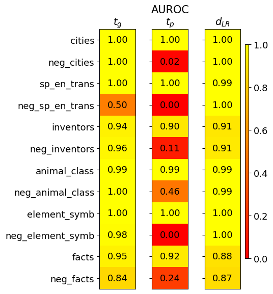
The image is a heatmap displaying AUROC (Area Under the Receiver Operating Characteristic curve) scores for different categories across three different models or conditions, labeled as *t<sub>g</sub>*, *t<sub>p</sub>*, and *d<sub>LR</sub>*. The heatmap uses a color gradient from red (low AUROC) to yellow (high AUROC) to represent the scores.
### Components/Axes
* **Title:** AUROC
* **Columns (Models/Conditions):**
* *t<sub>g</sub>* (left column)
* *t<sub>p</sub>* (middle column)
* *d<sub>LR</sub>* (right column)
* **Rows (Categories):**
* cities
* neg\_cities
* sp\_en\_trans
* neg\_sp\_en\_trans
* inventors
* neg\_inventors
* animal\_class
* neg\_animal\_class
* element\_symb
* neg\_element\_symb
* facts
* neg\_facts
* **Color Scale (Legend):** Located on the right side of the heatmap, ranging from 0.0 (red) to 1.0 (yellow).
### Detailed Analysis or Content Details
Here's a breakdown of the AUROC scores for each category and model:
* **cities:**
* *t<sub>g</sub>*: 1.00 (yellow)
* *t<sub>p</sub>*: 1.00 (yellow)
* *d<sub>LR</sub>*: 1.00 (yellow)
* **neg\_cities:**
* *t<sub>g</sub>*: 1.00 (yellow)
* *t<sub>p</sub>*: 0.02 (red)
* *d<sub>LR</sub>*: 1.00 (yellow)
* **sp\_en\_trans:**
* *t<sub>g</sub>*: 1.00 (yellow)
* *t<sub>p</sub>*: 1.00 (yellow)
* *d<sub>LR</sub>*: 0.99 (yellow)
* **neg\_sp\_en\_trans:**
* *t<sub>g</sub>*: 0.50 (orange)
* *t<sub>p</sub>*: 0.00 (red)
* *d<sub>LR</sub>*: 1.00 (yellow)
* **inventors:**
* *t<sub>g</sub>*: 0.94 (yellow)
* *t<sub>p</sub>*: 0.90 (yellow)
* *d<sub>LR</sub>*: 0.91 (yellow)
* **neg\_inventors:**
* *t<sub>g</sub>*: 0.96 (yellow)
* *t<sub>p</sub>*: 0.11 (red)
* *d<sub>LR</sub>*: 0.91 (yellow)
* **animal\_class:**
* *t<sub>g</sub>*: 0.99 (yellow)
* *t<sub>p</sub>*: 0.99 (yellow)
* *d<sub>LR</sub>*: 0.99 (yellow)
* **neg\_animal\_class:**
* *t<sub>g</sub>*: 1.00 (yellow)
* *t<sub>p</sub>*: 0.46 (orange)
* *d<sub>LR</sub>*: 0.99 (yellow)
* **element\_symb:**
* *t<sub>g</sub>*: 1.00 (yellow)
* *t<sub>p</sub>*: 1.00 (yellow)
* *d<sub>LR</sub>*: 1.00 (yellow)
* **neg\_element\_symb:**
* *t<sub>g</sub>*: 0.98 (yellow)
* *t<sub>p</sub>*: 0.00 (red)
* *d<sub>LR</sub>*: 1.00 (yellow)
* **facts:**
* *t<sub>g</sub>*: 0.95 (yellow)
* *t<sub>p</sub>*: 0.92 (yellow)
* *d<sub>LR</sub>*: 0.88 (yellow)
* **neg\_facts:**
* *t<sub>g</sub>*: 0.84 (yellow)
* *t<sub>p</sub>*: 0.24 (red)
* *d<sub>LR</sub>*: 0.87 (yellow)
### Key Observations
* The *t<sub>p</sub>* model consistently shows lower AUROC scores for the "neg\_" categories (neg\_cities, neg\_sp\_en\_trans, neg\_inventors, neg\_animal\_class, neg\_element\_symb, neg\_facts) compared to *t<sub>g</sub>* and *d<sub>LR</sub>*.
* The *t<sub>g</sub>* and *d<sub>LR</sub>* models generally perform well across all categories, with most scores close to 1.0.
* The *t<sub>p</sub>* model has AUROC scores of 0.0 for "neg\_sp\_en\_trans" and "neg\_element\_symb".
### Interpretation
The heatmap suggests that the *t<sub>p</sub>* model struggles with the "neg\_" categories, indicating a potential issue in handling negative examples or a bias against them. The *t<sub>g</sub>* and *d<sub>LR</sub>* models appear to be more robust and perform well across both positive and negative examples. The significant difference in AUROC scores between *t<sub>p</sub>* and the other two models for the "neg\_" categories warrants further investigation to understand the underlying reasons for this discrepancy. It could be related to data imbalance, feature representation, or model architecture.