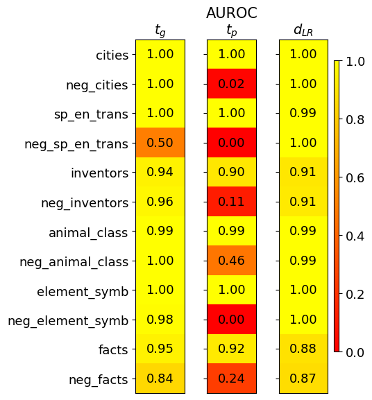
## Heatmap: AUROC Performance Metrics
### Overview
The image is a heatmap visualizing AUROC (Area Under the Receiver Operating Characteristic curve) scores for three different metrics (\( t_g \), \( t_p \), \( d_{LR} \)) across twelve distinct categories. The color scale ranges from red (0.0, poor performance) to yellow (1.0, perfect performance), with intermediate values represented by shades of orange.
### Components/Axes
* **Title:** "AUROC" (top center).
* **Column Headers (Metrics):** Three columns labeled with mathematical notation:
* \( t_g \) (left column)
* \( t_p \) (center column)
* \( d_{LR} \) (right column)
* **Row Labels (Categories):** Twelve categories listed vertically on the left side:
1. cities
2. neg_cities
3. sp_en_trans
4. neg_sp_en_trans
5. inventors
6. neg_inventors
7. animal_class
8. neg_animal_class
9. element_symb
10. neg_element_symb
11. facts
12. neg_facts
* **Color Legend:** A vertical bar on the right side of the chart, mapping color to AUROC value. The scale is marked at 0.0, 0.2, 0.4, 0.6, 0.8, and 1.0. Red corresponds to 0.0, yellow to 1.0, with orange hues in between.
### Detailed Analysis
The following table reconstructs the data presented in the heatmap. Values are transcribed directly from the cells.
| Category | \( t_g \) | \( t_p \) | \( d_{LR} \) |
| :--- | :--- | :--- | :--- |
| cities | 1.00 | 1.00 | 1.00 |
| neg_cities | 1.00 | 0.02 | 1.00 |
| sp_en_trans | 1.00 | 1.00 | 0.99 |
| neg_sp_en_trans | 0.50 | 0.00 | 1.00 |
| inventors | 0.94 | 0.90 | 0.91 |
| neg_inventors | 0.96 | 0.11 | 0.91 |
| animal_class | 0.99 | 0.99 | 0.99 |
| neg_animal_class | 1.00 | 0.46 | 0.99 |
| element_symb | 1.00 | 1.00 | 1.00 |
| neg_element_symb | 0.98 | 0.00 | 1.00 |
| facts | 0.95 | 0.92 | 0.88 |
| neg_facts | 0.84 | 0.24 | 0.87 |
**Trend Verification by Column:**
* **\( t_g \) (Left Column):** This column shows consistently high performance. The visual trend is predominantly bright yellow. Values are mostly at or near 1.00, with the lowest being 0.50 for `neg_sp_en_trans` and 0.84 for `neg_facts`.
* **\( t_p \) (Center Column):** This column exhibits extreme variability. The visual trend is a stark contrast between bright yellow (1.00) and deep red (0.00, 0.02). Performance is perfect for some base categories (`cities`, `sp_en_trans`, `element_symb`) but collapses to near zero for their "neg_" counterparts (`neg_sp_en_trans`, `neg_element_symb`).
* **\( d_{LR} \) (Right Column):** This column shows robust, high performance across all categories. The visual trend is uniformly yellow to light orange. The lowest value is 0.87 for `neg_facts`, and most values are 0.99 or 1.00.
### Key Observations
1. **Metric Sensitivity:** The \( t_p \) metric is highly sensitive to the category type, showing catastrophic failure (AUROC ≤ 0.11) for five of the six "neg_" categories.
2. **Robustness of \( d_{LR} \):** The \( d_{LR} \) metric maintains high AUROC scores (>0.87) for all categories, including the challenging "neg_" variants, suggesting it is a more robust measure.
3. **Performance on "neg_" Categories:** There is a clear pattern where the "neg_" (likely negative or control) versions of categories generally yield lower scores than their base counterparts, most dramatically for \( t_p \).
4. **Outliers:**
* `neg_sp_en_trans` under \( t_p \) has an AUROC of 0.00, the lowest possible score.
* `neg_cities` under \( t_p \) has an AUROC of 0.02, also indicating near-total failure.
* `neg_animal_class` under \( t_p \) has a moderate score of 0.46, which is an outlier among the other "neg_" categories for that metric.
### Interpretation
This heatmap likely compares the performance of three different models or methods (\( t_g \), \( t_p \), \( d_{LR} \)) on a series of classification tasks. The tasks involve distinguishing between base concepts (e.g., "cities") and their negations or adversarial counterparts (e.g., "neg_cities").
The data suggests that:
* The method represented by **\( t_p \)** is brittle. It performs perfectly on clean, base categories but fails completely when faced with negated or potentially adversarial examples. This indicates a lack of generalization or robustness.
* The method represented by **\( d_{LR} \)** is highly robust. Its consistent high performance across both base and negated categories implies it captures a more fundamental or invariant feature of the data, making it reliable for deployment in scenarios where such variations are expected.
* The method represented by **\( t_g \)** offers a middle ground, with generally high performance that degrades only slightly on the most challenging negated categories.
The investigation points to \( d_{LR} \) as the most reliable metric for real-world applications where data may not be perfectly curated, while \( t_p \) may only be suitable for controlled environments with known, clean data distributions. The stark failure modes of \( t_p \) on "neg_" categories warrant further analysis to understand the underlying cause of its lack of robustness.