# Technical Document Extraction
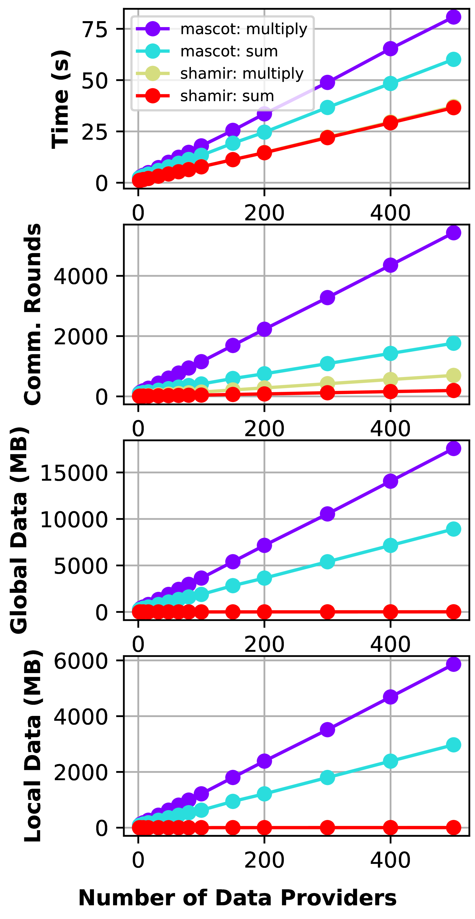
## Graph 1: Time (s) vs. Number of Data Providers
- **Y-Axis**: Time (s)
- **X-Axis**: Number of Data Providers (0, 200, 400)
- **Legend**:
- Purple: `mascot: multiply`
- Cyan: `mascot: sum`
- Yellow: `shamir: multiply`
- Red: `shamir: sum`
- **Key Trends**:
- All lines exhibit linear growth with increasing data providers.
- `mascot: multiply` (purple) has the steepest slope, reaching ~75s at 400 providers.
- `mascot: sum` (cyan) follows, reaching ~55s at 400 providers.
- `shamir: multiply` (yellow) and `shamir: sum` (red) have similar slopes, reaching ~30s and ~25s at 400 providers, respectively.
## Graph 2: Communication Rounds vs. Number of Data Providers
- **Y-Axis**: Communication Rounds
- **X-Axis**: Number of Data Providers (0, 200, 400)
- **Legend**: Same as Graph 1.
- **Key Trends**:
- Linear growth for all lines.
- `mascot: multiply` (purple) peaks at ~4,000 rounds at 400 providers.
- `mascot: sum` (cyan) reaches ~2,000 rounds.
- `shamir: multiply` (yellow) and `shamir: sum` (red) plateau near ~1,000 and ~500 rounds, respectively.
## Graph 3: Global Data (MB) vs. Number of Data Providers
- **Y-Axis**: Global Data (MB)
- **X-Axis**: Number of Data Providers (0, 200, 400)
- **Legend**: Same as Graph 1.
- **Key Trends**:
- Linear scaling for all lines.
- `mascot: multiply` (purple) reaches ~15,000 MB at 400 providers.
- `mascot: sum` (cyan) reaches ~10,000 MB.
- `shamir: multiply` (yellow) and `shamir: sum` (red) plateau near ~5,000 and ~1,000 MB, respectively.
## Graph 4: Local Data (MB) vs. Number of Data Providers
- **Y-Axis**: Local Data (MB)
- **X-Axis**: Number of Data Providers (0, 200, 400)
- **Legend**: Same as Graph 1.
- **Key Trends**:
- Linear growth for all lines.
- `mascot: multiply` (purple) peaks at ~6,000 MB at 400 providers.
- `mascot: sum` (cyan) reaches ~4,000 MB.
- `shamir: multiply` (yellow) and `shamir: sum` (red) plateau near ~2,000 and ~1,000 MB, respectively.
## Cross-Reference Summary
- **Legend Consistency**: All line colors (purple, cyan, yellow, red) match their respective labels across all graphs.
- **Performance Comparison**:
- `mascot: multiply` consistently exhibits the highest values across all metrics.
- `shamir: sum` (red) shows the lowest growth rate in all graphs.
- `shamir: multiply` (yellow) and `shamir: sum` (red) demonstrate similar scaling patterns but with lower magnitudes compared to `mascot` methods.