## Diagram: GNN Layer Processing
### Overview
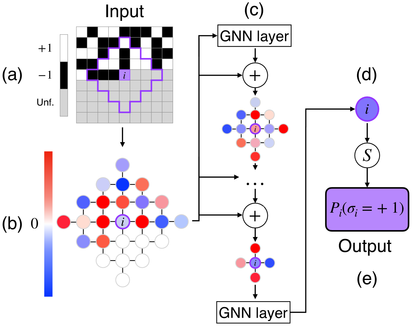
The image illustrates the processing steps of a Graph Neural Network (GNN) layer, starting from an input grid, transforming it through intermediate representations, and culminating in an output probability. The diagram is divided into five sections labeled (a) through (e), each representing a stage in the process.
### Components/Axes
* **(a) Input:** A grid representing the input data. The grid cells are either black (+1), white (-1), or gray (Unf., representing an undefined state). A purple line highlights a specific region of interest. The label "i" indicates a specific cell within this region.
* **Color Scale (Left of Input):**
* Top: +1 (Black)
* Middle: -1 (White)
* Bottom: Unf. (Gray)
* **(b) Intermediate Representation:** A graph where nodes are colored based on a continuous color scale, ranging from blue to red. The color of each node represents a value between 0 (blue) and a positive value (red). The node labeled "i" is colored purple.
* **Color Scale (Left of Graph):**
* Bottom: Blue, labeled "0"
* Top: Red, unlabeled (Implies a positive value)
* **(c) GNN Layer:** This section shows the application of a GNN layer. It involves multiple GNN layers, each followed by an addition operation (+). The output of each addition is a graph with nodes colored similarly to section (b). The "..." indicates that there are intermediate steps not explicitly shown.
* **(d) Node i:** A single node "i" colored purple, representing the node of interest. It is connected to a function "S" via a downward arrow.
* **(e) Output:** A purple rectangle labeled "Pᵢ(σᵢ = +1)", representing the output probability for node i having a value of +1. The label "Output" is placed below the rectangle.
### Detailed Analysis
* **Input Grid (a):** The input grid consists of black, white, and gray cells. The purple line highlights a specific region, and the label "i" points to a particular cell within that region.
* **Intermediate Graph (b):** The input grid is transformed into a graph where each node's color represents a value. The color scale ranges from blue (0) to red (positive value). The node "i" is colored purple, indicating its value in this representation.
* **GNN Layer Processing (c):** The graph is processed through multiple GNN layers. Each layer's output is added to the previous result. The "..." indicates that there are intermediate GNN layers and addition operations not explicitly shown.
* **Output Probability (e):** The final output is the probability Pᵢ(σᵢ = +1), which represents the likelihood that node i has a value of +1.
### Key Observations
* The diagram illustrates the transformation of data from a grid-based input to a probability output through a GNN layer.
* The color scales in sections (a) and (b) provide a visual representation of the data values at different stages of the process.
* The GNN layer processing involves multiple steps, including GNN layers and addition operations.
### Interpretation
The diagram demonstrates how a Graph Neural Network (GNN) processes input data to generate an output probability. The input grid is transformed into a graph representation, which is then processed through multiple GNN layers. The color scales provide a visual representation of the data values at different stages of the process. The final output is the probability that a specific node (i) has a value of +1. This process is crucial for tasks such as image segmentation, node classification, and graph-based prediction, where the relationships between data points are important. The use of GNN layers allows the network to learn complex patterns and dependencies within the graph structure, leading to accurate predictions.