## Scatter Plot with Overlaid Lines: Critical Batch Size vs. Performance
### Overview
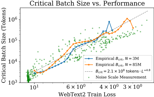
The image is a scientific chart plotting "Critical Batch Size" against "WebText2 Train Loss" on a log-log scale. It compares empirical measurements for two different model sizes (N=3M and N=85M parameters) against a theoretical scaling law and a cloud of individual noise scale measurements. The chart illustrates the relationship between model training loss and the optimal batch size for training efficiency.
### Components/Axes
* **Title:** "Critical Batch Size vs. Performance" (Top center).
* **Y-Axis:** Label is "Critical Batch Size (Tokens)". It is a logarithmic scale ranging from 10³ to just above 10⁶.
* **X-Axis:** Label is "WebText2 Train Loss". It is a logarithmic scale, with major tick marks labeled from left to right as: 10¹, 6×10⁰, 4×10⁰, 3×10⁰. The scale decreases from left to right, meaning lower loss (better performance) is to the right.
* **Legend:** Located in the bottom-right quadrant of the chart area. It contains four entries:
1. **Blue line with circular markers:** "Empirical B_crit, N = 3M"
2. **Orange line with circular markers:** "Empirical B_crit, N = 85M"
3. **Gray dashed line:** "B_crit = 2.1 × 10⁹ tokens · L⁻⁴.⁸"
4. **Green dots:** "Noise Scale Measurement"
### Detailed Analysis
**Data Series and Trends:**
1. **Empirical B_crit, N = 3M (Blue Line):**
* **Trend:** The line shows a general upward trend as train loss decreases (moving right on the x-axis). It starts near 10³ tokens at a loss of ~10¹ and rises to a peak near 10⁶ tokens at a loss of ~4×10⁰. The path is not smooth, exhibiting significant local fluctuations and a notable dip around a loss of 6×10⁰.
* **Key Points (Approximate):** (Loss ~10¹, B_crit ~10³), (Loss ~6×10⁰, B_crit ~10⁵), (Loss ~4×10⁰, B_crit ~10⁶ - peak), (Loss ~3.5×10⁰, B_crit ~4×10⁵).
2. **Empirical B_crit, N = 85M (Orange Line):**
* **Trend:** Follows a similar upward trend to the N=3M line but is generally positioned higher on the y-axis for a given loss value, especially in the mid-to-low loss region. It also peaks near 10⁶ tokens.
* **Key Points (Approximate):** (Loss ~10¹, B_crit ~3×10³), (Loss ~6×10⁰, B_crit ~5×10⁴), (Loss ~4×10⁰, B_crit ~3×10⁵), (Loss ~3.2×10⁰, B_crit ~10⁶ - peak).
3. **Theoretical Scaling Law (Gray Dashed Line):**
* **Trend:** A perfectly straight line on this log-log plot, representing the power-law function `B_crit = 2.1 × 10⁹ * L^(-4.8)`. It slopes upward from left to right.
* **Key Points (Approximate):** It passes through (Loss ~10¹, B_crit ~2×10⁴) and (Loss ~3×10⁰, B_crit ~2×10⁶). It lies between the two empirical lines for much of the range but is exceeded by the N=3M empirical peak.
4. **Noise Scale Measurement (Green Dots):**
* **Distribution:** A dense cloud of hundreds of individual green data points scattered across the chart. They show extremely high variance.
* **Range:** They span nearly the entire y-axis range from below 10³ to above 10⁶ tokens. Horizontally, they are concentrated between losses of ~10¹ and ~3×10⁰.
* **Pattern:** While scattered, the centroid of the cloud appears to drift upward as loss decreases, loosely following the trend of the lines but with massive dispersion.
### Key Observations
1. **Model Size Effect:** The larger model (N=85M, orange) generally has a higher critical batch size than the smaller model (N=3M, blue) at the same loss level, particularly in the middle of the loss range shown.
2. **Non-Monotonic Empirical Data:** Both empirical lines show significant non-monotonic behavior (dips and peaks), deviating from the smooth theoretical prediction. The N=3M line has a particularly sharp dip and recovery.
3. **High Variance in Noise Measurements:** The green "Noise Scale" points exhibit enormous scatter, spanning three orders of magnitude in batch size for similar loss values. This indicates high measurement noise or that the noise scale is influenced by factors not captured solely by the final loss.
4. **Theoretical Model as an Approximation:** The dashed gray line provides a reasonable central trend for the empirical data but fails to capture the detailed fluctuations and the peak values observed empirically.
5. **Peak Performance Region:** The highest critical batch sizes (approaching or exceeding 10⁶ tokens) are observed in the region of lowest train loss (between 4×10⁰ and 3×10⁰).
### Interpretation
This chart investigates the **scaling laws of neural network training efficiency**. The "critical batch size" is a key parameter that determines the point of diminishing returns when increasing the number of data samples processed in parallel.
* **Core Finding:** The data supports the hypothesis that the critical batch size (`B_crit`) scales as a power law with the training loss (`L`), approximately `B_crit ∝ L^(-4.8)`. This means as models are trained to lower loss (better performance), the optimal batch size for efficient training grows dramatically.
* **Model Size Nuance:** The separation between the blue (3M) and orange (85M) lines suggests that model size (`N`) is another critical factor. Larger models may sustain efficient training at larger batch sizes for a given loss level, which has direct implications for distributed training hardware allocation.
* **Practical vs. Theoretical:** The significant scatter of the green noise measurements and the wiggles in the empirical lines highlight the gap between clean theoretical scaling laws and the noisy reality of experimental measurements. The theoretical line is a useful guide but not a precise predictor for any single experiment.
* **Implication for Training:** To train state-of-the-art models to very low loss, practitioners must be prepared to use extremely large batch sizes (millions of tokens), requiring sophisticated distributed training infrastructure. The chart provides a quantitative framework for predicting these requirements. The high variance in noise measurements also cautions that determining the exact optimal batch size for a specific run requires careful empirical tuning.