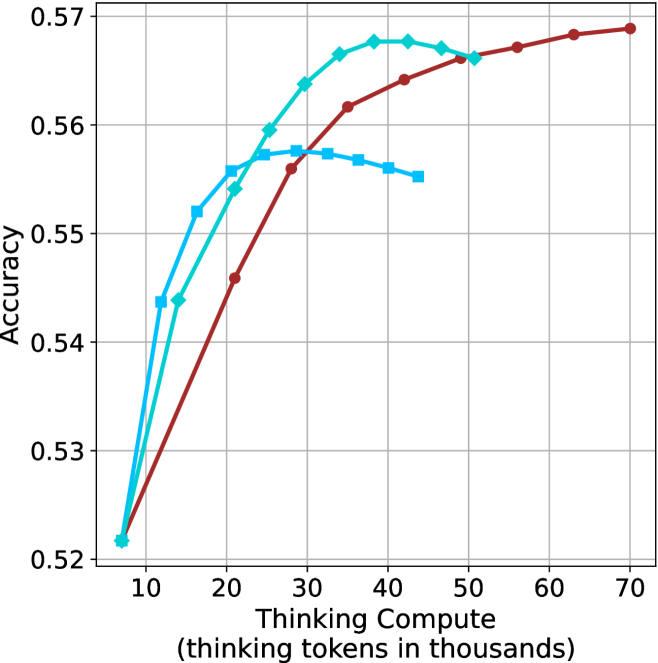
## Line Chart: Accuracy vs. Thinking Compute
### Overview
This image presents a line chart illustrating the relationship between "Thinking Compute" (measured in thousands of tokens) and "Accuracy". Three distinct data series are plotted, each represented by a different colored line. The chart appears to demonstrate how accuracy improves with increased computational effort (thinking tokens).
### Components/Axes
* **X-axis:** "Thinking Compute (thinking tokens in thousands)". Scale ranges from approximately 8 to 70, with markers at 10, 20, 30, 40, 50, 60, and 70.
* **Y-axis:** "Accuracy". Scale ranges from approximately 0.52 to 0.57, with markers at 0.52, 0.53, 0.54, 0.55, 0.56, and 0.57.
* **Data Series:** Three lines are present, each representing a different model or configuration.
* **Red Line:** Represents a data series with a generally upward trend.
* **Cyan Line:** Represents a data series that initially rises sharply, plateaus, and then slightly declines.
* **Blue Line:** Represents a data series that rises quickly and then plateaus.
* **Grid:** A light gray grid is overlaid on the chart to aid in reading values.
### Detailed Analysis
Let's analyze each line individually:
* **Red Line:** This line exhibits a consistent upward trend.
* At x = 10, y ≈ 0.525
* At x = 20, y ≈ 0.545
* At x = 30, y ≈ 0.56
* At x = 40, y ≈ 0.565
* At x = 50, y ≈ 0.567
* At x = 60, y ≈ 0.568
* At x = 70, y ≈ 0.57
* **Cyan Line:** This line shows a rapid initial increase, followed by a plateau and a slight decrease.
* At x = 10, y ≈ 0.527
* At x = 20, y ≈ 0.55
* At x = 30, y ≈ 0.567
* At x = 40, y ≈ 0.565
* At x = 50, y ≈ 0.564
* At x = 60, y ≈ 0.562
* At x = 70, y ≈ 0.56
* **Blue Line:** This line demonstrates a quick rise and then levels off.
* At x = 10, y ≈ 0.528
* At x = 20, y ≈ 0.548
* At x = 30, y ≈ 0.562
* At x = 40, y ≈ 0.562
* At x = 50, y ≈ 0.563
* At x = 60, y ≈ 0.563
* At x = 70, y ≈ 0.563
### Key Observations
* All three lines show an increase in accuracy as "Thinking Compute" increases.
* The red line consistently demonstrates the highest accuracy across the entire range of "Thinking Compute".
* The cyan line exhibits the most pronounced plateau and slight decline at higher "Thinking Compute" values.
* The blue line reaches a plateau earlier than the red line.
* The initial gains in accuracy are most significant for all three lines.
### Interpretation
The chart suggests that increasing the amount of "Thinking Compute" generally leads to improved accuracy. However, there appear to be diminishing returns. The red line indicates that a particular model or configuration benefits most from increased computation, achieving the highest accuracy. The cyan line suggests that beyond a certain point, additional computation may not yield significant improvements and could even lead to a slight decrease in accuracy, potentially due to overfitting or other factors. The blue line shows a rapid initial improvement, but then plateaus, indicating that it reaches its maximum potential accuracy relatively quickly.
This data could be used to optimize the allocation of computational resources. For example, it might be more efficient to invest in improving the model represented by the cyan line rather than continuing to increase the "Thinking Compute" for that model beyond a certain threshold. The chart highlights the importance of finding the right balance between computational cost and accuracy. The fact that all lines increase suggests that "Thinking Compute" is a valuable factor in improving accuracy, but the specific benefits vary depending on the model or configuration.