## Bar Chart: Activation Function Performance Comparison
### Overview
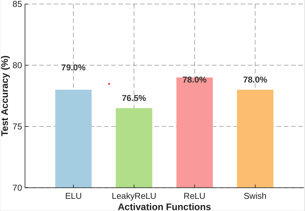
This image is a bar chart comparing the "Test Accuracy (%)" of four different neural network activation functions: ELU, LeakyReLu, ReLU, and Swish. The chart uses a vertical axis to represent accuracy percentages and a horizontal axis to categorize the activation functions.
### Components/Axes
* **Y-Axis (Vertical):** Labeled "Test Accuracy (%)". The scale ranges from 70 to 85, with major grid lines marked at 70, 75, 80, and 85.
* **X-Axis (Horizontal):** Labeled "Activation Functions". It contains four categorical labels: "ELU", "LeakyReLu", "ReLU", and "Swish".
* **Data Series:** Four vertical bars, each color-coded:
* **ELU:** Light Blue
* **LeakyReLu:** Light Green
* **ReLU:** Light Red/Pink
* **Swish:** Light Orange
* **Annotations:** Each bar has a numerical percentage value placed directly above it.
* **Artifacts:** There is a small, stray red dot located in the white space above the ELU bar and to the left of the LeakyReLu bar.
### Detailed Analysis
The chart presents a significant discrepancy between the visual height of the bars and the numerical labels provided. Below is the breakdown of the data as presented:
| Activation Function | Bar Color | Label Value | Visual Bar Height (Approx.) |
| :--- | :--- | :--- | :--- |
| **ELU** | Light Blue | 79.0% | ~78.0% |
| **LeakyReLu** | Light Green | 76.5% | ~76.5% |
| **ReLU** | Light Red | 78.0% | ~79.0% |
| **Swish** | Light Orange | 78.0% | ~78.0% |
* **ELU (Far Left):** The bar is visually aligned with the 78% mark, yet the text label indicates 79.0%.
* **LeakyReLu (Second from Left):** The bar is visually aligned with the 76.5% mark, and the text label matches (76.5%).
* **ReLU (Third from Left):** The bar is visually the tallest, reaching approximately 79%, yet the text label indicates 78.0%.
* **Swish (Far Right):** The bar is visually aligned with the 78% mark, and the text label matches (78.0%).
### Key Observations
* **Data Inconsistency:** There is a clear mismatch between the visual representation (bar height) and the textual data (labels) for the ELU and ReLU categories.
* **Visual Trend:** Visually, the ReLU function appears to have the highest test accuracy, followed by ELU and Swish (which appear equal), and finally LeakyReLu.
* **Label Trend:** According to the text labels, ELU is the highest performing function, followed by a tie between ReLU and Swish, with LeakyReLu being the lowest.
* **Artifact:** A stray red pixel/dot is visible in the upper-left quadrant of the chart area, suggesting a potential rendering or editing error.
### Interpretation
The data presented in this chart is **highly unreliable** due to the internal contradictions between the visual bar heights and the numerical labels.
From a technical standpoint, this chart cannot be used to draw valid conclusions about the performance of these activation functions because the source of truth (the label vs. the bar) is ambiguous. If the labels are correct, the visual representation is misleading. If the visual representation is correct, the labels are incorrect. The presence of the stray red dot further suggests that this image may be a draft or an improperly rendered graphic. Any analysis derived from this image should be treated with extreme skepticism until the raw data is verified.