\n
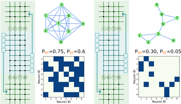
## Diagram: Neural Network Connectivity and Activity
### Overview
The image presents a comparison of two neural network configurations with differing connectivity probabilities and resulting activity patterns. It consists of four panels arranged in two columns. Each panel shows a grid-like representation of neurons, a corresponding network graph, and a heatmap representing neuron activity.
### Components/Axes
Each panel contains the following components:
* **Neuron Grid:** A grid of squares representing neurons, with numbered circles indicating specific neurons. Arrows indicate input and output connections.
* **Network Graph:** A graph depicting the connections between neurons. Nodes represent neurons, and edges represent connections.
* **Heatmap:** A square matrix representing the activity level between neurons. The x and y axes are labeled "Neuron ID". The color intensity indicates the strength of the connection or activity.
* **Probability Labels:** Each panel includes labels indicating the values of P<sub>NT</sub> and P<sub>RT</sub>.
### Detailed Analysis or Content Details
**Panel 1 (Left Column)**
* **Neuron Grid:** 8 neurons are numbered 1 through 8. Input arrows point to neurons 1-4, and output arrows originate from neurons 5-8.
* **Network Graph:** A fully connected graph with 8 nodes (neurons). Every neuron is connected to every other neuron.
* **Probability Labels:** P<sub>NT</sub> = 0.75, P<sub>RT</sub> = 0.6
* **Heatmap:** The heatmap is an 8x8 matrix. The color intensity is variable, with darker blue indicating higher activity. Notable activity is observed at:
* (1,1) - Moderate intensity
* (1,2) - Moderate intensity
* (1,3) - Moderate intensity
* (1,4) - Moderate intensity
* (2,1) - Moderate intensity
* (2,2) - Moderate intensity
* (2,3) - Moderate intensity
* (2,4) - Moderate intensity
* (3,1) - Moderate intensity
* (3,2) - Moderate intensity
* (3,3) - Moderate intensity
* (3,4) - Moderate intensity
* (4,1) - Moderate intensity
* (4,2) - Moderate intensity
* (4,3) - Moderate intensity
* (4,4) - Moderate intensity
* (5,5) - Moderate intensity
* (5,6) - Moderate intensity
* (5,7) - Moderate intensity
* (5,8) - Moderate intensity
* (6,5) - Moderate intensity
* (6,6) - Moderate intensity
* (6,7) - Moderate intensity
* (6,8) - Moderate intensity
* (7,5) - Moderate intensity
* (7,6) - Moderate intensity
* (7,7) - Moderate intensity
* (7,8) - Moderate intensity
* (8,5) - Moderate intensity
* (8,6) - Moderate intensity
* (8,7) - Moderate intensity
* (8,8) - Moderate intensity
**Panel 2 (Right Column)**
* **Neuron Grid:** Similar to Panel 1, with 8 neurons numbered 1 through 8.
* **Network Graph:** A sparsely connected graph with 8 nodes. Neurons 1, 2, 3, and 4 form a connected cluster, and neurons 5, 6, 7, and 8 form another connected cluster. There are limited connections between the two clusters.
* **Probability Labels:** P<sub>NT</sub> = 0.30, P<sub>RT</sub> = 0.05
* **Heatmap:** The heatmap is an 8x8 matrix. The color intensity is significantly lower than in Panel 1, indicating lower activity. Notable activity is observed at:
* (1,2) - Low intensity
* (2,1) - Low intensity
* (2,3) - Low intensity
* (3,2) - Low intensity
* (5,6) - Low intensity
* (6,5) - Low intensity
* (6,7) - Low intensity
* (7,6) - Low intensity
### Key Observations
* **Connectivity vs. Activity:** Panel 1, with higher connectivity probabilities (P<sub>NT</sub> = 0.75, P<sub>RT</sub> = 0.6), exhibits significantly higher overall activity in the heatmap compared to Panel 2 (P<sub>NT</sub> = 0.30, P<sub>RT</sub> = 0.05).
* **Network Structure and Activity Patterns:** The fully connected network in Panel 1 shows a more uniform distribution of activity across all neurons. The sparsely connected network in Panel 2 shows activity concentrated within the two clusters.
* **Heatmap Intensity:** The heatmap in Panel 1 has a much wider range of color intensities, indicating a more diverse range of activity levels.
### Interpretation
The diagram illustrates the relationship between network connectivity, connection probabilities, and resulting neural activity. The higher connectivity probabilities in Panel 1 lead to a more densely connected network and, consequently, higher overall activity. The heatmap visually represents this, showing a greater number of active connections.
Panel 2 demonstrates that lower connectivity probabilities result in a sparser network and reduced activity. The activity is localized within the two clusters, suggesting that information processing is more compartmentalized.
The values of P<sub>NT</sub> and P<sub>RT</sub> likely represent the probabilities of creating new connections (NT - New Transmission) and retaining existing connections (RT). The difference in these probabilities significantly impacts the network's structure and function.
The diagram suggests that network connectivity is a crucial factor in determining the level and distribution of neural activity. This has implications for understanding how neural networks learn, process information, and adapt to changing environments. The diagram is a simplified representation, but it effectively conveys the fundamental principles of neural network dynamics.