## Neural Network Diagram: Connectivity and Adjacency Matrices
### Overview
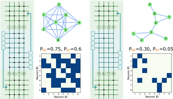
The image presents two sets of diagrams illustrating neural network connectivity. Each set includes a schematic of a physical neuron array, a graph representing the network's connectivity, and a heatmap visualizing the adjacency matrix. The left set represents a network with higher connection probabilities (PNT=0.75, PRT=0.6), while the right set represents a network with lower connection probabilities (PNT=0.30, PRT=0.05).
### Components/Axes
**Left Side:**
* **Neuron Array Schematic:** A grid of interconnected nodes, with input/output connections labeled 1-4 and 5-8.
* **Connectivity Graph:** A graph showing connections between neurons 1-8. The thickness of the lines indicates the strength or frequency of connection.
* **Adjacency Matrix (Heatmap):** A matrix where rows and columns represent neuron IDs (1-8). Blue squares indicate a connection between the corresponding neurons, while light squares indicate no connection.
* X-axis: Neuron ID (1-8)
* Y-axis: Neuron ID (1-8)
* **Connection Probabilities:** PNT=0.75, PRT=0.6 (PNT and PRT are not defined in the image, but are assumed to be connection probabilities)
**Right Side:**
* **Neuron Array Schematic:** Identical to the left side.
* **Connectivity Graph:** A graph showing connections between neurons 1-8, but with fewer connections compared to the left side.
* **Adjacency Matrix (Heatmap):** A matrix where rows and columns represent neuron IDs (1-8). Blue squares indicate a connection between the corresponding neurons, while light squares indicate no connection.
* X-axis: Neuron ID (1-8)
* Y-axis: Neuron ID (1-8)
* **Connection Probabilities:** PNT=0.30, PRT=0.05
### Detailed Analysis
**Left Side (High Connectivity):**
* **Connectivity Graph:** Neurons 3, 6, and 7 are highly interconnected. Neuron 7 has the most connections.
* **Adjacency Matrix:**
* Row 1: Connections to neurons 2, 3, 6, and 7.
* Row 2: Connections to neurons 1, 3, 5, 7, and 8.
* Row 3: Connections to neurons 1, 2, 4, 6, 7, and 8.
* Row 4: Connections to neurons 3, 5, 6, and 7.
* Row 5: Connections to neurons 2, 4, 6, 7, and 8.
* Row 6: Connections to neurons 1, 3, 4, 5, 7, and 8.
* Row 7: Connections to neurons 1, 2, 3, 4, 5, 6, and 8.
* Row 8: Connections to neurons 2, 3, 5, 6, and 7.
**Right Side (Low Connectivity):**
* **Connectivity Graph:** Neurons 3, 6, and 8 are interconnected.
* **Adjacency Matrix:**
* Row 1: Connections to neurons 2 and 3.
* Row 2: Connections to neurons 1 and 3.
* Row 3: Connections to neurons 1, 2, 6, and 8.
* Row 4: Connection to neuron 3.
* Row 5: Connection to neuron 8.
* Row 6: Connections to neurons 3, 7, and 8.
* Row 7: Connection to neuron 6.
* Row 8: Connections to neurons 3, 5, and 6.
### Key Observations
* The left side demonstrates a highly connected network, while the right side shows a sparsely connected network.
* The adjacency matrices visually confirm the connectivity patterns observed in the graphs.
* The connection probabilities (PNT and PRT) significantly influence the network's connectivity.
### Interpretation
The image illustrates how varying connection probabilities (PNT and PRT) affect the structure and connectivity of a neural network. Higher probabilities result in a densely connected network with numerous connections between neurons, as seen on the left. Lower probabilities lead to a sparse network with fewer connections, as seen on the right. The adjacency matrices provide a clear visual representation of these connectivity patterns, allowing for a quantitative analysis of the network's structure. The connectivity graphs provide a more intuitive representation of the network's structure. The combination of these representations provides a comprehensive understanding of the network's connectivity properties.