## Time Series Analysis: Availability and Positive Counts Across Station, Area, and Total Levels
### Overview
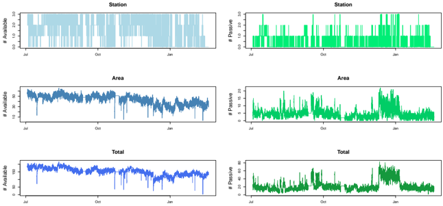
The image displays a 3x2 grid of six time series plots. The rows represent three hierarchical levels of aggregation: **Station**, **Area**, and **Total**. The columns represent two different metrics: **# Available** (left column, blue color scheme) and **# Positive** (right column, green color scheme). All plots share a common x-axis representing time, with major tick marks labeled "Jul", "Oct", and "Jan", suggesting a timeline spanning approximately from July of one year to January of the next.
### Components/Axes
* **Layout:** A 3-row by 2-column grid of individual plots.
* **Row Titles (Top of each plot):** "Station", "Area", "Total".
* **Y-Axis Labels:**
* Left Column: "# Available"
* Right Column: "# Positive"
* **X-Axis Labels (Common to all plots):** Time markers for "Jul", "Oct", "Jan".
* **Color Scheme & Chart Type:**
* **Left Column (# Available):** Blue color palette.
* Station: Light blue filled area chart.
* Area: Medium blue line chart.
* Total: Dark blue line chart.
* **Right Column (# Positive):** Green color palette.
* Station: Bright green filled area chart.
* Area: Medium green line chart.
* Total: Dark green line chart.
### Detailed Analysis
**Left Column: # Available**
1. **Station (Top-Left):**
* **Trend:** The data appears as a filled area, indicating a binary or step-function state. The value is predominantly at a high level (approximately 25) but frequently drops to zero for varying durations, creating a "barcode" or "on/off" pattern throughout the timeline.
* **Values:** Fluctuates between 0 and ~25.
2. **Area (Middle-Left):**
* **Trend:** A continuous line showing a gradual, slight downward trend from July to January. The line exhibits high-frequency noise or daily variability.
* **Values:** Starts around 28-30 in July, ends around 22-24 in January. Fluctuates within a band of approximately ±3 units around the trend line.
3. **Total (Bottom-Left):**
* **Trend:** Similar to the Area plot but at a higher magnitude. Shows a gradual downward trend with high-frequency variability.
* **Values:** Starts around 38-40 in July, ends around 32-34 in January. Fluctuates within a band of approximately ±4 units.
**Right Column: # Positive**
1. **Station (Top-Right):**
* **Trend:** A filled area chart showing frequent, sharp spikes from a baseline near zero. The spikes are irregular and vary greatly in height and duration.
* **Values:** Baseline near 0. Spikes reach up to ~30, with many in the 10-20 range.
2. **Area (Middle-Right):**
* **Trend:** A line chart showing more sustained periods of elevated values compared to the Station plot. There is a notable period of increased activity and higher peaks starting around late December/early January.
* **Values:** Generally fluctuates between 0 and 10, with a significant cluster of peaks reaching 15-20 in the January period.
3. **Total (Bottom-Right):**
* **Trend:** A line chart showing the aggregated positive count. It displays a clear pattern of low-level background activity punctuated by distinct "events" or surges. The most prominent surge occurs in January, where values are consistently elevated for a sustained period.
* **Values:** Background level fluctuates between 0 and 20. The January surge shows values consistently between 25 and 50, with peaks near 50.
### Key Observations
1. **Inverse Relationship:** There is a visual inverse relationship between the "# Available" and "# Positive" metrics, particularly noticeable in the **Total** row. As the "# Available" (blue) shows a gradual decline, the "# Positive" (green) shows increasing volatility and a major surge in January.
2. **Aggregation Effect:** Moving from Station -> Area -> Total smooths the data. The Station plots show binary/impulse behavior, while Area and Total plots reveal underlying trends and aggregated event magnitudes.
3. **January Anomaly:** A significant event or change in pattern occurs around January across all metrics, most dramatically seen as a sustained high plateau in the **Total # Positive** plot.
4. **Data Density:** The "# Available" plots (especially Station) suggest discrete, possibly operational status data. The "# Positive" plots suggest count data of occurrences or incidents.
### Interpretation
This dashboard likely monitors the operational status and incident/positive case load of a distributed system (e.g., sensor networks, service stations, testing sites) over a six-month period.
* **What the data suggests:** The system experienced a gradual reduction in available capacity or operational stations from summer to winter. Concurrently, the number of "positive" events (which could indicate faults, detections, alerts, or cases) became more frequent and severe, culminating in a major incident or outbreak period in January.
* **Relationship between elements:** The "Station" level shows raw, unfiltered activity. The "Area" level aggregates stations into regions, showing regional trends. The "Total" level provides the global picture. The decline in availability may be a contributing factor to, or a result of, the surge in positive events. For example, stations going offline (drop in # Available) could be due to the events being counted as # Positive.
* **Notable outliers/trends:** The January surge in Total # Positive is the most critical anomaly. It represents a systemic event, not just isolated station failures. The steady decline in # Available suggests a deteriorating baseline condition that may have predisposed the system to this major event.
* **Underlying narrative:** The data tells a story of a system under increasing stress. A slow degradation in operational capacity (available stations) was accompanied by a rising tide of issues, leading to a critical failure or peak event in January. This pattern is classic for scenarios like infrastructure decay leading to breakdown, or the spread of a condition through a network.