## Time Series Charts: Availability and Passivity Metrics
### Overview
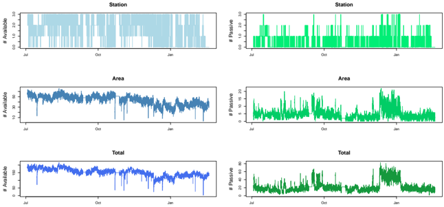
The image presents six time series charts arranged in a 3x2 grid. The left column displays the number of available resources, while the right column shows the number of passive resources. The rows represent different aggregation levels: "Station," "Area," and "Total." The x-axis for all charts represents time, spanning from approximately July to January.
### Components/Axes
**General:**
* **X-Axis:** Time, labeled with "Jul," "Oct," and "Jan."
* **Left Column Y-Axis:** "# Available"
* **Right Column Y-Axis:** "# Passive"
**Specific Charts:**
* **Top Row (Station):**
* Left Chart: Y-axis ranges from 0.0 to 3.0. Data series is light blue.
* Right Chart: Y-axis ranges from 0.0 to 3.0. Data series is green.
* **Middle Row (Area):**
* Left Chart: Y-axis ranges from 10 to 50. Data series is dark blue.
* Right Chart: Y-axis ranges from 0 to 20. Data series is green.
* **Bottom Row (Total):**
* Left Chart: Y-axis ranges from 0 to 150. Data series is dark blue.
* Right Chart: Y-axis ranges from 0 to 80. Data series is green.
### Detailed Analysis
**Station - Available (Top Left):**
* Trend: Fluctuates between approximately 0 and 3.
* Values: The line jumps between 0 and 3, with no clear trend.
**Station - Passive (Top Right):**
* Trend: Fluctuates between approximately 0 and 3.
* Values: The line jumps between 0 and 3, with no clear trend.
**Area - Available (Middle Left):**
* Trend: Generally decreasing over time.
* Values: Starts around 50 in July, decreases to approximately 30 by January. There are several sharp drops and recoveries throughout the period.
**Area - Passive (Middle Right):**
* Trend: Fluctuating, with a possible increase towards the end.
* Values: Varies between 0 and 20, with spikes and dips.
**Total - Available (Bottom Left):**
* Trend: Generally decreasing over time.
* Values: Starts around 160 in July, decreases to approximately 120 by January. Similar to "Area - Available," there are sharp drops and recoveries.
**Total - Passive (Bottom Right):**
* Trend: Fluctuating, with a possible increase towards the end.
* Values: Varies between 0 and 60, with spikes and dips.
### Key Observations
* The "Station" charts show binary availability/passivity, either fully available/passive or not at all.
* The "Area" and "Total" charts show a general decrease in availability from July to January.
* The "Area" and "Total" charts show a fluctuating passivity, with a possible increase towards the end of the period.
### Interpretation
The data suggests a potential decrease in resource availability ("Area" and "Total") over time, possibly due to increased usage or other factors. The "Station" data indicates a simple on/off state. The fluctuating passivity could be related to maintenance, downtime, or periods of inactivity. The increase in passivity towards the end of the period might indicate a seasonal trend or a specific event causing resources to become passive. The relationship between "Area" and "Total" suggests that the overall trend is reflected at both the aggregated and more granular levels.