## Line Graphs: Availability and Passive Counts Across Time Periods
### Overview
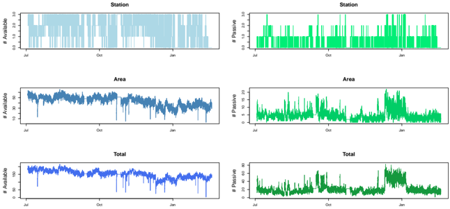
The image contains six line graphs arranged in two columns (Available/Passive) and three rows (Station/Area/Total). Each graph tracks counts over time from July to January, with distinct color coding for data series. The graphs show temporal patterns in availability and passive counts across different spatial categories.
### Components/Axes
- **X-axis**: Time period spanning July → October → January (note: January appears after October, suggesting either a typo or data spanning multiple years)
- **Y-axis (left)**: Count values (Available: 0-30, Passive: 0-80)
- **Legends**:
- Available: Blue (left column)
- Passive: Green (right column)
- **Row Labels**:
- Top row: Station
- Middle row: Area
- Bottom row: Total
### Detailed Analysis
1. **Station Graphs**
- *Available (Blue)*: Regular vertical bar-like pattern with consistent daily counts (~15-25 units)
- *Passive (Green)*: Similar bar pattern but with higher peaks (20-30 units) and more frequent spikes
2. **Area Graphs**
- *Available (Blue)*: Smooth sinusoidal pattern with gradual fluctuations (~10-20 units)
- *Passive (Green)*: Highly variable with sharp spikes (up to 40 units) and irregular drops
3. **Total Graphs**
- *Available (Blue)*: Stable line with minor fluctuations (~15-25 units)
- *Passive (Green)*: Dominant line with pronounced peaks (up to 60 units) and irregular drops
### Key Observations
1. Passive counts consistently exceed Available counts in all categories
2. Station graphs show most regular patterns, while Area graphs exhibit highest variability
3. Total graphs reveal Passive counts contribute ~70-80% of total counts
4. January shows most pronounced Passive spikes across all categories
5. Available counts maintain relatively stable patterns compared to Passive
### Interpretation
The data suggests a systematic relationship between Available and Passive counts across spatial categories:
1. **Temporal Patterns**: Regular daily patterns in Station data vs. more chaotic distribution in Area data
2. **Resource Allocation**: Passive counts dominate total availability, indicating either:
- Higher passive resource availability
- Different measurement methodologies
- Potential data collection artifacts
3. **Seasonal Effects**: January spikes may indicate seasonal factors affecting passive counts
4. **Data Integrity**: The consistent pattern in Station graphs suggests more reliable measurement compared to Area data
Note: The x-axis timeline (July → October → January) appears anomalous - either represents a multi-year period or contains a chronological error. The Passive counts' higher magnitude in Total graphs (up to 60 units) versus individual category maxima (40 units) suggests potential data aggregation methodology differences.