\n
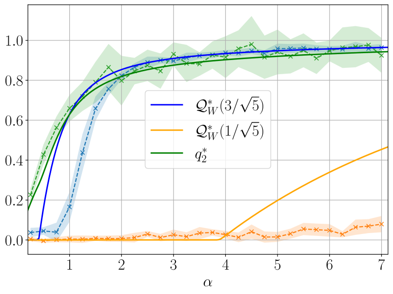
## Chart: Performance Curves
### Overview
The image presents a line chart comparing three performance curves, likely representing different strategies or algorithms, plotted against a parameter denoted as α (alpha). The chart includes shaded regions around each line, indicating a degree of uncertainty or variance.
### Components/Axes
* **X-axis:** Labeled "α", ranging from approximately 0 to 7, with gridlines at intervals of 1.
* **Y-axis:** Ranges from approximately 0 to 1.1, with gridlines at intervals of 0.2.
* **Legend:** Located in the top-right corner, listing the following curves with corresponding colors:
* `Q*w (3/√5)` - Dark Blue
* `Q*w (1/√5)` - Orange
* `q2` - Green
* **Data Series:** Three lines representing the performance of each strategy, with shaded areas indicating variance. The shaded areas are light blue, light orange, and light green, respectively.
* **Markers:** Each line is also marked with 'x' symbols at irregular intervals.
### Detailed Analysis
Let's analyze each curve individually:
1. **`Q*w (3/√5)` (Dark Blue):** This line starts at approximately 0.1 at α = 0, rapidly increases to around 0.85 at α = 1, and then plateaus, approaching a value of approximately 0.98 by α = 3. It remains relatively stable between α = 3 and α = 7, fluctuating slightly around 0.98. The shaded region indicates a variance of approximately ±0.05.
2. **`Q*w (1/√5)` (Orange):** This line begins at approximately 0 at α = 0 and exhibits a slow, steady increase throughout the entire range of α. It reaches approximately 0.1 at α = 1, 0.2 at α = 4, 0.3 at α = 6, and continues to increase, reaching approximately 0.5 at α = 7. The shaded region indicates a variance of approximately ±0.02.
3. **`q2` (Green):** This line starts at approximately 0.1 at α = 0, increases rapidly to around 0.8 at α = 1, and then plateaus, approaching a value of approximately 0.95 by α = 2. It remains relatively stable between α = 2 and α = 7, fluctuating slightly around 0.95. The shaded region indicates a variance of approximately ±0.05.
### Key Observations
* The `Q*w (3/√5)` and `q2` curves converge to similar values (around 0.95-0.98) as α increases, suggesting they achieve comparable performance for larger values of α.
* The `Q*w (1/√5)` curve consistently underperforms compared to the other two, especially for smaller values of α.
* The shaded regions around each line indicate that the performance is not deterministic and has some degree of variability.
* The `Q*w (1/√5)` curve shows a consistent upward trend, while the other two curves exhibit diminishing returns as α increases.
### Interpretation
This chart likely represents the performance of different algorithms or strategies as a function of a parameter α. The parameter α could represent a regularization strength, a learning rate, or some other control variable.
The convergence of `Q*w (3/√5)` and `q2` suggests that both strategies achieve high performance for sufficiently large values of α. The consistently lower performance of `Q*w (1/√5)` indicates that this strategy is less effective, potentially due to its sensitivity to the value of α.
The shaded regions highlight the inherent variability in the performance of each strategy. This variability could be due to randomness in the algorithm, noise in the data, or other factors.
The rapid initial increase in performance for all three curves suggests that there is a significant benefit to increasing α from a small value. However, the diminishing returns observed for `Q*w (3/√5)` and `q2` indicate that there is a point beyond which increasing α further does not significantly improve performance.
The chart provides valuable insights into the trade-offs between different strategies and the importance of tuning the parameter α to achieve optimal performance.