\n
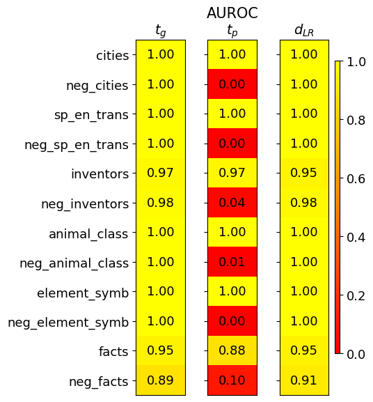
## Heatmap: Performance Metrics for Different Categories
### Overview
This image presents a heatmap displaying performance metrics for various categories. The heatmap has three columns representing different metrics: *t<sub>G</sub>*, *AUROC<sub>tp</sub>*, and *d<sub>LR</sub>*. The rows represent different categories and their negative counterparts. The color intensity indicates the value of the metric, with yellow representing higher values and red representing lower values.
### Components/Axes
* **Rows (Categories):**
* cities
* neg\_cities
* sp\_en\_trans
* neg\_sp\_en\_trans
* inventors
* neg\_inventors
* animal\_class
* neg\_animal\_class
* element\_symb
* neg\_element\_symb
* facts
* neg\_facts
* **Columns (Metrics):**
* t<sub>G</sub> (Top-left)
* AUROC<sub>tp</sub> (Center)
* d<sub>LR</sub> (Top-right)
* **Color Scale (Bottom-right):** Ranges from 0.0 (red) to 1.0 (yellow).
* **Title:** "AUROC" is present above the columns.
### Detailed Analysis
The heatmap displays numerical values at the intersection of each row and column. The values are as follows:
| Category | t<sub>G</sub> | AUROC<sub>tp</sub> | d<sub>LR</sub> |
| ------------------ | -------- | -------- | -------- |
| cities | 1.00 | 1.00 | 1.00 |
| neg\_cities | 1.00 | 0.00 | 1.00 |
| sp\_en\_trans | 1.00 | 1.00 | 1.00 |
| neg\_sp\_en\_trans | 1.00 | 0.00 | 1.00 |
| inventors | 0.97 | 0.97 | 0.95 |
| neg\_inventors | 0.98 | 0.04 | 0.98 |
| animal\_class | 1.00 | 1.00 | 1.00 |
| neg\_animal\_class | 1.00 | 0.01 | 1.00 |
| element\_symb | 1.00 | 1.00 | 1.00 |
| neg\_element\_symb | 1.00 | 0.00 | 1.00 |
| facts | 0.95 | 0.88 | 0.95 |
| neg\_facts | 0.89 | 0.10 | 0.91 |
**Trends:**
* **t<sub>G</sub>:** Most categories have a value of 1.00. *neg\_facts* has the lowest value at 0.89.
* **AUROC<sub>tp</sub>:** A clear pattern emerges: positive categories (e.g., cities, sp\_en\_trans) consistently score 1.00, while their negative counterparts (e.g., neg\_cities, neg\_sp\_en\_trans) score very low, close to 0.00. *neg\_inventors* and *neg\_animal\_class* also have very low scores. *facts* has a moderate score of 0.88.
* **d<sub>LR</sub>:** Values are generally high, mostly 1.00, across all categories. *neg\_facts* has the lowest value at 0.91.
### Key Observations
* The negative categories consistently perform poorly on the *AUROC<sub>tp</sub>* metric, indicating a difficulty in distinguishing between positive and negative instances for these categories.
* The *t<sub>G</sub>* and *d<sub>LR</sub>* metrics are relatively stable across all categories, suggesting consistent performance in these aspects.
* *neg\_facts* consistently shows the lowest performance across multiple metrics.
### Interpretation
This heatmap likely represents the performance of a model or system in classifying or identifying different types of entities or concepts. The categories represent different types of data (cities, inventors, animal classes, etc.), and the metrics evaluate different aspects of performance.
* **t<sub>G</sub>** might represent a threshold or a measure of confidence.
* **AUROC<sub>tp</sub>** (Area Under the Receiver Operating Characteristic curve for true positives) indicates the model's ability to correctly identify positive instances. The low scores for negative categories suggest the model struggles to differentiate between true positives and false positives for those categories.
* **d<sub>LR</sub>** (Likelihood Ratio) measures the evidence provided by the model in favor of a positive instance.
The consistent high performance on *t<sub>G</sub>* and *d<sub>LR</sub>* suggests the model is generally confident in its predictions, but the low *AUROC<sub>tp</sub>* scores for negative categories indicate a potential bias or difficulty in handling negative instances. The *neg\_facts* category appears to be particularly problematic, requiring further investigation. The data suggests that the model is better at identifying the presence of a concept than its absence.