## Heatmap: AUROC Performance Across Categories and Metrics
### Overview
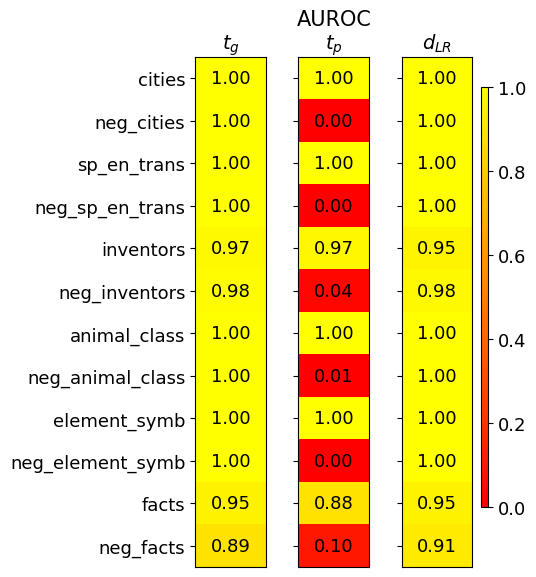
The image is a heatmap visualizing the Area Under the Receiver Operating Characteristic curve (AUROC) scores for three different metrics (`t_g`, `t_p`, `d_LR`) across twelve distinct categories. The categories appear to be datasets or tasks, with some having a "neg_" prefix, likely indicating negative or adversarial versions. The heatmap uses a color scale from red (0.0) to yellow (1.0) to represent the AUROC score, with exact numerical values overlaid on each cell.
### Components/Axes
* **Title:** "AUROC" (centered at the top).
* **Column Headers (Metrics):** Three columns labeled `t_g`, `t_p`, and `d_LR` (from left to right).
* **Row Labels (Categories):** Twelve categories listed vertically on the left side:
1. `cities`
2. `neg_cities`
3. `sp_en_trans`
4. `neg_sp_en_trans`
5. `inventors`
6. `neg_inventors`
7. `animal_class`
8. `neg_animal_class`
9. `element_symb`
10. `neg_element_symb`
11. `facts`
12. `neg_facts`
* **Color Scale/Legend:** A vertical color bar located on the far right of the chart. It maps colors to AUROC values, ranging from **0.0 (red)** at the bottom to **1.0 (yellow)** at the top. Intermediate markers are at 0.2, 0.4, 0.6, and 0.8.
* **Data Cells:** A 12x3 grid where each cell contains a numerical AUROC value and is colored according to the scale.
### Detailed Analysis
The following table reconstructs the data from the heatmap. The color description is based on the visual mapping from the legend.
| Category | `t_g` (AUROC) | `t_p` (AUROC) | `d_LR` (AUROC) |
| :--- | :--- | :--- | :--- |
| **cities** | 1.00 (Yellow) | 1.00 (Yellow) | 1.00 (Yellow) |
| **neg_cities** | 1.00 (Yellow) | 0.00 (Red) | 1.00 (Yellow) |
| **sp_en_trans** | 1.00 (Yellow) | 1.00 (Yellow) | 1.00 (Yellow) |
| **neg_sp_en_trans** | 1.00 (Yellow) | 0.00 (Red) | 1.00 (Yellow) |
| **inventors** | 0.97 (Yellow) | 0.97 (Yellow) | 0.95 (Yellow) |
| **neg_inventors** | 0.98 (Yellow) | 0.04 (Red) | 0.98 (Yellow) |
| **animal_class** | 1.00 (Yellow) | 1.00 (Yellow) | 1.00 (Yellow) |
| **neg_animal_class** | 1.00 (Yellow) | 0.01 (Red) | 1.00 (Yellow) |
| **element_symb** | 1.00 (Yellow) | 1.00 (Yellow) | 1.00 (Yellow) |
| **neg_element_symb** | 1.00 (Yellow) | 0.00 (Red) | 1.00 (Yellow) |
| **facts** | 0.95 (Yellow) | 0.88 (Yellow) | 0.95 (Yellow) |
| **neg_facts** | 0.89 (Yellow) | 0.10 (Red) | 0.91 (Yellow) |
**Trend Verification per Metric:**
* **`t_g` (Left Column):** The line of values shows consistently high performance (AUROC ≥ 0.89). The trend is nearly perfect (1.00) for most categories, with slight dips for `inventors` (0.97), `facts` (0.95), and `neg_facts` (0.89). This metric appears robust across both standard and "neg_" categories.
* **`t_p` (Middle Column):** This column shows a stark, binary trend. For standard categories (`cities`, `sp_en_trans`, `inventors`, `animal_class`, `element_symb`, `facts`), the AUROC is high (0.88 to 1.00). For their corresponding "neg_" prefixed categories, the AUROC drops dramatically to near zero (0.00 to 0.10), with the exception of `neg_inventors` at 0.04. This indicates the `t_p` metric is highly sensitive to the distinction between standard and "neg_" versions of the tasks.
* **`d_LR` (Right Column):** This metric shows uniformly high performance (AUROC ≥ 0.91) across all categories, mirroring the robustness of `t_g`. The lowest score is for `neg_facts` (0.91).
### Key Observations
1. **Perfect Scores:** The metrics `t_g` and `d_LR` achieve a perfect AUROC of 1.00 on 7 out of 12 categories each.
2. **Catastrophic Failure of `t_p`:** The `t_p` metric fails completely (AUROC ≤ 0.10) on all categories prefixed with "neg_", except for a very low score of 0.04 on `neg_inventors`.
3. **Resilience of `t_g` and `d_LR`:** Both `t_g` and `d_LR` maintain high performance on the "neg_" categories, showing no significant drop compared to their standard counterparts.
4. **Hardest Category:** The `facts` and `neg_facts` categories yield the lowest scores across all three metrics, suggesting these tasks are more challenging for the models being evaluated.
5. **Spatial Layout:** The legend is positioned to the right of the main data grid. The column headers are centered above their respective data columns. Row labels are left-aligned.
### Interpretation
This heatmap likely compares the performance of three different detection or classification methods (`t_g`, `t_p`, `d_LR`) on a set of benchmark tasks, some of which are adversarial or negative examples (the "neg_" categories).
The data suggests a fundamental difference in how these metrics operate:
* **`t_p` is a brittle metric.** It performs perfectly on standard tasks but fails catastrophically on their negative counterparts. This implies it may be overfit to specific features present in the standard data that are absent or inverted in the negative sets. It is not a reliable measure for adversarial robustness.
* **`t_g` and `d_LR` are robust metrics.** They maintain high performance regardless of whether the category is standard or negative. This indicates they capture more generalizable and reliable signals for the underlying task, making them suitable for evaluating model performance in adversarial settings.
The near-perfect scores for `t_g` and `d_LR` on most tasks could imply that the underlying models have mastered these benchmarks, or that the benchmarks themselves may not be sufficiently challenging to differentiate model capabilities beyond a certain point. The relative difficulty of the `facts` category provides a better point of comparison. The investigation would benefit from examining why `t_p` is so uniquely sensitive to the "neg_" transformation.