## Diagram: Data Processing Flow
### Overview
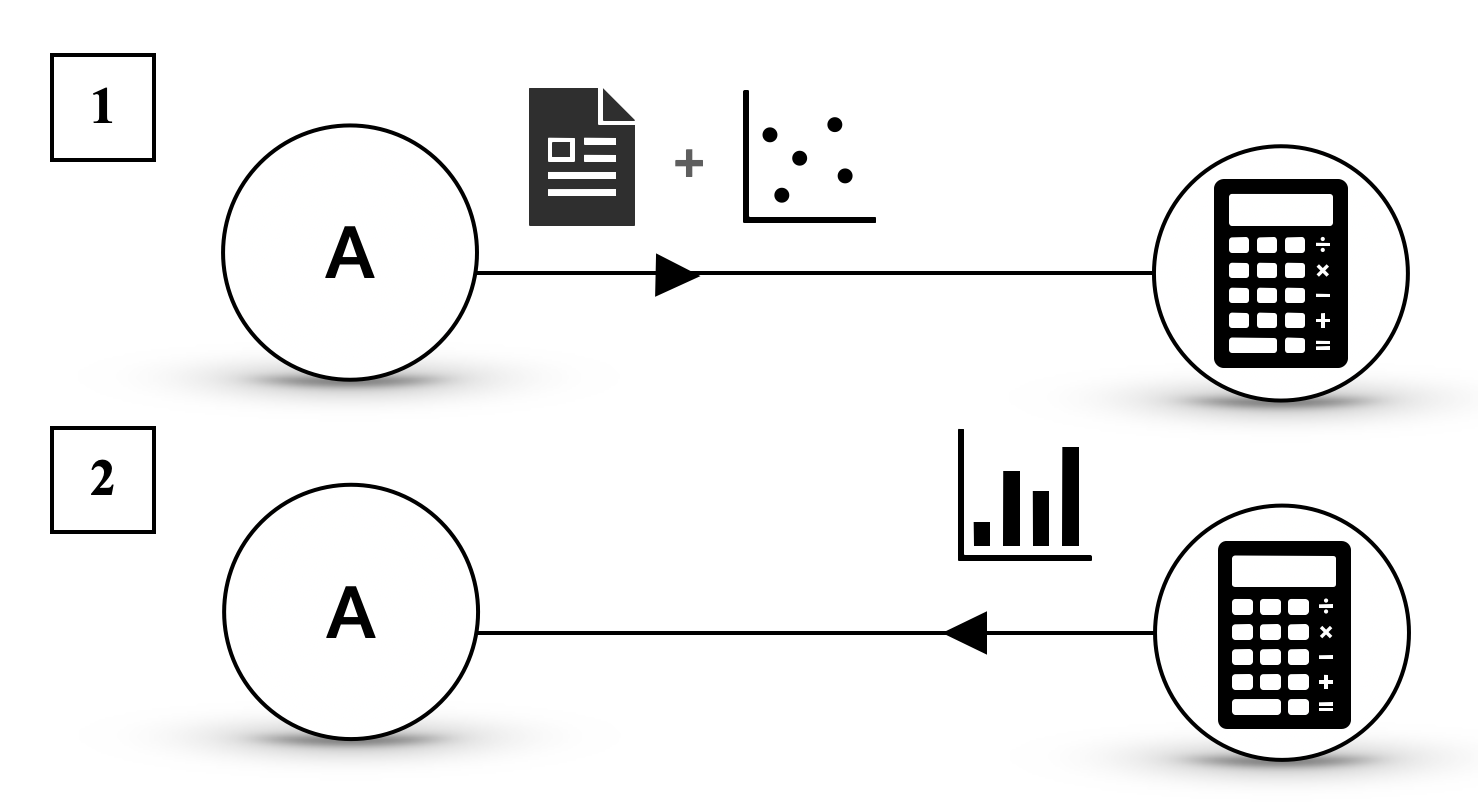
The image presents a diagram illustrating two distinct data processing flows. Each flow starts with a labeled input, undergoes a transformation represented by the letter "A" within a circle, incorporates different types of data visualization, and culminates in a calculation step symbolized by a calculator icon.
### Components/Axes
* **Input Labels:** The flows are labeled "1" and "2" within square boxes on the left side.
* **Transformation Node:** Each flow includes a circular node labeled "A", representing a transformation or processing step.
* **Data Visualization:**
* Flow 1: A document icon is combined with a scatter plot.
* Flow 2: A bar chart is used.
* **Calculation Node:** Each flow ends with a calculator icon within a circle, representing a calculation or final processing step.
* **Flow Direction:** Arrows indicate the direction of data flow from left to right.
### Detailed Analysis or Content Details
**Flow 1:**
* Starts with input labeled "1".
* Passes through transformation node "A".
* Combines a document icon with a scatter plot. The scatter plot contains approximately 6 data points.
* Ends with a calculator icon.
**Flow 2:**
* Starts with input labeled "2".
* Passes through transformation node "A".
* Incorporates a bar chart with 4 bars of varying heights. The heights are approximately:
* Bar 1: 25% of max height
* Bar 2: 50% of max height
* Bar 3: 75% of max height
* Bar 4: 100% of max height
* Ends with a calculator icon.
### Key Observations
* Both flows share a similar structure, starting with an input, undergoing a transformation, and ending with a calculation.
* The key difference between the flows lies in the type of data visualization used: scatter plot vs. bar chart.
* The transformation node "A" is identical in both flows, suggesting a common processing step.
### Interpretation
The diagram illustrates two alternative data processing pipelines. The choice between the two pipelines likely depends on the nature of the input data and the desired type of analysis. Flow 1, using a scatter plot, might be suitable for exploring relationships between variables, while Flow 2, using a bar chart, might be used for comparing categorical data. The calculator icon at the end of each flow suggests that both pipelines ultimately lead to a numerical result or decision. The "A" node represents a common processing step that is applied to both types of data.