\n
## Diagram: Data Processing Flow
### Overview
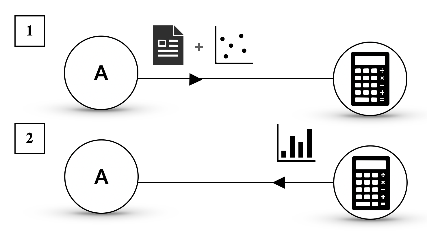
The image depicts a diagram illustrating a two-step data processing flow. It shows how data originating from a source labeled "A" is processed through different stages involving data input, calculation, and output. The diagram is split into two parallel flows, numbered 1 and 2, both originating from the same source "A".
### Components/Axes
The diagram consists of the following components:
* **Source A:** Represented by a circle labeled "A".
* **Data Input (Flow 1):** A document icon and a scatter plot icon, connected by a "+" symbol, indicating data combination.
* **Calculator (Flow 1 & 2):** A standard calculator icon.
* **Data Output (Flow 1):** A calculator icon.
* **Data Output (Flow 2):** A bar chart icon.
* **Flow Arrows:** Arrows indicating the direction of data flow.
* **Sequence Numbers:** Boxes labeled "1" and "2" indicating the order of the flows.
### Detailed Analysis or Content Details
**Flow 1:**
* The flow starts from source "A".
* An arrow points from "A" to a combination of a document icon and a scatter plot icon. The "+" symbol between them suggests that data from a document is being combined with data represented by the scatter plot.
* An arrow then points from this combined data to a calculator icon.
* Finally, an arrow points from the calculator icon to another calculator icon.
**Flow 2:**
* The flow starts from source "A".
* An arrow points directly from "A" to a calculator icon.
* An arrow then points from the calculator icon to a bar chart icon.
There are no numerical values or specific data labels present in the diagram. The icons are symbolic representations of data and processes.
### Key Observations
* Both flows originate from the same source "A".
* Flow 1 involves a combination of document data and scatter plot data before calculation, while Flow 2 directly uses data from source "A" for calculation.
* Flow 1 outputs to a calculator, while Flow 2 outputs to a bar chart.
* The diagram does not specify the type of calculations performed by the calculator.
### Interpretation
The diagram illustrates two different data processing pipelines. Flow 1 suggests a process where data from multiple sources (document and scatter plot) is integrated and then processed. The output of this process is another calculator, which could represent further processing or a different type of output. Flow 2 represents a simpler process where data from source "A" is directly processed and visualized as a bar chart.
The diagram could represent a data analysis workflow where different types of data require different processing steps before visualization. The use of a calculator in both flows suggests a common mathematical or computational step. The difference in output (calculator vs. bar chart) indicates that the two flows serve different purposes or target different audiences.
The diagram is abstract and lacks specific details about the data or the calculations involved. It serves as a high-level overview of the data processing flow rather than a detailed technical specification.