\n
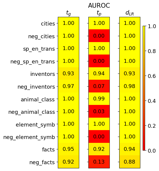
## Heatmap: Performance Metrics for Different Categories
### Overview
This image presents a heatmap displaying performance metrics for ten categories and their corresponding negative counterparts. The metrics are represented by color intensity, with a scale ranging from 0.0 to 1.0. The heatmap is divided into three columns, each representing a different metric: *t<sub>G</sub>*, *AUROC<sub>tp</sub>*, and *d<sub>LR</sub>*. The rows represent different categories, including both positive and negative examples.
### Components/Axes
* **Rows (Categories):** cities, neg\_cities, sp\_en\_trans, neg\_sp\_en\_trans, inventors, neg\_inventors, animal\_class, neg\_animal\_class, element\_symb, neg\_element\_symb, facts, neg\_facts.
* **Columns (Metrics):**
* *t<sub>G</sub>* (Top-left column)
* *AUROC<sub>tp</sub>* (Center column) - Area Under the Receiver Operating Characteristic curve for the positive class.
* *d<sub>LR</sub>* (Bottom-right column) - Log-likelihood ratio.
* **Color Scale:** A vertical color bar on the right side of the heatmap indicates the mapping between color intensity and metric values. The scale ranges from approximately 0.0 (dark red) to 1.0 (yellow).
* **Legend:** The color scale acts as the legend.
### Detailed Analysis
The heatmap displays numerical values at the intersection of each category and metric. Here's a breakdown of the values, row by row:
* **cities:** *t<sub>G</sub>* = 1.00, *AUROC<sub>tp</sub>* = 1.00, *d<sub>LR</sub>* = 1.00
* **neg\_cities:** *t<sub>G</sub>* = 1.00, *AUROC<sub>tp</sub>* = 0.00, *d<sub>LR</sub>* = 1.00
* **sp\_en\_trans:** *t<sub>G</sub>* = 1.00, *AUROC<sub>tp</sub>* = 1.00, *d<sub>LR</sub>* = 1.00
* **neg\_sp\_en\_trans:** *t<sub>G</sub>* = 1.00, *AUROC<sub>tp</sub>* = 0.00, *d<sub>LR</sub>* = 1.00
* **inventors:** *t<sub>G</sub>* = 0.93, *AUROC<sub>tp</sub>* = 0.94, *d<sub>LR</sub>* = 0.93
* **neg\_inventors:** *t<sub>G</sub>* = 0.97, *AUROC<sub>tp</sub>* = 0.07, *d<sub>LR</sub>* = 0.98
* **animal\_class:** *t<sub>G</sub>* = 1.00, *AUROC<sub>tp</sub>* = 0.99, *d<sub>LR</sub>* = 1.00
* **neg\_animal\_class:** *t<sub>G</sub>* = 1.00, *AUROC<sub>tp</sub>* = 0.03, *d<sub>LR</sub>* = 1.00
* **element\_symb:** *t<sub>G</sub>* = 1.00, *AUROC<sub>tp</sub>* = 1.00, *d<sub>LR</sub>* = 1.00
* **neg\_element\_symb:** *t<sub>G</sub>* = 1.00, *AUROC<sub>tp</sub>* = 0.00, *d<sub>LR</sub>* = 1.00
* **facts:** *t<sub>G</sub>* = 0.95, *AUROC<sub>tp</sub>* = 0.92, *d<sub>LR</sub>* = 0.94
* **neg\_facts:** *t<sub>G</sub>* = 0.92, *AUROC<sub>tp</sub>* = 0.13, *d<sub>LR</sub>* = 0.88
**Trends:**
* For the *t<sub>G</sub>* metric, most categories achieve a score of 1.00, except for "inventors" (0.93) and "facts" (0.95), and "neg_facts" (0.92).
* The *AUROC<sub>tp</sub>* metric shows a clear pattern: positive categories (cities, sp\_en\_trans, animal\_class, element\_symb) generally have values close to 1.00, while their negative counterparts (neg\_cities, neg\_sp\_en\_trans, neg\_animal\_class, neg\_element\_symb) have values close to 0.00. "inventors" and "facts" show intermediate values, while their negative counterparts show very low values.
* The *d<sub>LR</sub>* metric is consistently high (close to 1.00) for most categories, with "neg\_facts" being the lowest at 0.88.
### Key Observations
* The negative examples consistently exhibit low *AUROC<sub>tp</sub>* values, indicating poor performance in distinguishing positive from negative instances for those categories.
* The *t<sub>G</sub>* metric is generally high across all categories, suggesting good performance in a different aspect of the evaluation.
* The *d<sub>LR</sub>* metric is relatively stable across all categories, indicating a consistent ability to discriminate between classes.
* The heatmap clearly differentiates between positive and negative examples based on the *AUROC<sub>tp</sub>* metric.
### Interpretation
This heatmap likely represents the performance of a classification model on different categories of data. The categories appear to be related to knowledge or information retrieval (cities, inventors, facts, etc.). The "neg\_" prefix indicates negative examples, likely created through some form of adversarial or contrastive learning.
The high *t<sub>G</sub>* values suggest the model is generally good at identifying relevant information. However, the low *AUROC<sub>tp</sub>* values for the negative examples indicate that the model struggles to correctly identify *non*-examples of these categories. This could be due to several factors, such as:
* **Data Imbalance:** The negative examples might be underrepresented in the training data.
* **Feature Overlap:** The features used to represent the categories might not be sufficiently discriminative between positive and negative examples.
* **Adversarial Examples:** The negative examples might be specifically designed to fool the model.
The *d<sub>LR</sub>* metric provides a measure of the model's confidence in its predictions. The relatively high values across all categories suggest that the model is generally confident in its classifications, even when it is incorrect (as evidenced by the low *AUROC<sub>tp</sub>* for negative examples). This could indicate that the model is overconfident or that the features are not providing sufficient information to make accurate predictions.
The heatmap provides valuable insights into the strengths and weaknesses of the model, highlighting areas where further improvement is needed. Specifically, addressing the poor performance on negative examples should be a priority.